John Verzani
20000 40000 60000 80000 120000 160000
2e+054e+056e+058e+05
y
Preface
These notes are an introduction to using the statistical software package Rfor an introductory statistics course.
They are meant to accompany an introductory statistics book such as Kitchens “Exploring Statistics”. The goals are not to show all the features of R, or to replace a standard textbook, but rather to be used with a textbook to illustrate the features of Rthat can be learned in a one-semester, introductory statistics course.
These notes were written to take advantage of Rversion 1.5.0 or later. For pedagogical reasons the equals sign,
=, is used as an assignment operator and not the traditional arrow combination<-. This was added to Rin version 1.4.0. If only an older version is available the reader will have to make the minor adjustment.
There are several references to data and functions in this text that need to be installed prior to their use. To install the data is easy, but the instructions vary depending on your system. For Windows users, you need to download the “zip” file , and then install from the “packages” menu. In UNIX, one uses the command R CMD INSTALL packagename.tar.gz. Some of the datasets are borrowed from other authors notably Kitchens. Credit is given in the help files for the datasets. This material is available as anRpackage from:
http://www.math.csi.cuny.edu/Statistics/R/simpleR/Simple 0.4.zipfor Windows users.
http://www.math.csi.cuny.edu/Statistics/R/simpleR/Simple 0.4.tar.gzfor UNIX users.
If necessary, the file can sent in an email. As well, the individual data sets can be found online in the directory http://www.math.csi.cuny.edu/Statistics/R/simpleR/Simple.
This is version 0.4 of these notes and were last generated on August 22, 2002. Before printing these notes, you should check for the most recent version available from
the CSI Math department (http://www.math.csi.cuny.edu/Statistics/R/simpleR).
Copyright c John Verzani (verzani@math.csi.cuny.edu), 2001-2. All rights reserved.
Contents
Introduction 1
What isR . . . . 1
A note on notation . . . . 1
Data 1 Starting R . . . . 1
Entering data with c . . . . 2
Data is avector . . . . 3
Problems . . . . 7
Univariate Data 8 Categorical data . . . . 8
Numerical data . . . . 10
Problems . . . . 18
Bivariate Data 19 Handling bivariate categorical data . . . . 20
Handling bivariate data: categorical vs. numerical . . . . 21
Bivariate data: numerical vs. numerical . . . . 22
Linear regression. . . . 24
Problems . . . . 31
Multivariate Data 32 Storing multivariate data in data frames . . . . 32
Accessing data in data frames . . . . 33
Manipulating data frames: stackandunstack . . . . 34
Using R’s model formula notation . . . . 35
Ways to view multivariate data . . . . 35
Thelatticepackage . . . . 40
Problems . . . . 40
Random Data 41
Random number generators in R– the “r” functions. . . . 41
Problems . . . . 46
Simulations 47 The central limit theorem . . . . 47
Using simple.simand functions . . . . 49
Problems . . . . 51
Exploratory Data Analysis 54 Our toolbox . . . . 54
Examples . . . . 54
Problems . . . . 58
Confidence Interval Estimation 59 Population proportion theory . . . . 59
Proportion test . . . . 61
Thez-test . . . . 62
Thet-test . . . . 62
Confidence interval for the median . . . . 64
Problems . . . . 65
Hypothesis Testing 66 Testing a population parameter . . . . 66
Testing a mean . . . . 67
Tests for the median . . . . 67
Problems . . . . 68
Two-sample tests 68 Two-sample tests of proportion . . . . 68
Two-samplet-tests . . . . 69
Resistant two-sample tests . . . . 71
Problems . . . . 71
Chi Square Tests 72 The chi-squared distribution . . . . 72
Chi-squared goodness of fit tests . . . . 72
Chi-squared tests of independence . . . . 74
Chi-squared tests for homogeneity . . . . 75
Problems . . . . 76
Regression Analysis 77 Simple linear regression model . . . . 77
Testing the assumptions of the model . . . . 78
Statistical inference . . . . 79
Problems . . . . 83
Multiple Linear Regression 84 The model . . . . 84
Problems . . . . 89
Analysis of Variance 89 one-way analysis of variance . . . . 89
Problems . . . . 92
Appendix: Installing R 94 Appendix: External Packages 94 Appendix: A sample R session 94 A sample session involving regression . . . . 94
t-tests . . . . 97
A simulation example . . . . 99
Appendix: What happens when R starts? 100
Appendix: Using Functions 100
The basic template . . . 100
For loops . . . 102
Conditional expressions . . . 103
Appendix: Entering Data intoR 103 Using c . . . 104
usingscan . . . 104
Using scanwith a file . . . 104
Editing your data . . . 104
Reading in tables of data . . . 105
Fixed-width fields . . . 105
Spreadsheet data . . . 105
XML, urls . . . 106
“Foreign” formats . . . 106
Appendix: Teaching Tricks 106
Appendix: Sources of help, documentation 107
Section 1: Introduction
What is R
These notes describe how to useRwhile learning introductory statistics. The purpose is to allow this fine software to be used in ”lower-level” courses where often MINITAB, SPSS, Excel, etc. are used. It is expected that the reader has had at least a pre-calculus course. It is the hope, that students shown how to useRat this early level will better understand the statistical issues and will ultimately benefit from the more sophisticated program despite its steeper
“learning curve”.
The benefits of Rfor an introductory student are
• Ris free. Ris open-source and runs on UNIX, Windows and Macintosh.
• Rhas an excellent built-in help system.
• Rhas excellent graphing capabilities.
• Students can easily migrate to the commercially supported S-Plus program if commercial software is desired.
• R’s language has a powerful, easy to learn syntax with many built-in statistical functions.
• The language is easy to extend with user-written functions.
• R is a computer programming language. For programmers it will feel more familiar than others and for new computer users, the next leap to programming will not be so large.
What isRlacking compared to other software solutions?
• It has a limited graphical interface (S-Plus has a good one). This means, it can be harder to learn at the outset.
• There is no commercial support. (Although one can argue the international mailing list is even better)
• The command language is a programming language so students must learn to appreciate syntax issues etc.
R is an open-source (GPL) statistical environment modeled after S and S-Plus (http://www.insightful.com).
The S language was developed in the late 1980s at AT&T labs. TheRproject was started by Robert Gentleman and Ross Ihaka of the Statistics Department of the University of Auckland in 1995. It has quickly gained a widespread audience. It is currently maintained by theRcore-development team, a hard-working, international team ofvolunteer developers. TheRproject web page
http://www.r-project.org
is the main site for information onR. At this site are directions for obtaining the software, accompanying packages and other sources of documentation.
A note on notation
A few typographical conventions are used in these notes. These include different fonts for urls, R commands, dataset namesand different typesetting for
longer sequences of R commands.
and for
Data sets.
Section 2: Data
Statistics is the study of data. After learning how to startR, the first thing we need to be able to do is learn how to enter data intoRand how to manipulate the data once there.
Starting R
R is most easily used in an interactive manner. You ask it a question andRgives you an answer. Questions are asked and answered on the command line. To start upR’s command line you can do the following: in Windows find the Ricon and double click, on Unix, from the command line type R. Other operating systems may have different ways. OnceRis started, you should be greeted with a command similar to
R : Copyright 2001, The R Development Core Team Version 1.4.0 (2001-12-19)
R is free software and comes with ABSOLUTELY NO WARRANTY.
You are welcome to redistribute it under certain conditions.
Type ‘license()’ or ‘licence()’ for distribution details.
R is a collaborative project with many contributors.
Type ‘contributors()’ for more information.
Type ‘demo()’ for some demos, ‘help()’ for on-line help, or
‘help.start()’ for a HTML browser interface to help.
Type ‘q()’ to quit R.
[Previously saved workspace restored]
>
The> is called theprompt. In what follows below it is not typed, but is used to indicate where you are to type if you follow the examples. If a command is too long to fit on a line, a+is used for the continuation prompt.
Entering data with c
The most usefulRcommand for quickly entering in small data sets is the cfunction. This functioncombines, or concatenates terms together. As an example, suppose we have the following count of the number of typos per page of these notes:
2 3 0 3 1 0 0 1
To enter this into anRsession we do so with
> typos = c(2,3,0,3,1,0,0,1)
> typos
[1] 2 3 0 3 1 0 0 1 Notice a few things
• We assigned the values to a variable calledtypos
• The assignment operator is a =. This is valid as of Rversion 1.4.0. Previously it was (and still can be) a<-.
Both will be used, although, you should learn one and stick with it.
• The value of the typosdoesn’t automatically print out. It does when we type just the name though as the last input line indicates
• The value of typos is prefaced with a funny looking[1]. This indicates that the value is avector. More on that later.
Typing less
For many implementations ofRyou can save yourself a lot of typing if you learn that the arrow keys can be used to retrieve your previous commands. In particular, each command is stored in a history and the up arrow will traverse backwards along this history and the down arrow forwards. The left and right arrow keys will work as expected. This combined with a mouse can make it quite easy to do simple editing of your previous commands.
Applying a function
Rcomes with many built in functions that one can apply to data such astypos. One of them is themeanfunction for finding the mean or average of the data. To use it is easy
> mean(typos) [1] 1.25
As well, we could call the median, or var to find the median or sample variance. The syntax is the same – the function name followed by parentheses to contain the argument(s):
> median(typos) [1] 1
> var(typos) [1] 1.642857
Data is a vector
The data is stored inRas avector. This means simply that it keeps track of the order that the data is entered in.
In particular there is a first element, a second element up to a last element. This is a good thing for several reasons:
• Our simple data vectortyposhas a natural order – page 1, page 2 etc. We wouldn’t want to mix these up.
• We would like to be able to make changes to the data item by item instead of having to enter in the entire data set again.
• Vectors are also a mathematical object. There are natural extensions of mathematical concepts such as addition and multiplication that make it easy to work with data when they are vectors.
Let’s see how these apply to our typos example. First, suppose these are the typos for the first draft of section 1 of these notes. We might want to keep track of our various drafts as the typos change. This could be done by the following:
> typos.draft1 = c(2,3,0,3,1,0,0,1)
> typos.draft2 = c(0,3,0,3,1,0,0,1)
That is, the two typos on the first page were fixed. Notice the two different variable names. Unlike many other languages, the period is only used as punctuation. You can’t use an_(underscore) to punctuate names as you might in other programming languages so it is quite useful.1
Now, you might say, that is a lot of work to type in the data a second time. Can’t I just tellRto change the first page? The answer of course is “yes”. Here is how
> typos.draft1 = c(2,3,0,3,1,0,0,1)
> typos.draft2 = typos.draft1 # make a copy
> typos.draft2[1] = 0 # assign the first page 0 typos
Now notice a few things. First, the comment character, #, is used to make comments. Basically anything after the comment character is ignored (by R, hopefully not the reader). More importantly, the assignment to the first entry in the vectortypos.draft2is done by referencing the first entry in the vector. This is done with square brackets[].
It is important to keep this in mind: parentheses ()are for functions, and square brackets []are for vectors (and later arrays and lists). In particular, we have the following values currently intypos.draft2
> typos.draft2 # print out the value [1] 0 3 0 3 1 0 0 1
> typos.draft2[2] # print 2nd pages’ value [1] 3
> typos.draft2[4] # 4th page [1] 3
> typos.draft2[-4] # all but the 4th page [1] 0 3 0 1 0 0 1
> typos.draft2[c(1,2,3)] # fancy, print 1st, 2nd and 3rd.
[1] 0 3 0
Notice negative indices give everything except these indices. The last example is very important. You can take more than one value at a time by using another vector of index numbers. This is calledslicing.
Okay, we need to work these notes into shape, let’s find the real bad pages. By inspection, we can notice that pages 2 and 4 are a problem. Can we do this withRin a more systematic manner?
1The underscore was originally used as assignment so a name such asThe Datawould actually assign the value ofDatato the variable The. The underscore is being phased out and the equals sign is being phased in.
> max(typos.draft2) # what are worst pages?
[1] 3 # 3 typos per page
> typos.draft2 == 3 # Where are they?
[1] FALSE TRUE FALSE TRUE FALSE FALSE FALSE FALSE
Notice, the usage of double equals signs (==). This tests all the values of typos.draft2to see if they are equal to 3.
The 2nd and 4th answer yes (TRUE) the others no.
Think of this as askingRa question. Is the value equal to 3? R/ answers all at once with a long vector of TRUE’s and FALSE’s.
Now the question is – how can we get the indices (pages) corresponding to theTRUEvalues? Let’s rephrase,which indices have 3 typos? If you guessed that the commandwhichwill work, you are on your way toRmastery:
> which(typos.draft2 == 3) [1] 2 4
Now, what if you didn’t think of the commandwhich? You are not out of luck – but you will need to work harder.
The basic idea is to create a new vector 1 2 3 ... keeping track of the page numbers, and then slicing off just the ones for whichtypos.draft2==3:
> n = length(typos.draft2) # how many pages
> pages = 1:n # how we get the page numbers
> pages # pages is simply 1 to number of pages [1] 1 2 3 4 5 6 7 8
> pages[typos.draft2 == 3] # logical extraction. Very useful [1] 2 4
To create the vector1 2 3 ... we used the simple: colon operator. We could have typed this in, but this is a useful thing to know. The commanda:bis simplya, a+1, a+2, ..., bif a,bare integers and intuitively defined if not. A more generalRfunction isseq()which is a bit more typing. Try?seqto see it’s options. To produce the above tryseq(a,b,1).
The use of extracting elements of a vector using another vector of the same size which is comprised of TRUEs and FALSEs is referred to asextraction by a logical vector. Notice this is different from extracting by page numbers by slicing as we did before. Knowing how to use slicing and logical vectors gives you the ability to easily access your data as you desire.
Of course, we could have done all the above at once with this command (but why?)
> (1:length(typos.draft2))[typos.draft2 == max(typos.draft2)]
[1] 2 4
This looks awful and is prone to typos and confusion, but does illustrate how things can be combined into short powerful statements. This is an important point. To appreciate the use ofRyou need to understand how onecomposes the output of one function or operation with the input of another. In mathematics we call this composition.
Finally, we might want to know how many typos we have, or how many pages still have typos to fix or what the difference is between drafts? These can all be answered with mathematical functions. For these three questions we have
> sum(typos.draft2) # How many typos?
[1] 8
> sum(typos.draft2>0) # How many pages with typos?
[1] 4
> typos.draft1 - typos.draft2 # difference between the two [1] 2 0 0 0 0 0 0 0
Example: Keeping track of a stock; adding to the data
Suppose the daily closing price of your favorite stock for two weeks is 45,43,46,48,51,46,50,47,46,45
We can again keep track of this withRusing a vector:
> x = c(45,43,46,48,51,46,50,47,46,45)
> mean(x) # the mean
[1] 46.7
> median(x) # the median [1] 46
> max(x) # the maximum or largest value
[1] 51
> min(x) # the minimum value
[1] 43
This illustrates that many interesting functions can be found easily. Let’s see how we can do some others. First, lets add the next two weeks worth of data tox. This was
48,49,51,50,49,41,40,38,35,40 We can add this several ways.
> x = c(x,48,49,51,50,49) # append values to x
> length(x) # how long is x now (it was 10) [1] 15
> x[16] = 41 # add to a specified index
> x[17:20] = c(40,38,35,40) # add to many specified indices
Notice, we did three different things to add to a vector. All are useful, so lets explain. First we used thec(combine) operator to combine the previous value of x with the next week’s numbers. Then we assigned directly to the 16th index. At the time of the assignment, xhad only 15 indices, this automatically created another one. Finally, we assigned to a slice of indices. This latter make some things very simple to do.
R Basics: Graphical Data Entry Interfaces
There are some other ways to edit data that use a spreadsheet interface. These may be preferable to some students. Here are examples with annotations
> data.entry(x) # Pops up spreadsheet to edit data
> x = de(x) # same only, doesn’t save changes
> x = edit(x) # uses editor to edit x.
All are easy to use. The main confusion is that the variablexneeds to be defined previously. For example
> data.entry(x) # fails. x not defined Error in de(..., Modes = Modes, Names = Names) :
Object "x" not found
> data.entry(x=c(NA)) # works, x is defined as we go.
Other data entry methods are discussed in the appendix on entering data.
Before we leave this example, lets see how we can do some other functions of the data. Here are a few examples.
The moving average simply means to average over some previous number of days. Suppose we want the 5 day moving average (50-day or 100-day is more often used). Here is one way to do so. We can do this for days 5 through 20 as the other days don’t have enough data.
> day = 5;
> mean(x[day:(day+4)]) [1] 48
The trick is the slice takes out days 5,6,7,8,9
> day:(day+4) [1] 5 6 7 8 9
and the mean takes just those values of x.
What is the maximum value of the stock? This is easy to answer withmax(x). However, you may be interested in a running maximum or the largest value to date. This too is easy – if you know thatRhad a built-in function to handle this. It is calledcummax which will take the cumulative maximum. Here is the result for our 4 weeks worth of data along with the similarcummin:
> cummax(x) # running maximum
[1] 45 45 46 48 51 51 51 51 51 51 51 51 51 51 51 51 51 51 51 51
> cummin(x) # running minimum
[1] 45 43 43 43 43 43 43 43 43 43 43 43 43 43 43 41 40 38 35 35
Example: Working with mathematics
Rmakes it easy to translate mathematics in a natural way once your data is read in. For example, suppose the yearly number of whales beached in Texas during the period 1990 to 1999 is
74 122 235 111 292 111 211 133 156 79
What is the mean, the variance, the standard deviation? Again,Rmakes these easy to answer:
> whale = c(74, 122, 235, 111, 292, 111, 211, 133, 156, 79)
> mean(whale) [1] 152.4
> var(whale) [1] 5113.378
> std(whale)
Error: couldn’t find function "std"
> sqrt(var(whale)) [1] 71.50789
> sqrt( sum( (whale - mean(whale))^2 /(length(whale)-1))) [1] 71.50789
Well, almost! First, one needs to remember the names of the functions. In this case meanis easy to guess, var is kind of obvious but less so,stdis also kind of obvious, but guess what? It isn’t there! So some other things were tried. First, we remember that the standard deviation is the square of the variance. Finally, the last line illustrates thatRcan almost exactly mimic the mathematical formula for the standard deviation:
SD(X) = vu ut 1
n−1 Xn
i=1
(Xi−X¯)2.
Notice the sum is nowsum, ¯X ismean(whale)andlength(x)is used instead ofn.
Of course, it might be nice to have this available as a built-in function. Since this example is so easy, lets see how it is done:
> std = function(x) sqrt(var(x))
> std(whale) [1] 71.50789
The ease of defining your own functions is a very appealing feature ofRwe will return to.
Finally, if we had thought a little harder we might have found the actual built-insd()command. Which gives
> sd(whale) [1] 71.50789
R Basics: Accessing Data
There are several ways to extract data from a vector. Here is a summary using both slicing and extraction by a logical vector. Supposexis the data vector, for examplex=1:10.
how many elements? length(x)
ith element x[2](i= 2)
allbut ith element x[-2](i= 2)
firstk elements x[1:5](k= 5)
lastkelements x[(length(x)-5):length(x)](k= 5)
specific elements. x[c(1,3,5)](First, 3rd and 5th) all greater than some value x[x>3](the value is 3)
bigger than or less than some values x[ x< -2 | x > 2]
which indices are largest which(x == max(x))
Problems
2.1 Suppose you keep track of your mileage each time you fill up. At your last 6 fill-ups the mileage was 65311 65624 65908 66219 66499 66821 67145 67447
Enter these numbers into R. Use the functiondiffon the data. What does it give?
> miles = c(65311, 65624, 65908, 66219, 66499, 66821, 67145, 67447)
> x = diff(miles)
You should see the number of miles between fill-ups. Use themaxto find the maximum number of miles between fill-ups, themeanfunction to find the average number of miles and theminto get the minimum number of miles.
2.2 Suppose you track your commute times for two weeks (10 days) and you find the following times in minutes 17 16 20 24 22 15 21 15 17 22
Enter this intoR. Use the functionmaxto find the longest commute time, the functionmeanto find the average and the function minto find the minimum.
Oops, the 24 was a mistake. It should have been 18. How can you fix this? Do so, and then find the new average.
How many times was your commute 20 minutes or more? To answer this one can try (if you called your numbers commutes)
> sum( commutes >= 20)
What do you get? What percent of your commutes are less than 17 minutes? How can you answer this withR?
2.3 Your cell phone bill varies from month to month. Suppose your year has the following monthly amounts 46 33 39 37 46 30 48 32 49 35 30 48
Enter this data into a variable called bill. Use thesumcommand to find the amount you spent this year on the cell phone. What is the smallest amount you spent in a month? What is the largest? How many months was the amount greater than $40? What percentage was this?
2.4 You want to buy a used car and find that over 3 months of watching the classifieds you see the following prices (suppose the cars are all similar)
9000 9500 9400 9400 10000 9500 10300 10200
Use R to find the average value and compare it to Edmund’s (http://www.edmunds.com) estimate of $9500.
Use Rto find the minimum value and the maximum value. Which price would you like to pay?
2.5 Try to guess the results of these R commands. Remember, the way to access entries in a vector is with [].
Suppose we assume
> x = c(1,3,5,7,9)
> y = c(2,3,5,7,11,13) 1. x+1
2. y*2
3. length(x)andlength(y) 4. x + y
5. sum(x>5)andsum(x[x>5])
6. sum(x>5 | x< 3) # read | as ’or’, & and ’and’
7. y[3]
8. y[-3]
9. y[x](What isNA?) 10. y[y>=7]
2.6 Let the dataxbe given by
> x = c(1, 8, 2, 6, 3, 8, 5, 5, 5, 5)
Use Rto compute the following functions. Note, we useX1 to denote the first element of x(which is 0) etc.
1. (X1+X2+· · ·+X10)/10 (usesum)
2. Find log10(Xi) for eachi. (Use thelogfunction which by default is basee) 3. Find (Xi−4.4)/2.875 for eachi. (Do it all at once)
4. Find the difference between the largest and smallest values ofx. (This is the range. You can use maxand minor guess a built in command.)
Section 3: Univariate Data
There is a distinction between types of data in statistics andRknows about some of these differences. In particular, initially, data can be of three basic types: categorical, discrete numeric and continuous numeric. Methods for viewing and summarizing the data depend on the type, and so we need to be aware of how each is handled and what we can do with it.
Categorical data is data that records categories. Examples could be, a survey that records whether a person is for or against a proposition. Or, a police force might keep track of the race of the individuals they pull over on the highway. The U.S. census (http://www.census.gov), which takes place every 10 years, asks several different questions of a categorical nature. Again, there was one on race which in the year 2000 included 15 categories with write-in space for 3 more for this variable (you could mark yourself as multi-racial). Another example, might be a doctor’s chart which records data on a patient. The gender or the history of illnesses might be treated as categories.
Continuing the doctor example, the age of a person and their weight are numeric quantities. The age is a discrete numeric quantity (typically) and the weight as well (most people don’t say they are 4.673 years old). These numbers are usually reported as integers. If one really needed to know precisely, then they could in theory take on a continuum of values, and we would consider them to be continuous. Why the distinction? In data sets, and some tests it is important to know if the data can have ties (two or more data points with the same value). For discrete data it is true, for continuous data, it is generally not true that there can be ties.
A simple, intuitive way to keep track of these is to ask what is the mean (average)? If it doesn’t make sense then the data is categorical (such as the average of a non-smoker and a smoker), if it makes sense, but might not be an answer (such as 18.5 for age when you only record integers integer) then the data is discrete otherwise it is likely to be continuous.
Categorical data
We often view categorical data with tables but we may also look at the data graphically with bar graphs or pie charts.
Using tables
Thetablecommand allows us to look at tables. Its simplest usage looks like table(x)where xis a categorical variable.
Example: Smoking survey
A survey asks people if they smoke or not. The data is Yes, No, No, Yes, Yes
We can enter this intoRwith thec()command, and summarize with the tablecommand as follows
> x=c("Yes","No","No","Yes","Yes")
> table(x)
x No Yes
2 3
Thetablecommand simply adds up the frequency of each unique value of the data.
Factors
Categorical data is often used to classify data into various levels or factors. For example, the smoking data could be part of a broader survey on student health issues. Rhas a special class for working with factors which is occasionally important to know asRwill automatically adapt itself when it knows it has a factor. To make a factor is easy with the commandfactororas.factor. Notice the difference in howRtreats factors with this example
> x=c("Yes","No","No","Yes","Yes")
> x # print out values in x
[1] "Yes" "No" "No" "Yes" "Yes"
> factor(x) # print out value in factor(x) [1] Yes No No Yes Yes
Levels: No Yes # notice levels are printed.
Bar charts
A bar chart draws a bar with a a height proportional to the count in the table. The height could be given by the frequency, or the proportion. The graph will look the same, but the scales may be different.
Suppose, a group of 25 people are surveyed as to their beer-drinking preference. The categories were (1) Domestic can, (2) Domestic bottle, (3) Microbrew and (4) import. The raw data is
3 4 1 1 3 4 3 3 1 3 2 1 2 1 2 3 2 3 1 1 1 1 4 3 1
Let’s make a barplot of both frequencies and proportions. First, we use the scanfunction to read in the data then we plot (figure 1)
> beer = scan()
1: 3 4 1 1 3 4 3 3 1 3 2 1 2 1 2 3 2 3 1 1 1 1 4 3 1 26:
Read 25 items
> barplot(beer) # this isn’t correct
> barplot(table(beer)) # Yes, call with summarized data
> barplot(table(beer)/length(beer)) # divide by n for proportion
02
Oops, I want 4 categories, not 25
1 2 3 4
06
barplot(table(beer)) −− frequencies
1 2 3 4
0.00.3
barplot(table(beer)/length(beer)) −− proportions
Figure 1: Sample barplots Notice a few things:
• We usedscan()to read in the data. This command is very useful for reading data from a file or by typing. Try
?scanfor more information, but the basic usage is simple. You type in the data. It stops adding data when you enter a blank row.
• The color scheme is kinda ugly.
• We did 3 barplots. The first to show that we don’t use barplotwith the raw data.
• The second shows the use of the tablecommand to create summarized data, and the result of this is sent to barplotcreating the barplot of frequencies shown.
• Finally, the command
> table(beer)/length(beer)
1 2 3 4
0.40 0.16 0.32 0.12
produces the proportions first. (We divided by the number of data points which is 25 or length(beer).) The result is then handed off to barplot to make a graph. Notice it has the same shape as the previous one, but the height axis is now between 0 and 1 as it measures the proportion and not the frequency.
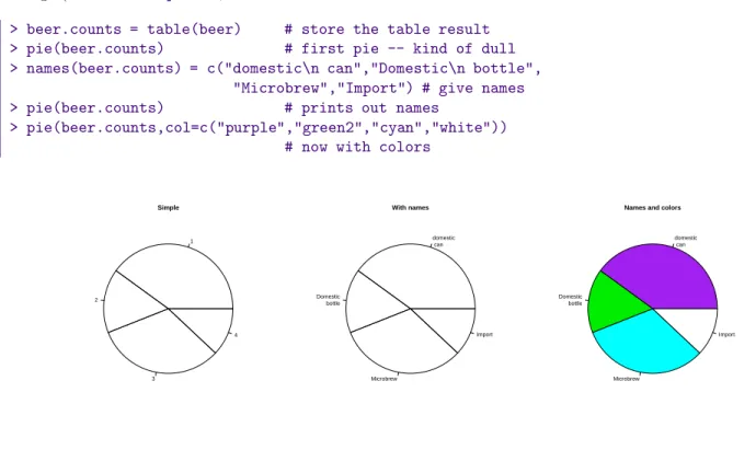
Pie charts
The same data can be studied with pie charts using thepiefunction.23 Here are some simple examples illustrating the usage (similar tobarplot(), but with some added features.
> beer.counts = table(beer) # store the table result
> pie(beer.counts) # first pie -- kind of dull
> names(beer.counts) = c("domestic\n can","Domestic\n bottle",
"Microbrew","Import") # give names
> pie(beer.counts) # prints out names
> pie(beer.counts,col=c("purple","green2","cyan","white"))
# now with colors
1
2
3
4 Simple
domestic can
Domestic bottle
Microbrew
Import With names
domestic can
Domestic bottle
Microbrew
Import Names and colors
Figure 2: Piechart example
The first one was kind of boring so we added names. This is done with thenameswhich allows us to specify names to the categories. The resulting piechart shows how the names are used. Finally, we added color to the piechart. This is done by setting the piechart attributecol. We set this equal to a vector of color names that was the same length as ourbeer.counts. The help command (?pie) gives some examples for automatically getting different colors, notably usingrainbowandgray.
Notice we used additionalarguments to the functionpieThe syntax for these isname=value. The ability to pass in named values to a function, makes it easy to have fewer functions as each one can have more functionality.
Numerical data
2Prior to version 1.5.0 this function was calledpiechart
3The tide is turning on the usage of piecharts and they are no longer used much by statisticians. They are still frequently found in the media. An interesting editorial comment is made in the help page for piechart. Try?pieto see.
There are many options for viewing numerical data. First, we consider the common numerical summaries of center and spread.
Numeric measures of center and spread
To describe a distribution we often want to know where is it centered and what is the spread. These are typically measured with mean and variance (or standard deviation), or the median and more generally the five-number sum- mary. TheRcommands for these aremean,var,sd,median,fivenumandsummary.
Example: CEO salaries
Suppose, CEO yearly compensations are sampled and the following are found (in millions). (This is before being indicted for cooking the books.)
12 .4 5 2 50 8 3 1 4 0.25
> sals = scan() # read in with scan 1: 12 .4 5 2 50 8 3 1 4 0.25
11:
Read 10 items
> mean(sals) # the average
[1] 8.565
> var(sals) # the variance
[1] 225.5145
> sd(sals) # the standard deviation
[1] 15.01714
> median(sals) # the median
[1] 3.5
> fivenum(sals) # min, lower hinge, Median, upper hinge, max [1] 0.25 1.00 3.50 8.00 50.00
> summary(sals)
Min. 1st Qu. Median Mean 3rd Qu. Max.
0.250 1.250 3.500 8.565 7.250 50.000
Notice the summary command. For a numeric variable it prints out the five number summary and the median.
For other variables, it adapts itself in an intelligent manner.
Some Extra Insight: The difference between fivenum and the quantiles.
You may have noticed the slight difference between thefivenumand thesummarycommand. In particular, one gives 1.00 for the lower hinge and the other 1.250 for the first quantile. What is the difference? The story is below.
The median is the point in the data that splits it into half. That is, half the data is above the data and half is below. For example, if our data in sorted order is
10, 17, 18, 25, 28
then the midway number is clearly 18 as 2 values are less and 2 are more. Whereas, if the data had an additional point:
10, 17, 18, 25, 28, 28
Then the midway point is somewhere between 18 and 25 as 3 are larger and 3 are smaller. For concreteness, we average the two values giving 21.5 for the median. Notice, the point where the data is split in half depends on the number of data points. If there are an odd number, then this point is the (n+ 1)/2 largest data point. If there is an even number of data points, then again we use the (n+ 1)/2 data point, but since this is a fractional number, we average the actual data to the left and the right.
The idea of a quantile generalizes this median. Thepquantile, (also known as the 100p%-percentile) is the point in the data where 100p% is less, and 100(1-p)% is larger. If there arendata points, then thepquantile occurs at the position 1 + (n−1)pwith weighted averaging if this is between integers. For example the .25 quantile of the numbers 10,17,18,25,28,28 occurs at the position 1+(6-1)(.25) = 2.25. That is 1/4 of the way between the second and third number which in this example is 17.25.
The .25 and .75 quantiles are denoted thequartiles. The first quartile is calledQ1, and the third quartile is called Q3. (You’d think the second quartile would be calledQ2, but use “the median” instead.) These values are in the R function
RCodesummary. More generally, there is aquantilefunction which will compute any quantile between 0 and 1. To find the quantiles mentioned above we can do
> data=c(10, 17, 18, 25, 28, 28)
> summary(data)
Min. 1st Qu. Median Mean 3rd Qu. Max.
10.00 17.25 21.50 21.00 27.25 28.00
> quantile(data,.25) 25%
17.25
> quantile(data,c(.25,.75)) # two values of p at once 25% 75%
17.25 27.25
There is a historically popular set of alternatives to the quartiles, called the hinges that are somewhat easier to compute by hand. The median is defined as above. The lower hinge is then the median of all the data to the left of the median, not counting this particular data point (if it is one.) The upper hinge is similarly defined. For example, if your data is again 10, 17, 18, 25, 28, 28, then the median is 21.5, and the lower hinge is the median of 10, 17, 18 (which is 17) and the upper hinge is the median of 25,28,28 which is 28. These are available in the function fivenum(), and later appear in the boxplot function.
Here is an illustration with the sals data, which has n = 10. From above we should have the median at (10+1)/2=5.5, the lower hinge at the 3rd value and the upper hinge at the 8th largest value. Whereas, the value of Q1should be at the 1 + (10−1)(1/4) = 3.25 value. We can check that this is the case by sorting the data
> sort(sals)
[1] 0.25 0.40 1.00 2.00 3.00 4.00 5.00 8.00 12.00 50.00
> fivenum(sals) # note 1 is the 3rd value, 8 the 8th.
[1] 0.25 1.00 3.50 8.00 50.00
> summary(sals) # note 3.25 value is 1/4 way between 1 and 2 Min. 1st Qu. Median Mean 3rd Qu. Max.
0.250 1.250 3.500 8.565 7.250 50.000
Resistant measures of center and spread
The most used measures of center and spread are the mean and standard deviation due to their relationship with the normal distribution, but they suffer when the data has long tails, or many outliers. Various measures of center and spread have been developed to handle this. The median is just such a resistant measure. It is oblivious to a few arbitrarily large values. That is, is you make a measurement mistake and get 1,000,000 for the largest value instead of 10 the median will be indifferent.
Other resistant measures are available. A common one for the center is the trimmed mean. This is useful if the data has many outliers (like the CEO compensation, although better if the data is symmetric). We trim off a certain percentage of the data from the top and the bottom and then take the average. To do this in Rwe need to tell the mean()how much to trim.
> mean(sals,trim=1/10) # trim 1/10 off top and bottom [1] 4.425
> mean(sals,trim=2/10) [1] 3.833333
Notice as we trim more and more, the value of the mean gets closer to the median which is whentrim=1/2. Again notice how we used a named argument to themeanfunction.
The variance and standard deviation are also sensitive to outliers. Resistant measures of spread include the IQR and themad.
The IQR or interquartile range is the difference of the 3rd and 1st quartile. The functionIQRcalculates it for us
> IQR(sals) [1] 6
The median average deviation (MAD) is also a useful, resistant measure of spread. It finds the median of the absolute differences from the median and then multiplies by a constant. (Huh?) Here is a formula
median|Xi−median(X)|(1.4826)
That is, find the median, then find all the differences from the median. Take the absolute value and then find the median of this new set of data. Finally, multiply by the constant. It is easier to do withRthan to describe.
> mad(sals) [1] 4.15128
And to see that we could do this ourself, we would do
> median(abs(sals - median(sals))) # without normalizing constant [1] 2.8
> median(abs(sals - median(sals))) * 1.4826 [1] 4.15128
(The choice of 1.4826 makes the value comparable with the standard deviation for the normal distribution.)
Stem-and-leaf Charts
There are a range of graphical summaries of data. If the data set is relatively small, the stem-and-leaf diagram is very useful for seeing the shape of the distribution and the values. It takes a little getting used to. The number on the left of the bar is the stem, the number on the right the digit. You put them together to find the observation.
Suppose you have the box score of a basketball game and find the following points per game for players on both teams
2 3 16 23 14 12 4 13 2 0 0 0 6 28 31 14 4 8 2 5 To create a stem and leaf chart is simple
> scores = scan()
1: 2 3 16 23 14 12 4 13 2 0 0 0 6 28 31 14 4 8 2 5 21:
Read 20 items
> apropos("stem") # What exactly is the name?
[1] "stem" "system" "system.file" "system.time"
> stem(scores)
The decimal point is 1 digit(s) to the right of the | 0 | 000222344568
1 | 23446 2 | 38 3 | 1
R Basics: help, ? and apropos
Notice we use apropos() to help find the name for the function. It is stem() and not stemleaf(). The apropos()command is convenient when you think you know the function’s name but aren’t sure. Thehelpcommand will help us find help on the given function or dataset once we know the name. For example help(stem) or the abbreviated?stemwill display the documentation on thestemfunction.
Suppose we wanted to break up the categories into groups of 5. We can do so by setting the “scale”
> stem(scores,scale=2)
The decimal point is 1 digit(s) to the right of the | 0 | 000222344
0 | 568 1 | 2344 1 | 6 2 | 3 2 | 8 3 | 1
Example: Making numeric data categorical
Categorical variables can come from numeric variables by aggregating values. For example. The salaries could be placed into broad categories of 0-1 million, 1-5 million and over 5 million. To do this usingRone uses thecut() function and thetable()function.
Suppose the salaries are again 12 .4 5 2 50 8 3 1 4 .25
And we want to break that data into the intervals
[0,1],(1,5],(5,50]
To use the cut command, we need to specify the cut points. In this case 0,1,5 and 50 (=max(sals)). Here is the syntax
> sals = c(12, .4, 5, 2, 50, 8, 3, 1, 4, .25) # enter data
> cats = cut(sals,breaks=c(0,1,5,max(sals))) # specify the breaks
> cats # view the values
[1] (5,50] (0,1] (1,5] (1,5] (5,50] (5,50] (1,5] (0,1] (1,5] (0,1]
Levels: (0,1] (1,5] (5,50]
> table(cats) # organize cats
(0,1] (1,5] (5,50]
3 4 3
> levels(cats) = c("poor","rich","rolling in it") # change labels
> table(cats) cats
poor rich rolling in it
3 4 3
Notice, cut()answers the question “which interval is the number in?”. The output is the interval (as afactor).
This is why thetablecommand is used to summarize the result ofcut. Additionally, the names of the levels where changed as an illustration of how to manipulate these.
Histograms
If there is too much data, or your audience doesn’t know how to read the stem-and-leaf, you might try other summaries. The most common is similar to the bar plot and is a histogram. The histogram defines a sequence of breaks and then counts the number of observation in the bins formed by the breaks. (This is identical to the features of the cut()function.) It plots these with a bar similar to the bar chart, but the bars are touching. The height can be the frequencies, or the proportions. In the latter case the areas sum to 1 – a property that will be sound familiar when you study probability distributions. In either case the area is proportional to probability.
Let’s begin with a simple example. Suppose the top 25 ranked movies made the following gross receipts for a week4
29.6 28.2 19.6 13.7 13.0 7.8 3.4 2.0 1.9 1.0 0.7 0.4 0.4 0.3 0.3 0.3 0.3 0.3 0.2 0.2 0.2 0.1 0.1 0.1 0.1 0.1
Let’s visualize it (figure 3). First we scan it in then make some histograms
> x=scan()
1: 29.6 28.2 19.6 13.7 13.0 7.8 3.4 2.0 1.9 1.0 0.7 0.4 0.4 0.3 0.3 16: 0.3 0.3 0.3 0.2 0.2 0.2 0.1 0.1 0.1 0.1 0.1
27:
Read 26 items
> hist(x) # frequencies
> hist(x,probability=TRUE) # proportions (or probabilities)
> rug(jitter(x)) # add tick marks
Histogram of x
0 10 25
05101520
Histogram of x
0 10 25
0.000.050.100.15
Figure 3: Histograms using frequencies and proportions
Two graphs are shown. The first is the default graph which makes a histogram of frequencies (total counts). The second does a histogram of proportions which makes the total area add to 1. This is preferred as it relates better to the concept of a probability density. Note the only difference is the scale on they axis.
A nice addition to the histogram is to plot the points using therugcommand. It was used above in the second graph to give the tick marks just above thex-axis. If your data is discrete and has ties, then therug(jitter(x)) command will give a little jitter to the xvalues to eliminate ties.
Notice these commands opened up a graph window. The graph window inRhas few options available using the mouse, but many using command line options. The GGobi (http://www.ggobi.org/) package has more but requires an extra software installation.
The basic histogram has a predefined set of break points for the bins. If you want, you can specify the number of breaks or your own break points (figure 4).
> hist(x,breaks=10) # 10 breaks, or just hist(x,10)
> hist(x,breaks=c(0,1,2,3,4,5,10,20,max(x))) # specify break points
many breaks
x
Density
0 5 15 25
0.00.10.20.30.40.50.6
few breaks
x
Density
0 5 15 25
0.000.050.100.15
Figure 4: Histograms with breakpoints specified
From the histogram, you can easily make guesses as to the values of the mean, the median, and the IQR. To do so, you need to know that the median divides the histogram into two equal area pieces, the mean would be the point where the histogram would balance if you tried to, and the IQR captures exactly the middle half of the data.
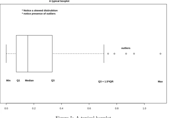
Boxplots
The boxplot (eg. figure 5) is used to summarize data succinctly, quickly displaying if the data is symmetric or has suspected outliers. It is based on the 5-number summary. In its simplest usage, the boxplot has a box with lines at the lower hinge (basicallyQ1), the Median, the upper hinge (basicallyQ3) and whiskers which extend to the min and max. To showcase possible outliers, a convention is adopted to shorten the whiskers to a length of 1.5 times the box length. Any points beyond that are plotted with points. These may further be marked differently if the data is more
4Such data is available from movieweb.com (http://movieweb.com/movie/top25.html)