Through Interactive Visualization
Christian Richthammer and G¨ unther Pernul Department of Information Systems University of Regensburg, Regensburg, Germany {firstname.lastname}@wiwi.uni-regensburg.de
Abstract. Even though today’s recommender algorithms are highly so- phisticated, they can hardly take into account the users’ situational needs. An obvious way to address this is to initially inquire the users’
momentary preferences, but the users’ inability to accurately state them upfront may lead to the loss of several good alternatives. Hence, this pa- per suggests to generate the recommendations without such additional input data from the users and let them interactively explore the rec- ommended items on their own. To support this explorative analysis, a novel visualization tool based on treemaps is developed. The analysis of the prototype demonstrates that the interactive treemap visualization facilitates the users’ comprehension of the big picture of available alter- natives and the reasoning behind the recommendations. This helps the users get clear about their situational needs, inspect the most relevant recommendations in detail, and finally arrive at informed decisions.
Key words: Recommender systems, interactive visualization, search space, explorative analysis
1 Introduction
Nowadays, the ever-increasing amounts of alternatives and information over-
whelm people in their decision making processes. Recommender systems, which
emerged in the mid 1990s [1, 2, 3] and formed a research field of their own since
then, constitute an important approach to address this phenomenon of infor-
mation overload [4, 5]. Their main aim is to inform users about items they will
probably like and have previously not been aware of. This is also referred to as
the recommendation problem [1, 4]. For many years, the dominating topic in
the recommender systems community has been the development of prediction
algorithms along with the evaluation of their recommendation accuracy [5, 6],
experiencing its peak with the Netflix Prize [7]. As the development of new al-
gorithms and the optimization of existing ones often result in only marginal
improvements by now [8, 9], a shift of research interests to the ultimate user
experience can be observed [10]. Researchers have realized that algorithms may
be the backbone of any good recommender system but that the users’ evaluation
of the system and its recommendations is crucial [11, 12].
Traditional recommender algorithms can, even in their sophisticatedly opti- mized form, only produce a set of recommendations that may generally be of interest to the users. Considering that the users may have very special needs (no- tably deviating from their preferences determined according to their past rating behaviors) in a particular situation, the top recommendation does not necessar- ily have to be the best choice in that situation. An obvious way to address this is to initially inquire the users’ situational needs as done in knowledge-based recommender systems [13]. The users’ input can then be used for filtering or weighting processes. However, the users are unlikely to be able to accurately state all of their preferences upfront, especially without having seen any sug- gestions and if there are any suitable alternatives fulfilling their criteria at all [9, 14]. Thus, filtering may lead to the loss of several alternatives that are worth considering but lie just outside the defined filtering criteria.
In contrast to the aforementioned initial inquiry of the users’ situational needs, this paper suggests to generate the set of recommendations without such additional input data from the users and let them interactively explore the rec- ommended items on their own with their situational needs in mind. We aim to support this explorative analysis by relying on interactive visualization, a concept that has been ascribed a lot of uncovered potential in the field of recom- mender systems [8, 15]. In particular, we develop a novel visualization tool based on treemaps. Treemaps arrange the recommendations in a way that provides a structured overview of large parts of the search space (i.e. the set of all available alternatives), which facilitates the users’ comprehension of the big picture of options fitting their needs [16]. On the one hand, educating the users about the search space helps them understand the reasoning behind the recommendations [17]. On the other hand, it serves the users as a basis to get clear about their situational needs, reduce the number of displayed recommendations to the top ones, and inspect these in detail.
The remainder of the paper is structured according to the guidelines for
conducting design science research by Hevner et al. [18]. In particular, it fol-
lows the six activities of the design science research methodology introduced by
Peffers et al. [19]. In this section, the first activity (problem identification and
motivation) is covered by introducing the problem context and expounding the
motivation for the explorative analysis of recommendations. In Section 2, related
work on visualizations for recommender systems are discussed and the objectives
of our solution are pointed out as demanded by the second activity (define the
objectives for a solution ). The third activity (design and development ) is split
into two steps: presenting the conceptual design of the treemap visualization in
Section 3, and describing its prototypical implementation in Section 4. Section
5 is dedicated to the demonstration of our solution and the evaluation of our
research objectives, thus covering the fourth (demonstration) and fifth activity
(evaluation ). The discussion of aspects for future work in Section 6 concludes
the paper. Publishing our findings covers the sixth activity (communication).
2 Related Work and Research Objectives
The research interest in visualizations of recommendations that are more so- phisticated than simple lists has been growing steadily since the end of the last decade. One of the first notable proposals in this area is PeerChooser [20], whose graph-based interface is supposed to provide a visual explanation of the collabo- rative filtering process and to enable the users to interactively manipulate their neighborhood. Also using a graph-based interface, SmallWorlds [21] allows to express item preference profiles with which personalized item recommendations are generated in a transparent manner. This enables the users both to explore their relationships to their peers and to discover new relevant items. Explor- ing relationships to peers is also the motivation behind SFViz [22]. Here, friend recommendations in social networks are visualized using a radial space-filling technique as well as a circle layout with edge bundling. Residing in a simi- lar application area, TasteWeights [23] depicts item predictions based on social web resources (e.g. Wikipedia, Facebook, and Twitter). Its main characteristic is that the users are able to interactively adjust the weights of the different context sources and the corresponding items. Assigning weights to different recommen- dation strategies is an important feature in SetFusion [24], too.
In recent years, a number of researchers have used map-based interfaces to support the users in understanding and exploring recommendations. In partic- ular, Gansner et al. [25] use geographic maps for TV show recommendations, Kagie et al. [26] use two-dimensional maps for product recommendations in e- commerce, and Verbert et al. [27] use clustermaps for talk recommendations at scientific conferences. Specifically concentrating on treemaps, Tintarev and Masthoff [16, 28] state that this kind of visualization has not been used for recommender systems even though it may be a valuable choice. Based on our literature search, we can verify this claim and confirm that it still holds. The only proposal going into this direction is the treemap-like component presented by Katarya et al. [29], which is included in their interface containing several visual explanation styles for movie recommendations. We call it “treemap-like”
because we are missing two distinctive properties of treemaps (cf. Section 3).
First, the visualization does not use the available space to its full extent. And second, it does not display any hierarchical structures. In this work, we em- ploy the treemap visualization in its traditional form because we believe these two properties to be important for depicting the search space as completely as possible. Furthermore, the focus of Katarya et al. [29] differs from ours. They concentrate on different ways to visualize explanations for recommendations, whereas explanations are rather an add-on in our proposal. We believe that a good visualization can improve user satisfaction by itself, which is why we lay our primary focus on the detailed examination of the treemap.
The analysis of related work shows that despite the generally increasing in-
terest in interactive visualizations for recommender systems, the employment
of treemaps has received comparatively little attention so far. Since this kind
of visualization has proven to be effective in connection with non-personalized
news recommendations [30], we want to explore this promising concept in its
traditional form for personalized recommendations as well. The overall goal of our treemap visualization is to support the users’ explorative analysis of rec- ommendations. In particular, we want to achieve this by pursuing the following objectives:
1. Facilitate the users’ comprehension of the recommendations by educating them about the search space.
2. Enable the users to interactively explore the recommendations with their situational needs in mind.
3. Increase the transparency of the recommender system by helping the users understand the accomplishment of the recommendations.
3 Conceptual Design
The treemap (first designed in the early 1990s [31, 32]) is a space-constrained visualization that uses nested rectangles to display large amounts of monohier- archical, tree-structured data with great efficiency and high readability [33].
The sizes of the rectangles are calculated by the underlying tiling algorithm, for which several popular alternatives with different characteristics are available.
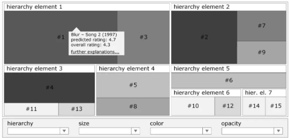
Moreover, it is possible to use different colors and different degrees of opacity for the rectangles, which enables displaying additional attributes. Ways to display even more attributes include different font sizes, font styles, and borders of the rectangles. However, we limit the employment of dimensions to the following four because we do not want to clutter our treemap visualization.
Hierarchy. As its name suggests and as already pointed out, the treemap is used to visualize tree-structured data. In contrast to the size dimension, the overarching hierarchy dimension is not used for quantitative data but for distinct categories (e.g. different states when visualizing voting data of US presidential elections).
Size. The size dimension determines the size of the single rectangles. It should represent a quantifiable attribute so that the sizes of the rectangles at a lower hierarchical level can be summed up to the size of the superordinate rectangle. The largest rectangle is arranged in the top left corner.
Color. The color dimension determines the color of the single rectangles. It is most qualified to depict a measure of performance, change, or development [34]. However, it can also be used to support the visualization of the hierarchy dimension by assigning different colors to the different elements on a certain hierarchy level.
Opacity. The opacity dimension can be used in addition to the color dimension
and in order to reduce the degree of visibility of items that are less relevant
according to a specified criterion. In a news recommender system, for exam-
ple, older stories may be less interesting than more recent stories regardless
of their overall predicted importance.
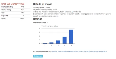
Figure 1 provides a conceptual overview of our visualization component in- cluding the dimensions introduced before. As can be seen in the bottom part of the figure, we want the users to be able to change the assignment of the available attributes to the dimensions in order to give them full control over the visualiza- tion. In addition, the users are provided with comprehensive information on the items in the form of a tooltip. This includes general metadata (e.g. title, artist, and release year in a music recommender) but also recommendation-specific data such as predicted rating, overall rating, and further explanations. When clicking on a treemap element, the corresponding tooltip is expanded (cf. Figure 4).
Fig. 1. Conceptual overview of the treemap visualization component.
Although this proposal’s focus is on the pure visualization, we include expla- nations as an add-on to further increase the user acceptance of recommendations [35]. The positive effect on the user acceptance mainly stems from the increase in transparency that follows from the employment of explanations. When providing explanations, recommender systems are no black boxes anymore. Instead, they feel like the digital analogue to the transparent social process of recommendation- making in the real world [36]. Specifically, we add a histogram (cf. Figure 4) showing the ratings of other users to each item because this easy-to-understand form of explanation performed especially well in Herlocker et al.’s [37] pioneer- ing study on the persuasiveness of explanations. In contrast to this, we also provide detailed information on the calculations and intermediate values of the algorithms such as the similarity values of the nearest neighbors. Because of the complexity of the latter form of explanation, the corresponding information is collapsed by default but can be expanded by interested users (cf. Figure 4).
4 Implementation
In this section, we demonstrate the feasibility of the conceptual design by imple-
menting it in a software prototype. We base the implementation on the popular
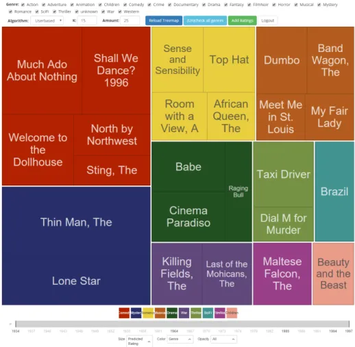
MovieLens 100K dataset (100,000 ratings from 943 users on 1,682 movies) [38]
because its list of entities and attributes perfectly fits our conceptual design:
– rating: user ID, movie ID, rating, timestamp – user: user ID, age, gender, occupation, zip code – movie: movie ID, title, release date, IMDb URL, genre
The release date, the genre, the popularity (number of ratings), and the average rating of the movies can be employed as attributes for the treemap dimensions introduced before. The age, the gender, the occupation, and the zip code of the users can be employed for the explanation of user-based collaborative filtering algorithms. The IMDb URL is needed to provide additional data on the movies. The list of attributes is completed by the predicted rating of the movies, which is determined by the recommender algorithm and used as another attribute for the treemap dimensions.
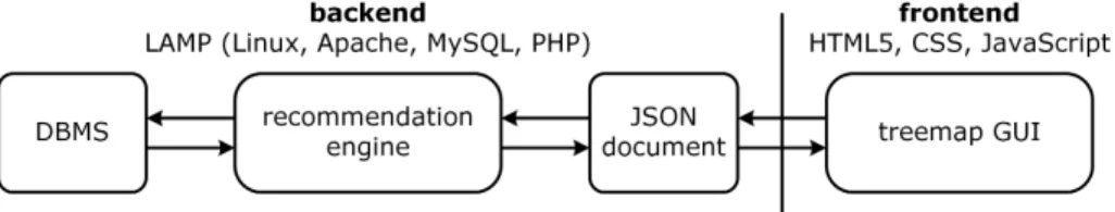
Figure 2 provides an overview of the architecture underlying our prototype.
In the backend, we use the LAMP solution stack, which consists of a Linux op- erating system, an Apache web server, a MySQL database management system, and the PHP programming language. The frontend of the prototype is realized using HTML5, CSS, and the JavaScript framework jQuery. Thus, it is platform- independent and can easily be accessed through a web browser.
Fig. 2. Application architecture of the treemap prototype.
When the users trigger the generation of a new set of recommendations or the alteration of the currently displayed treemap, the parameters of their request are transferred to the recommendation engine in the form of a JSON document.
The parameters mainly include the assignment of the attributes to the treemap dimensions (cf. Section 3) as well as the recommender algorithm along with the corresponding settings. Regarding the recommender algorithms, the prototype relies on the Vogoo PHP library
1, whose user-based collaborative filtering, item- based collaborative filtering and SlopeOne implementations are used in slightly adjusted forms. The recommendation engine collects the data needed to process the request from the database management system (DBMS), generates the set of recommendations, and forwards them to the treemap graphical user inter- gace (GUI) in the form of a JSON document. Finally, this JSON document is employed to create the treemap, which is realized using the JavaScript libraries D3.js and D3plus.
1