OXFAM METHODOLOGY NOTE JANUARY 2018
REWARD WORK, NOT WEALTH
Methodology note
EMBARGOED UNTIL 00:01 HRS GMT 22 JANUARY 2018
1 INTRODUCTION
This methodology document looks at three areas of new research by Oxfam for its paper Reward Work, not Wealth:
1. Our calculations of trends in the income and wealth of the super-rich, and estimates of their tax evasion.
2. Our research into public perceptions of inequality in 10 countries.
3. Our calculations comparing returns to shareholders and CEO compensation with returns to ordinary workers.
2 CALCULATING WEALTH AND INCOME FACTS FOR THE SUPER-RICH
2.1 GLOBAL WEALTH DISTRIBUTION
Data source
Credit Suisse publishes its Global Wealth Databook annually. The 2017 edition was published on the 14
November 2017. It brings together household balance sheets and survey data from around the world to estimate how wealth is distributed within countries and globally. It presents data from 2000–2017, incorporating, for the first time this year, all available historical data sources to provide better estimates for the change in wealth over time.
Every year new data sets are incorporated into the calculations, which result in revision to the historical estimates as published in previous editions of the databook. This year, revised UN estimates for population as well as new data on the value of non-financial assets in China, India, Japan and Russia was incorporated, resulting in some important changes compared with the 2016 report. Specifically, the revised data shows an extra $8 trillion in global wealth, shared across the distribution. All national wealth data is converted to US$ using foreign exchange rates.
See Credit Suisse. (2017). Global Wealth Databook. Available at: https://www.credit- suisse.com/corporate/en/research/research-institute/publications.html
Summary statistics
The report shows that global wealth is highly concentrated towards the top of the distribution, and the share on wealth held by the richest 1% has been growing, from 45% in 2000 to just over 50% in 2017.
Chart 1: Share of global wealth, by decile in 2017
Chart 2: Share of global wealth of the richest 1%
-10%
0%
10%
20%
30%
40%
50%
60%
70%
80%
90%
100%
1 2 3 4 5 6 7 8 9 10
Share of global wealth of decile Top 1% share of global wealth
38%
40%
42%
44%
46%
48%
50%
52%
Top 1%
Calculations
1. Oxfam analysed the change in wealth between Q2 2016 and Q2 2017 (data is also available for Q4 2016, but for the purposes of this calculation we used annual change over the 12-month period). The data is presented in money of the day US$, so we adjusted the 2016 wealth to 2017 dollars using the average annual US Consumer Price Index (CPI) inflation rate from the US Department of Labor Bureau of Statistics.
Table 1: The richest 1% accumulated 82% of the increase in global wealth in 2016–2017 Total wealth
(money of the day), $bn
Total wealth
$2017bn
Share of wealth of the 1%
Wealth of the 1% ($2017)
Q2 2016 263,545 271,025 49.0% 132,884
Q2 2017 280,289 280,289 50.1% 140,509
Increase 9,264 1.1 7,625
1% share of increase in total wealth 2016–2017 82%
2. Oxfam analysed the share of wealth held by the poorest 50% of the global population. Credit Suisse provides estimates of the wealth distribution across the global adult population of 5 billion, assuming that children hold no wealth. For our analysis, we assume that the 2.5 billion children (under the age of 18) are distributed equally across the adult distribution and share the wealth of their parents/guardians. As such, the bottom 50%
represents 2.5 billion adults, or 3.7 billion people (adults and children). We know that this is a conservative estimate, as family sizes are bigger in countries that have lower levels of household wealth. The wealth of the bottom 10% of the global population is net debt; we calculated the wealth of the bottom 50% with and without net debt included.
Table 2: The bottom 50% of the global population (3.7 billion people) has less than 1% of total wealth in 2017
Decile 1 2 3 4 5
Wealth range $ (-)139k1–89 90–465 466–1,083 1,083–
2,151
2,152–
3,581 Share of
global wealth
-0.43% 0.05% 0.13% 0.28% 0.50%
Total share of wealth 0.53%
Total wealth $bn 1,486
Total share of wealth (excluding net debt) 0.96%
Total wealth $bn (excluding net debt) 2,691
2.2 BILLIONAIRES AND EXTREME WEALTH
Data source
Forbes publishes its list of billionaire’s wealth annually. The 2017 edition was published in March 2017. Wealth can fluctuate quite dramatically from day to day due to changes in asset prices, and this is captured in Forbes’
‘Real Time Ranking’ data. However, for this analysis, Oxfam uses the annual list published each March, which enables comparisons to be made year to year. We have access to billionaire lists from 2002 onwards. The data is presented for each year in money of the day and US$.
Forbes. (2017). Billionaire List. Available at https://www.forbes.com/billionaires/list/
Summary statistics
The list presents the name, gender, age and main source of wealth for each of the 2,043 people that had a net worth of more than $1bn as of March 2017.
Table 3: The 2017 billionaires list identifies 2,043 billionaires, with a total net worth of $7.7 trillion. Nine out of 10 are men.
Male Female Both (mixed couple)
Total
Number of billionaires 1816 217 10 2,043
% of total 89% 11% 0%
Wealth of billionaires $bn 6,817 787 64 7,668
% of total 89% 10% 1%
Calculations
1. Oxfam analysed the change in the number of billionaires and in the value of their wealth between 2002 and 2017 (based on data availability). The data is presented in money of the day in US$, so we adjusted all previous years’ wealth to 2017 dollars using the US CPI inflation rate to present the real inflation-adjusted change in the value of wealth.
Chart 3: The number of billionaires increased more last year (233) than in any other year.
2. The increase in the net wealth of the billionaires is partly accounted for by the increase in the number of billionaires included in this cohort. To calculate the accumulation of wealth of the billionaires who have already accumulated $1bn or more, out of the total group of 2,043 billionaires listed for 2017, we identified the 1,690 billionaires who were included on the list in both 2016 and 2017.
6,637 7,668
1810 2043
- 1,000 2,000 3,000 4,000 5,000 6,000 7,000 8,000 9,000
2000 2001 2002 2003 2004 2005 2006 2007 2008 2009 2010 2011 2012 2013 2014 2015 2016 2017 Sum of wealth (2017$bil) Number of billionaires
Table 4: Billionaires who increased their wealth by 12% in real terms ($762bn) between March 2016 and March 2017
1,690 billionaires listed in 2016 and 2017 Nominal Real
Wealth in 2016 $bn 6,217.1 6,365.1
Wealth in 2017 $bn 7,127.6 7,127.6
Increase $bn 910.5 762.5
Increase % 15% 12%
3. For the last five years, Oxfam has been comparing the wealth of the billionaires on the Forbes list with the wealth of the bottom 50%, as presented in the Credit Suisse data. See Table 2 for the total wealth of the bottom 50%. Starting with the wealthiest billionaire, we add up the wealth of the billionaires until we arrive at an equivalent value of wealth in US$ that matches the wealth of the bottom 50%.
In 2017, 42 billionaires on the Forbes list had a cumulative net worth of $1,498bn – more than the wealth of the bottom 50%. 128 billionaires had a net worth of $2,694bn – more than the wealth of the bottom 50% (excluding debt).
Table 5: How many billionaires have the same wealth as the bottom 50% in 2017?
In 2017, number of billionaires with more wealth than bottom 50%
42
In 2017, number of billionaires with more than wealth than the bottom 50%, with debts of bottom 50%
excluded
128
These results should not be compared like for like against the comparisons made in previous years. For example, in 2016 Oxfam calculated that eight billionaires have the same amount of wealth as the bottom 50%. Every year revisions are used to adjust the Credit Suisse wealth data, such that changes in values from previous editions of the report reflect changes in availability of data, rather than changes in wealth year to year. In particular, new data on wealth in Russia, China and India has resulted in some important revisions to the wealth held by the bottom 50% and this has been incorporated into revised estimates for the distribution of wealth in 2017 and in previous years. In order to compare the 2017 comparisons with 2016, we recalculated this comparison using the revised data for previous years. This means that the comparative figure for last year is not eight but 61.
Table 6: Revised data for Q2 2016: 61 billionaires, not eight, had the same amount of wealth as the bottom 50% of the planet
Decile 1 2 3 4 5
Share of global wealth per decile
-0.43% 0.05% 0.15% 0.30% 0.53%
Total share of wealth for the bottom 50%
0.60%
Total wealth of the bottom 50%, $bn 1,581
Number of billionaires 61
Total share of wealth for the bottom 50% (excluding net debt) 1.03%
Total wealth of the bottom 50%, $bn (excluding net debt) 2,715
Number of billionaires (excluding debt) 181
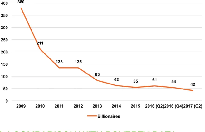
Chart 4: The number of billionaires it takes to equal the wealth of the poorest 50% has been falling since the global financial crisis. Based on revised data up to 2016 as published in the Global Wealth Databook 2017, the number fell from 380 in 2009 to 42 in 2017.
2.4 COMPARISON WITH POVERTY DATA
Data source
The World Bank collects household survey data from all countries in the world where this is available. This includes data on income/consumption at the household level, which can be used to estimate the national
distribution of income, as well as the population that have income/consumption below the extreme poverty line of
$1.90 a day. All data is provided in 2011 PPP.
World Bank. PovcalNet. Accessed November 2017.
http://iresearch.worldbank.org/PovcalNet/povOnDemand.aspx
Summary statistics
In 2013, an estimated 10.8% of the global population was living on less than $1.90 a day.
Table 7: The total poverty gap in $2011 PPP based on global estimates for the population living in poverty and the poverty gap in 2013 was $164bn.
Poverty line (PPP$/day) Headcount (%) Poverty gap (%)
1.9 10.8 3.29
Poverty gap in $ (per person per day) 0.0625
Global population (million) 7,183
Poverty gap in $m per day 449
Poverty gap in $m per year 163,888
380
211
135 135
83
62 55 61 54
42
0 50 100 150 200 250 300 350 400
2009 2010 2011 2012 2013 2014 2015 2016 (Q2) 2016 (Q4) 2017 (Q2) Billionaires
Calculations
The wealth data analysed in sections 2.1 and 2.2 uses foreign exchange rates to calculate what wealth held in currencies other than the US dollar are worth in terms of US$ in order to allow for a global analysis of wealth.
These ‘market’ dollars based on market exchange rates are used by both Credit Suisse and Forbes for their national and global data. More than 50% of global wealth is owned by the richest 1%, where assets (particularly financial assets) can be internationally mobile and traded using prevailing exchange rates.
Oxfam recognizes that equivalent values of wealth can also be understood in terms of purchasing power parity (PPP), which identifies the equivalent value of goods and services that can be purchased with each currency. This is the methodology used by the World Bank to set the $1.90 extreme poverty line, such that the local currency equivalent can buy the same amount of basic goods and services in each country.
Oxfam’s global analysis of wealth and income recognizes the trade of goods and services across borders and through global supply chains. Oxfam also identifies the importance of direct transfers between countries in terms of taxes and aid. As we refer to amounts of global wealth and the increase in global wealth in market dollars, for the purposes of like-for-like comparison we seek to compare this with incomes in market dollars, implying value equivalence through direct transfers across countries using market exchange rates. As a result, we calculated the poverty gap for each country for which data was available from the World Bank as provided in $2011 PPP. We then converted it back to local currency units using the World bank’s PPP conversion data for 2011. We then converted the poverty gap back to US$ using the average foreign exchange rate for 2011, and finally, inflated these values to their $2017 equivalent using the US CPI.
Table 8: The cost of the poverty gap in 2017 market US$
Average annual poverty gap per person living in poverty
$127
Total annual poverty gap for 846 million* people living in poverty around the world
$107 bn
*NOTE: National poverty data was downloaded for the most recent year for which household survey data was available. For 73 out of 167 countries, this was before 2013. As poverty rates have been falling, the total number of people living in poverty is higher in these calculations than in the 2013 global estimates (see Table 7). As a result, the cost of poverty using this national data is likely to be an overestimate and is thus higher than the estimate by Brookings, available here: https://www.brookings.edu/blog/up-front/2016/01/20/the-global-poverty-gap-is- falling-billionaires-could-help-close-it/. Our comparisons with the wealth data are therefore conservative.
The $1.90 poverty line is internationally recognized; however, as discussed in the main report, it is an inadequate measure of poverty in many countries, where national poverty lines are significantly higher. A 2016 paper by the World Bank proposes adjusted poverty lines for higher-income countries, specifically $3.20 for lower-middle- income countries (LMIC) and $5.50 for upper middle-income countries (UMIC).2 The World Development Indicators now provide poverty headcount data based on these two alternative poverty lines. By applying the
$1.90 line to low-income countries, the $3.20 line to LMIC and the $5.50 line to HMIC (higher-middle-income countries) and high-income countries, we arrive at a total global population living in poverty of 2.4 billion.
Table 9: Total population living in poverty using alternative poverty lines Global poverty headcount, 2013
Poor based on old definition (under $1.90) 788,749,743 Poor in LMIC (living between $1.90–$3.20) 899,987,090 Poor in UMIC (living between $1.90–$5.50) 678,271,391
Poor in HIC 14,026,125
TOTAL global population living in poverty 2,381,034,349
We then applied these alternative poverty lines to calculate the cost of the poverty gap by using national poverty data downloaded from PovcalNet and setting the poverty line to $1.90, $3.20 or $5.50, according to the income level of the country. Using the methodology described above, the cost in $2011 PPP for all 2.4 billion people to escape poverty under these alternative lines is $1.2 trillion, or in 2017 market $591bn*.
*NOTE: It was not possible to calculate the market US$ value of the poverty gap in Myanmar and therefore the PPP values were used in this instance.
2.5 CALCULATING THE TAX EVADED BY THE TOP 1% AND THE TOP 0.01%
The following calculations were made by Gabriel Zucman on behalf of Oxfam, extrapolating from his existing work:
• Global tax offshore evasion by rich individuals costs about $170bn a year.3
• It is also estimated that about half the wealth hidden in tax havens belongs to the top 0.01%.4
• Because of tax progressivity, this implies that out of the $170 billion evaded in total in tax havens, $100bn is evaded by the top 0.01%.
• To which must be added other forms of tax evasion, which on the basis of random audit studies5 can be estimated at around $20bn for the top 0.01%, hence the figure of $120bn. This figure only includes illegal tax evasion, not tax avoidance.
• For the top 1%, the approximate figure for taxes evaded is $200bn (the full $170bn of offshore evasion plus about $30bn of other forms of evasion).
3 METHODOLOGY FOR ANALYSING PUBLIC PERCEPTIONS OF INEQUALITY
The data referred to in this report was collected using online surveys that were designed as a randomized controlled experiment. The project was commissioned by Oxfam Great Britain and conducted by Oxfam in cooperation with Christopher Hoy of the Australian National University. Details about the project (including the questionnaire, information treatments and working paper) are publicly available on the American Economic Association’s registry for randomized controlled trials at: https://www.socialscienceregistry.org/trials/2534.
Registration citation:
Hoy, Christopher and Franziska Mager. 2017. Cross country evidence about perceptions of inequality and support for redistribution. AEA RCT Registry. October 24, 2017.
https://www.socialscienceregistry.org/trials/2534/history/22607
The results of the study are described in a working paper by Christopher Hoy and Franziska Mager: C. Hoy. and F. Mager. (2018). How information about inequality shapes preferences for redistribution – evidence from randomized controlled trials in 11 countries. Australian National University.
https://taxpolicy.crawford.anu.edu.au/publication
Oxfam has worked with three different survey providers to collect data across 10 middle- and high-income countries (the working paper also includes data from an MIT-funded study on the same issue in Indonesia). In the UK and Denmark, Oxfam has partnered with YouGov GB to collect nationally representative panel data. In Mexico, Oxfam has partnered with Lexia Insights to collect nationally representative panel data. In Nigeria, South
Africa, India, Morocco, the Netherlands, the United States and Spain, Oxfam has partnered with the global survey technology firm RIWI to capture data representative of the typical internet user.
All questions and information interventions in this experiment have previously been piloted in other studies or are part of established surveys. These sources are a 2014 World Bank Survey in Indonesia, the 2009 ISSP Survey implemented in over 40 countries, a 2014 study and a 2015 study on income inequality and a 2017 experimental study on social mobility from high ranking US universities. Wage ratios were also modelled after existing cross- country survey questions.
4 CALCULATING SHAREHOLDER
DIVIDENDS, CEO COMPENSATION AND WORKER COMPARISONS
The companies chosen for this analysis were based on the five largest publicly listed apparel retailers (excluding department stores) by sales (as of 2017) as listed on the Forbes Global 2000 list.
These are:
• Inditex (Zara)
• H&M
• Fast Retailing
• Gap Inc.
• L Brands
Source: Forbes. The World’s Biggest Public Companies. https://www.forbes.com/global2000/list/
To calculate CEO pay, Oxfam used the figures for total calculated compensation. This is the sum of all compensation components which include: salary; bonus; other annual compensation; restricted stock awards;
stock grants; long-term incentive plans (LTIPs); all other compensation; option awards; change in pension plan/non-qualified deferred comp earnings; director fees; director stock awards; director option awards; director non-equity incentive plan compensation; director change in pension plan/non-qualified deferred comp earnings;
director all other compensation; director stock grants; non-equity incentive plan compensation; director bonus;
non-equity annual incentive plans; and non-equity long-term incentive plans.
The cash returned to shareholders is the sum of common and special dividends and share buybacks.
The data on executive compensation, dividends and share buybacks is based on statutory reporting requirements sourced via S&P Capital IQ, based on the financial year ending 2016.
Oxfam used the High Pay Centre’s methodology for calculating the number of working days of a CEO. It was assumed that ‘CEOs work 12 hours a day, including three out of every four weekends, and take fewer than 10 days’ holiday per year.’
Source: High Pay Centre. (2017). Fat Cat Wednesday 2017. http://highpaycentre.org/blog/fat-cat-wednesday- 2017
To calculate the gap between prevailing and living wages, the data was drawn from the reports produced by the Global Living Wage Coalition, which uses the Anker methodology to calculate living wages and was based on
data gathered in 2016. The exchange rates and data on the number of employees working in the industry were drawn from the same reports. Further information on their methodology can be found here:
ISEAL Alliance. Global Living Wage Coalition. https://www.isealalliance.org/our-work/improving- effectiveness/global-living-wage-coalition.
To estimate the lifetime pay of a worker, Oxfam used the legal minimum working age and retirement age.
Conservative estimates were favoured – for instance, the prevailing wage estimates used the highest-paid tier of workers rather than the lowest.
Drawing on information found on the company’s website or in the media, we could determine that these
companies all have factories in the countries mentioned. The comparisons made with worker wages are designed to show an equivalency and are based on prevailing wages in that country and sector rather than being specific to the individual companies. It is not possible to determine the number of workers and the typical wages in each of the individual companies based on publicly available data.
NOTES
1 Includes debt.
2 D. Jolliffe and E.B. Prydz. (2016). Estimating International Poverty Lines from Comparable National Thresholds. World Bank.
Available at: http://documents.worldbank.org/curated/en/837051468184454513/pdf/WPS7606.pdf 3 G. Zucman. (2015). The Hidden Wealth of Nations. Chicago University Press.
4 Alstadsaeter, A., Niels, J. and Zucman, G. (2017). Tax Evasion and Inequality. http://gabriel-zucman.eu/files/AJZ2017.pdf.
5 Ibid.
© Oxfam International January 2018
This methodological annex was written by Deborah Hardoon, Franziska Mager, Alex Maitland and Gabriel Zucman. Oxfam acknowledges the assistance of Iñigo Macías in its production. It is part of a series of papers written to inform public debate on development and humanitarian policy issues.
For further information on the issues raised in this paper please email advocacy@oxfaminternational.org
This publication is copyright but the text may be used free of charge for the purposes of advocacy, campaigning, education, and research, provided that the source is acknowledged in full. The copyright holder requests that all such use be registered with them for impact assessment purposes. For copying in any other circumstances, or for re-use in other publications, or for translation or adaptation, permission must be secured and a fee may be charged. Email policyandpractice@oxfam.org.uk.
The information in this publication is correct at the time of going to press.
Published by Oxfam GB for Oxfam International under ISBN 978-1-78748-143-5 in January 2018.
Oxfam GB, Oxfam House, John Smith Drive, Cowley, Oxford, OX4 2JY, UK.
OXFAM
Oxfam is an international confederation of 20 organizations networked together in more than 90 countries, as part of a global movement for change, to build a future free from the injustice of poverty. Please write to any of the agencies for further information, or visit www.oxfam.org
Oxfam America (www.oxfamamerica.org) Oxfam Australia (www.oxfam.org.au) Oxfam-in-Belgium (www.oxfamsol.be) Oxfam Brasil (www.oxfam.org.br) Oxfam Canada (www.oxfam.ca) Oxfam France (www.oxfamfrance.org) Oxfam Germany (www.oxfam.de) Oxfam GB (www.oxfam.org.uk)
Oxfam Hong Kong (www.oxfam.org.hk) Oxfam IBIS (Denmark) (http://oxfamibis.dk/)
Oxfam India (www.oxfamindia.org)
Oxfam Intermón (Spain) (www.oxfamintermon.org) Oxfam Ireland (www.oxfamireland.org)
Oxfam Italy (www.oxfamitalia.org) Oxfam Japan (www.oxfam.jp)
Oxfam Mexico (www.oxfammexico.org) Oxfam New Zealand (www.oxfam.org.nz) Oxfam Novib (Netherlands) (www.oxfamnovib.nl) Oxfam Québec (www.oxfam.qc.ca)
Oxfam South Africa (www.oxfam.org.za)