Research Collection
Presentation
Lectures in Thematic Cartography
Graphical Aspects of Thematic Mapping
Author(s):
Spiess, Ernst Publication Date:
1993
Permanent Link:
https://doi.org/10.3929/ethz-a-010592979
Rights / License:
In Copyright - Non-Commercial Use Permitted
This page was generated automatically upon download from the ETH Zurich Research Collection. For more information please consult the Terms of use.
ETH Library
Lectures in Thematic Cartography
Graphical Aspects of Thematic Mapping by Ernst Spiess
Table of contents
1. Graphical aspects of thematic mapping
1.1 Informational potential of graphics and thematic maps in comparison to other media 1.2 Symbol and pattern recognition
1.3 Analogy between object space and symbol space
Three levels of information, quantitative, ordered, qualitative 1.4 Prerequisites for an efficient message transfer by maps
1.5 A variety of possible questions to maps Individual questions
Group questions
General or integral questions 2. Inventary of the graphic means and variables
2.1 Map symbols and graphic variables 2.2 Graphic variables
2.3 Determining the the possible variation of each graphic variable 2.4 Length of a graphic variable
2.5 The variable „dimension or size“
Recommendation for quantitative scales in the legend Range of symbol sizes
Quantity related dot symbols Length of scales with dot symbols Optical illusion
Interpretation potential of dot maps Continual or ratio scales and interval scales Selection of steps or classes in interval scales Symbolisation of continual quantitative series Reference elements of quantitative map symbols Location of point symbols
2.6 The variable „lightness“
Difference in lightness of point, line and area symbols Equidistant gray scales
2.7 The variable „colour“ or more precisely „hue“
Applications of colour in cartography Lightness and colour perception system
Colour strategies for the design of thematic maps; contrast and colour harmony Fundamental principles of colour harmony
Colour design of mosaic maps
Printing colours
Standard four colour printing The Moiré-problem
2.8 The variable „orientation“
2.9 The variable „form“ or „shape“
2.10 The combined variable „texture“
Pattern or inner form
Ruling or spacing or direction Pattern angles
Psychological effect of pattern angles
Strategies for the use of area patterns in thematic cartography Regular or irregular area patterns
2.11 Summary of the properties of the different graphic variables Properties of combinations of graphic variables
2.12 Minimal dimensions and identifiable steps Minimal dimensions
Identifiable steps
3. Splitting the map image on different image levels 3.1 Principle rule
3.2 Graphic means that allow for splitting the map image into three levels 3.3 Transparency of fine and coarse, light and dark patterns
3.4 Symbol design
Design of geometric symbols Design of pictorial symbols Symbol families
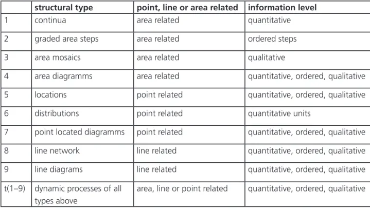
4. Structural models and generalisation in thematic maps 4.1 Structural models for the content of thematic maps
General approach
Table of structural models
4.2 Generalisation of the content and the graphic model of thematic maps 4.3 Generalisation process
5. Structural map types 5.1 Continua
Definition
Interpolation of continua
Analogies between terrain model and continuum Generalising continua
5.2 Choropleth maps 5.3 Area mosaic maps 5.4 Diagram maps
Definition of the diagram map Different diagram types
Criteria for the selection of a diagram type
Generalisation aspects for diagram maps
5.5 Positional maps
5.6 Point distribution maps (restricted sense of distribution) 5.7 Line network maps
5.8 Line diagram maps 5.9 Dynamic maps
5.10 Combined generalisation measures 6. Complex maps
6.1 The need for complex maps
6.2 Superimposition of images in complex maps 7. Base maps for thematic maps
7.1 Scale of the base map 7.2 Title and legend
7.3 Base map as geo-reference
1. Graphical aspects of thematic mapping
1.1 Informational potential of graphics and thematic maps in comparison to other media language s, t variable sound in function of time
light signs x, t variable light in function of time, fixed source
text x variable „spots“ in function of location (one-dimensional)
• graphics, image x, y variable „spots“ in function of location (two-dimensional)
• map x, y variable „spots“ in function of geographic location (2D) television s, x, y, t variable sound, variable „spots“ in function of location and
time
3D-model x, y, z variable „form“ in function of location (three-dimensional) If a graphic image has been constructed according the rules of the visual grammar, the user will concen- trate first on the global aspect. The eye generalises, captures a rough overview and concentrates on the most important phenomenon. Only afterwards he starts with seaching for details, partial images and image elements.
This sequence is reversed with text and language. The information makes sense only after the whole text or phrases have been read or listen to. This procedure requires a clear grammatical construction of the sentences.
In order to understand a graphic image or a map they must be constructed in a similar way according to clear concepts and rules of graphic design, as they will be discussed in this chapter.
Of what consists the information potential of a map ?
1. The main message is perceived in a minimum of time – maximal and minimal values
– distributions following a certain law
– coarse grouping of similar phenomena, etc.,
2. then follows an analysis of the details in an arbitrary sequence
– distributions among sub-classes (periods of time, branches of industry etc.) – search for single values (e.g. number of tourists in x in the year y)
– local or global comparisons of single values
1.2 Symbol and pattern recognition
Fig.1
The human eye and brain have an extraordinary ability for pattern recognition. This is one of the bases of the success of maps.
1.3 Analogy between object space and symbol space
Every spontaneous recognition of the most important phenomena in a conceptually sound graphic image bases on the analogy between the structure of the object space and the graphic structure of the map image.
object structures (structure model) e.g. population contains
different objects or phenomena detailed description of the distribution of the residential population, types of settlements, etc.
grouped in different components or administrative boundaries, indigenous and
object classes foreign population etc.
with observed, measured, counted or consi- state, province and district boundaries;
dered attributes or sub-classes, which may mother language swedish, finnisch etc.;
be differenciated by value or kind
map structures (structure model) e.g. area diagram map
with different map symbols line networks, proportional circles, area fills grouped in:
different map symbol classes linear symbols point symbols area symbols
with the attributes line textur
circle dimension area tint
which can accept different values three forms variable diametre ten tints
larger
smaller lighter
darker rotated distorted negative stretched
disturbed
surrounding disturbed edges
different
fillings
Three levels of information:
highest Q quantitative ratio scales not only ranking, but precise numbers or ratios medium O ordered ordinal scales classification and ranking
lowest ≠ qualitative nominal scales classification without ranking Example: Number of population and percentage of people employed in agriculture
50 200 400 1000
employees percentage occupied in agriculture
40 - 60 % 60 - 80 % über 80 %
Q O
≠
Q O
≠
O ≠
≠ (Q)
O ≠
combination
Q O O
≠ ≠
Object space Map space
no analogy ! best analogy !
Fig. 2
1.4 Prerequisites for efficient message transfer by maps
A prerequisite for messages to be transmitted by or stored in a map are sufficiently regionally distribut- ed phenomena. Maps that show an absolutely homogeneous distribution are useless. Such a message can be better formulated in one sentence.
The efficiency of the transmission of a message depends on:
– undisturbed legibility
– time needed for the transmission of the message – correctness of the transmitted message
– accuracy of the transmission process
– completeness of the transmitted information – ease for interpretation
– amount of information transmitted – aesthetic considerations
The map, therefore, must not be difficult and taking much time to read, erroneous, inaccurate, un- complete, complicated and overloaded, empty, boring, uninteresting and incomprehensible.
Usually there is a multitude of graphic solutions possible for each map. Depending on the map
purpose the above, partly contradictory prerequisites will have to be weightened.
1.5 A variety of possible questions to maps Individual questions
Individual questions concentrate on one location.
Examples:
– Number of inhabitants in a certain town ? – Type of soil at the upper end of the lake ? – Amount of taxes paid on the average in X ? Group questions
Group questions are directed to a small region.
Examples:
– Comparison of the number of people occupied in a small region
– Sequence of the different soil types along the shore of the lake ?
– Distribution of the population on the right side of the river ?
General or integral questions
General or integral questions are directed to the whole map.
Examples:
– Which town has the most inhabitants?
– What soil type is the widest distributed in the whole map ?
– Where are the areas with few population ?
Fig. 4 Fig. 3
Fig. 5
2. Inventary of the graphic means and variables 2.1 Map symbols and graphic variables
A graphic symbol can be varied in various aspects. These are therefore called graphic variables. In order to be visually perceptible map symbols must have a sufficiently distinct contrast against the background material and cover a minimal area. The larger this area is the weaker this contrast may be.
Symbol types and minimal dimensions for normal reading distances of 30 cm:
Fig. 6: Point symbols
minimal dot size for a single point symbol = 0,2 mm • Fig. 7: Line symbols
minimal line width for a black line = 0,05 mm
Fig. 8: Area symbols
2.2. Graphic variables
The term „graphic variable“ denominates a sequence of map symbols, which are different from each other by just one single characteristic. Jacques B ertin [1] enumerated and specified all of them in his book „Sémiologie graphique“. He observes that a spot on a paper map (a point, a line, an area symbol or a character) can be varied in its
• size
• lightness or value
• colour
• spacing or ruling or grain
• orientation or direction
• form or shape
• locations x and y
Determining
– of an area ( by the outline k = k (x , y ,...x , y )) – of a line ( by the polygone l = l (x , y, ...x , y)) – of a point ( by point p =p (x , y ))
in the coordinate plane
Determining the geometry of a symbol with reference point (x,y) and
orientation point ( Xo, Yo )
Determining figure scale M of the symbol
Determining the orientation of the symbol, as well as its rotation
angle ø° with reference to zero-direction around the reference point (x,y)
Determining the hue of the symbol
Determining the lightness or value of the symbol in contrast to the value of the background
Determining the geometry of the pattern unit and array Determining the spacing or of coarseness of the pattern Determining the orientation of the pattern or the screen angle
T e x t u r e Location X , Y
Form
Dimension, figure size
Orientientation
Colour hue
Lightness or value Pattern form Spacing or grain Pattern orientation
skip for area symbols
Fig. 9:
2.3. Determining the possible varia-
tion of each graphic variable the location
We might add to this enumeration two variables which are typical for maps presented on displays – luminosity
– temporal appearance (symbols flashing or changing by time)
Therefore if we design a map legend, we attribute to each thematic component a graphic variable or a combination of two or three of them, carefully observing to establish an analogy between object and symbol space. To do this we have to know the properties of each of these variables and each time to analyse those of the components involved in a thematic map.
2.4 Length of a graphic variable
The length of a graphic variable determines the number of values it can accept under a given condi- tion.
Example: We can distinguish only three tints of gray lines of 0,2 mm line width. Such a line type has therefore the length 3 (tints of gray)! If line width become larger and the comparable areas larger, we may distinguish more steps. The length of a variable depends also on whether the differenciation has to be made just on specific local positions (individual question) or over the map image as a whole.
Fig. 10: Three tints of gray between black and white; length = 5 Fig. 11: Length of area symbol scales with different variables
L = ∞ variable form, variable orientation, equal lightness, equal spacing
variable lightness, equal spacing, equal form (dot screen)
variable lightness, variable spacing (from fine to coarse), equal pattern (hachuring), equal orientation L = 7 ...11
L = 7 ... 11 ...
The two scales below are typical ordinal scales. They may be used e. g. in achromatic maps for density
ranges. By combining lightness and spacing their range may be enlarged without disturbing discrimina-
tion.
2.5 The variable „dimension or size“
The ratio between two symbols that are otherwise identical may be given as a figure, thus allowing for a quantiative information. It is the only variable that can represent quantities, if a quantity unit is deter- mined.
Fig. 12: Ratios...
What does the unlearned map reader compare? edges or areas? diametres of circles? line widths? or the respective areas ? A large number of tests have been made to get an answer to these questions. The results however were very much dependent on the test conditions, on the instructions given to the test persons. Therefore we formulate the following recommendation:
The quantities expressed by two map symbols correspond to the ratio of their areas.
Or the other way round:
Different quantities may be represented by area proportional map symbols.
Recommendation for quantitative scales in the legend
Furthermore we recommend to specifiy this representation law whenever possible in the legend. This allows the map reader to achieve a somehow correct interpretation, does not leave him in uncertainty on how symbols should be compared. There remains the problem of estimation accuracy, that will be touched upon later.
Fig. 13: In this version of a legend the identifica- Fig. 14: In this version of the legend the circles
tion is easier, because the symbols are equal in disturb each other. The mere outlines compare
graphic form to those in the map of fig. 14. not as good as the filled in circles.
Recommendations for quantitative scales in the legend
The symbols of the legend ought to be given in the same graphical form as in the map (fig. 13), inclu- ding contrast to the background. Coloured symbols may preferably be surrounded in the legend by a gray instead of a white background. The legend should allow for as may steps as possible, because this facilitates the comparison. Where appropriate it may be useful to include in the range of legend symbols also the smallest and the largest value.
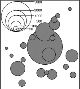
The interpretation of quantities can be performed by counting, measuring or estimating.
Fig. 15: 1 : 14 1 : 14 1 : 14
Range of symbol sizes
We determine as range of a series of symbol sizes the quotient of the smallest versus the largest area, that the symbol covers on the map. This range is equal to ratio of the quantities that can be represented by this range of symbols.
Fig. 16a: Example of a range of the graphic symbolization Edge ratio = 1,2 mm : 30 mm = 1:25; range (area!) R G = 1:625 Range of the phenomena, e.g. population (lower limit adjusted!):
R P = 500 : 320’000 inhabitants; R P = 1:640
Therefore this square symbol would match the numbers of inhabitants between 500 and 320’000 per- fectly. A solution might have be found for the representation of smaller communities.
Quantity related dot symbols
These dot symbols have a fairly large range. It depends on one side on the lower threshold, at which the symbol form still can be discriminated, on the other side on the largest symbol that is acceptable in the map.
• minimal diametre „s” of a solid round dot 0,3 mm
• minimal edge „s” of a solid squared dot 0,5 mm
• minimal edge „s” of a solid triangle 0,5 mm Fig. 16b: Range R for round black circles:
d C = 0,3 mm : 30 mm; R C = 1: 10000 d C = 1 mm : 30 mm; R C = 1: 900
d
Length of scales with dot symbols
In quantitative scales (Q) the diametres of the dots may have any value between the smallest and the largest symbol acceptable. However symbols of similar size can not be further differenciated without measuring.
> L = ∞ Fig. 17:
For ordinal scales it is possible to fix 50 steps, so that the individial symbols can be discriminated and ranked between its neighbours. If however all symbols of equal size must be perceived as a whole over the total map, 5 steps are a maximum.
Fig. 18: > L = 5
Optical illusion
A concentration of several small dots represent optically a larger number than one symbol of the same area:
Fig. 19:
Interpretation potential of dot maps
• Ratio between the quantities represented by two symbols?
• Quantity represented by a certain symbol in the map? Compare with legend!
• Largest / smallest quantity within the whole map? within a certain region?
• Summarized quantity within a delineated area?
• How are symbols with equal quantities distributed?
• Comparing densities in various map regions!
• Delineating areas with homogeneous density!
• Determining different gradients! Strong or smooth ones? Prominent steps or discontinuities?
• Areas that lack the phenomena represented in the map?
There are few tests made so far about the procedure, by which the map reader recognizes, groups, in- tegrates and differenciates size differencies. Therefore it is difficult to give estimates about the amount of deviation to be expected.
Measuring dot diametres in a map with graded circles to derive quantities is done rather sel- dom! Spatial analysis of such a map using computers, however, may be quite attractive and informati- ve.
Fig. 20:
Map with
graded
circles
converted
to a density
map on a
square grid
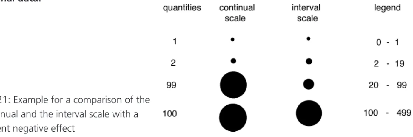
Continual or ratio scales and interval scales
Continual or ratio scales: • integer values, positive and negative, including zero ( 34; -16; 0 )
• decimal values ( 34,6; -0,09; 0 )
Interval scales: • integer values as limits of an interval(10-20 inhabitants per square km)
• decimal values as limits of an interval ( 0,01 - 0,1 litres per second) Normally continual scales are preferable, because they allow for the transmission of the total quantitati- ve information. Stepping down to the information level of an interval scale means to quit quantities and to restrict on ranking, therefore loosing information.
Using interval scales instead of continual or ratio scales may be appropriate, if
• quantities are known only approximately,
• quantities are subjected to considerable variation (e.g.water run-off),
• quantities are all alike, but some differenciation is needed,
• a few classes are to be clearly discriminated,
• quantities as such are of minor importance than their distribution,
• the purpose is a simplified version of the original information
Using interval scales instead of continual scales usually causes quite some distortion on the original data:
Fig. 21: Example for a comparison of the continual and the interval scale with a evident negative effect
For these reasons, one will have to carefully consider each time, whether an interval scale is appropriate, although continual values would be available. As small symbols can no longer be discriminated, it is cur- rent practice to combine a continual scale for large values with an interval scale at the lower end.
Selection of steps or classes in interval scales
The selection of the class limits is important for the information content of the map message. Round figures only can be remembered easily as class limits. The possible number of classes depends on the specific symbol, its minimum and maximum size. If too many classes are used, one may loose the advan- tage of the interval representation. Usually 3 to 7 steps or classes only are used.
Ideally the mean value of an interval should be used to determine the symbol size. Often this principle and an area proportional law for the symbole size is neglected in order to gain more space.
Fig. 22: Example of an interval scale; in parentesis the
respective values when the symbols are area proportional
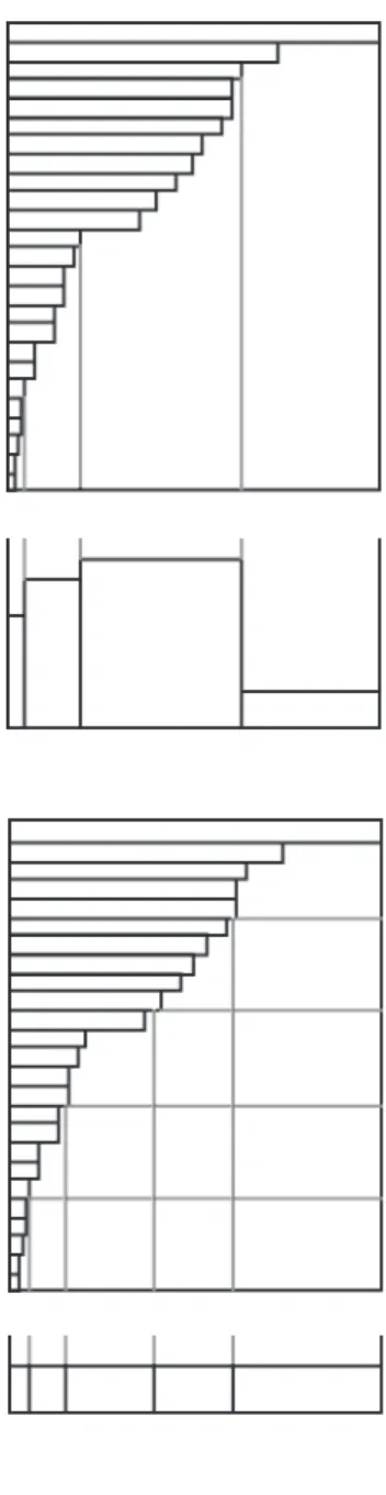
Selection of the class limits Distribution
Quantitative source data often are ordered al- phabetically according to location. It is recom- mended to order them according to quantities.
Such a frequency distribution graph allows for setting class limits specifically and not empiri- cally.
Fig. 23: Source data and their histogram Equidistant class intervals
The total range of the data is divided up into a number of equally sized classes. The middlest interval may correspond to the mean value.
Histogram is divided up in 8 equidistant classes
Histogram is divided up in 4 equidistant classes
Class intervals selected according to a mathematical law
Some natural law often is inherent in a data series, so that class limits may be adapted to such a law.
Fig. 25: Class intervals selected according to a geometric series or an empirical function
Fig. 24
Intervals based on thresholds
Data series often show sharp changes or dis- continuities, which may serve as class limits.
Fig. 26: The prominent jumps in the distribu- tion are selected as class limits
Equal number of values per class Often an equal number of quantities per class is aimed at, as e.g. 5 times 20 % of all communities.
Fig. 27: Five classes, each one representing 20% of all values
Intervals based on the total quantity
At first, based on the distri- bution, the summary graph has to be constructed and the total sum calculated.
The total sum is divided up into equal
parts (quantiles).
e.g. 25 % of the total population (quartiles)
Fig. 28: Quartiles
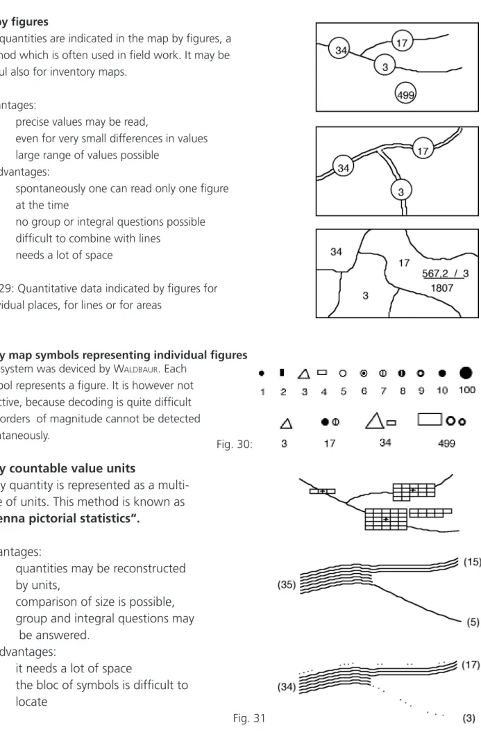
Symbolisation of continual quantitative series a) by figures
The quantities are indicated in the map by figures, a method which is often used in field work. It may be useful also for inventory maps.
advantages:
– precise values may be read,
even for very small differences in values – large range of values possible
disadvantages:
– spontaneously one can read only one figure at the time
– no group or integral questions possible – difficult to combine with lines
– needs a lot of space
Fig. 29: Quantitative data indicated by figures for individual places, for lines or for areas
b) by map symbols representing individual figures This system was deviced by W aldBaur . Each
symbol represents a figure. It is however not effective, because decoding is quite difficult and orders of magnitude cannot be detected spontaneously.
c) by countable value units
Every quantity is represented as a multi- tude of units. This method is known as
„Vienna pictorial statistics“.
advantages:
– quantities may be reconstructed by units,
– comparison of size is possible, – group and integral questions may
be answered.
disadvantages:
– it needs a lot of space
– the bloc of symbols is difficult to locate
Fig. 30:
Fig. 31
d) by hachured areas
All quantities have to be translated by a multitude of hachure lines.
disadvantage:
– very limited number of classes
Fig. 32 e) by more than one unit (coin method)
advantages:
– large values are counted more easily, – less space needed,
– comparisons possible on different levels disadvantages:
– difficult overview,
– arrangement is rather fix,
– optical illusions : the area of 10 units seems to be larger that that of a unit 10! Fig. 33 f) by bars of different length
Image statistics by putting the units together in form of horizontal (Fig. 34a) or vertical bars (Fig. 34b)
Advantages:
– simple linear comparisons
– adjustable size of the base line Fig. 34a
Disadvantage: Fig. 34b
– difficult comparisons for large ranges – problems with location
– rather small range
– bars are difficult to center on the data point; large quantities focus the eye away from their location.
Bars with a logarithmic scale are not to be recommen- ded. The general map user is not acquainted with the loga- rithmic laws.
g) by graded circles
It is recomended to scale the circles so that their area is proportional to the value to be represented and to mention this in the legend. Estimations about the values represented may vary widely.
Fig. 35
If the range of data is smaller than 1:2 an unambiguous compa- rison is no longer possible. A solution is to combine the variables dimension and lightness (–>ordinal scale)
Fig. 37a: Example: values between 100 and 200 h) by scaled bars with different base line sizes
An excellent gradation may be obtained with this system of a group of bars of different widths, that are scaled internally by their length, allowing for quite good estimations of a long data range.
Fig. 38: Example with values between 1 and 7200!
i) by lines of variable widths
This method is very common for quantities that are tied to lines.
Example: transport belt Fig. 39
j) by dot maps with uniform dot size An important decision is dot size versus value of the unit.
Dots must remain countable and describe the distribution as illustrative as possible. A compromise between an overloaded map in congested areas and to much concentration in one spot, when they are widely dispersed, has to be found.
Fig. 40: Same distribution, but different units k) by dot maps with graded dot size Instead of one unit, 3 to 4 well balanced dot sizes are selected.
Which version gives a better idea about dis- tribution?
The dot map emphasises different densities, the graded circles reinforce concentrations.
Fig. 41: Comparison between dot map with 4 graded units and one unit only
l) by absolute figures related to areas
Fig. 43:
A common mistake! Erroneous representation of absolute values!
The absolute figures are translated graphically in lightness or form dif- ferences. The result is misleading the eye, as the intensity of the tint is multiplied by its area.
If absolute values related to areas are rendered by lightness, they must be divided first by their respective area ( > density map)
Fig. 44: An appropriate solution for representing percentages per area.
Reference elements of quantitative map symbols Quantitative map symbols may be referenced to:
Fig. 42:
Number of tractors per100 farmers, source data in absolute figures
• single points (x,y)
• points in a grid, a regular location of the points
• lines
• areas outlined by a polygone
• grid areas, a special form of reference area
Fig. 45: Reference of map symbols
Location of point symbols
Each map symbol has a fixed reference point. For a group of identical symbols the choice of the refe- rence point has to be identical. Usually the reference point corresponds to the centroid of a symbol:
Fig. 46
In a restricted sense names may express also quantities:
The bigger the name the more (e.g. population) they represent.
Kiruna Umeå Uppsala Stockholm
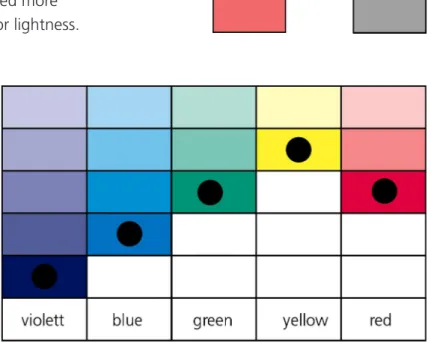
2.6 The variable „lightness“
Otherwise equal map symbols may differ by lightness. Lightness can be measured in absolu- te values by a luxmetre. What is measured is the light remitted from a homogeneous area.
Depending on the pigments on this surface, more or less light is remitted.The eye does not register absolute lightness values but relative lightness between to areas. The reason for this is that we adapt easily to a light or dark environment.
Fig. 47: Every coloured area can be matched more
or less easily with an equivalent gray tint or lightness. red gray
Different lightness may be achieved by:
a) different colour tones and hues Hues in the middle of the visible spect- rum have maximum lightness.
The same colour pigment may be ap- plied in different concentration, what results in different lightness.
Fig. 48: Lightness of different hues
b) Continuous-tones
Continuous-tones can be realized by applying very fine pigments in different concentrations (aquarell, airbrush, brush and ink, stomps etc.)
Fig. 49
c) Screen tints
Screen tints can be realized by regularily spreading the same pigment in form of a pattern on a cont- rasting homogeneous background.
dot screen cross hatching line screen structured screen Fig.50
The screen structure is no longer visible for dot screens < 40 points per cm for line screens < 50 lines per cm
The threshold values depend on the kind of paper and on colour. Yellow screens are most difficult to perceive.
Fig. 51: For a pure lightness variation, screen spacing must be constant.
d) Area patterns
Fig. 52: Area patterns with different lightness
Lightness of such textures (patterns with variable form, variable spacing and variable orientation) are determined by the percentage of area unit printed. A pattern is always clearly visible.
Difference in lightness of point symbols
In order to perceive lightness a certain minimal area is necessary.
Fig. 53
Difference in lightness of line symbols
Fig. 54
A certain minimal line width is necessary depending on the lightest colour.
Fig.55:
Equal lightness, different grain or spacing L = 3...5
The finer the lines are the less gradations may be distinguished.
Difference in lightness of area symbols
Fig.56: Value scale
number of classes for qualitative scales ( ≠): L = 5 ...7 (all areas with same symbolisation are seen as a whole) number of classes for ordered scales (O): L = 7 ...11 Equidistant gray scales
A common problem is to arrange visually equidistant gray tints between a given minimum and maxi- mum lightness, e.g. between the black solids and the white paper background.
Visual perception of tints of diffe- rent lightness is a fairly complica- ted process that has been studied by a number of authors.
Possible parameters may be:
– screen or pattern form – screen or pattern angle – density of the solid colour – spacing
– neighbourhood – quality of paper
– dimensions of the areas that are compared
– illumination of the field of vision
Some authors came to the con- clusion that only the last one is important for the result.
There is a checker board effect
near 50 % ! Fig.57: One of many different equidistant gray scales (above) Equidistant scale after WILLIAMS (below):
0%.4%..17%...33%...52%...75%...91%.100%
Usually screens or patterns are primarily defined by the percentage of the area unit that is printed, e.g.
Fig.58: 30 % line screen 10 % dot screen
2.7 The variable „colour“ or more precisely „hue“
Colour use in maps
achromatic representations • black and white or one single colour multicoloured representations • colour, mostly combined with lightness
In many cases colour is not an absolute must. Their main property is a very efficient qualitative sepa- ration, which may be realised also with a combination of other variables, but by far not so effective.
Superposition is always a problem in achromatic maps.
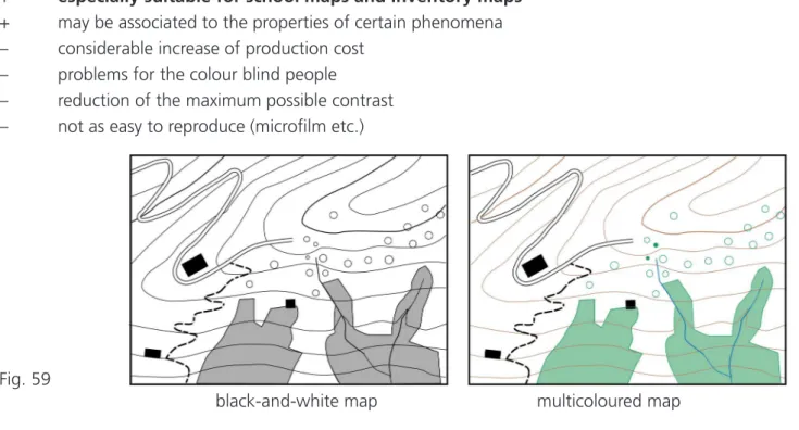
Advantages and disadvantages of colour:
+ excellent variable for qualitative separation
+ a distribution that is coded with a certain colour is easy to follow throughout the whole map + suitable for combinations with other variables
+ attraction for map users
+ especially suitable for school maps and inventory maps + may be associated to the properties of certain phenomena – considerable increase of production cost
– problems for the colour blind people
– reduction of the maximum possible contrast – not as easy to reproduce (microfilm etc.)
Fig. 59
black-and-white map multicoloured map
The variables colour and lightness are often combined C + L = (O)
Fig. 60: Colour scale from light yellow to dark red Applications of colour in cartography a) continual colour scales
Fig. 61:
Colour in combination
with lightness for portraying natural features with changing colours (forest). Actually such a scale does
not make use of the potential of the variable colour which is mainly to differenciate between items.
b) graded colour scales Fig. 62: Light red to brown
Clearly visible differences between adjacent colour tones. The latter may vary within the same hue or gradually change in a neighbouring hue. These scales are usually applied for ordered variables.
c) contrasting colour scales
Fig. 63: Contrasting colours
Contrasting colour scales are used if an optimal separation is needed, especially in mosaik maps. A visi- ble order, if there is any, is always of secondary priority.
d combinations of the above variants
Fig. 64:
Two leading colours (red and blue) toned down in two steps; a neutral gray in between. Such a scale may be used e.g. for values between + 500 ...0... – 500.
General rule: Colour tones usually should be light colours, so that a superimposition of other components is still possible (see also Fig.66).
e) line colours
For all small elements (symbols and lines) dark colours are needed. Light colours for lines have not enough contrast to the background (which is usually light). The same is true for coarse pattern in superimpositions.
Fig. 65
Fig. 66:
Economic map of East Asia in the Schweizerischer Sekundarschulatlas 1970 with light area tones, superposed by point symboles and lines in dark colours (black, brown, blue, green and red).
f) colour selection for superposition of line,
area and point symbols in different colours
Fig. 66:
Standard process colours and additional line colours Fig. 67:
Blue lines (100 % cyan) disappear on dark area
From the four standard process colours, yellow, cyan (blue), magenta (red) and black, only black is an ideal line colour. The relatively dark cyan too often disappears in other colours, e.g. a 100% blue river in a 40% cyan and 55 % yellow forest (see fig.67). This situation often provokes the wish to include additional line colours as printing colours, what increases of course the production cost.
Lightness and colour perception system
The saturated colours of different hues may be arranged in the well-known colour circle. These saturated colours have different lightness. Yellow is lighter than violet. If lightness varies along the vertical axis that corresponds to the neutral gray scale, the colour circle comes into an oblique position. Such an oblique double cone system includes all possible colour tones. It has been proposed by K irschBaum .
cyan magenta yellow black
55 % yellow + 25 % 34 % 44% 55 % 70 % 100 % cyan
1 Equal hue and different values;
monochrome value scales
2 Equal hue and different values and saturation (camaïeux); colour triangle, colour tones with equal amount of white
3 Equal value and saturation and different hue;
colour circle, simple harmonies
4 Equal value and saturation, opposite hues and their intermediate tones (faux-camaïeux); scale that leads from a pure colour through gray and ends at its complementaty pure colour. Difficult to keep under control, but may lead to extremly pleasing compositions, if transitions are alright.
5 Equal hue and value and different saturation;
colour tones with equal amount of black
6 Equal hue and saturation and different values
Fig.67: Perceptional colour space in form of a double
cone (after K irschBaum ), harmonious colour scales
Fundamental principles of colour harmony
It may be questioned whether such principles exist. But some points seem to be certified. Colour har- monies do not exist absolutely between different colour tones; they must be determined relatively to the field of vision.
• Establish colour harmonies means to implement a clearly visible principle.
• Scarcely visible differences should be avoided.
• The more familiar the order principle is, the more harmonic will be the colour composition.
• It shoud be avoided to vary all parameters at the same time; there must be some common element.
• few common elements –> chaos
• too much in common –> monotony
• Therefore one should establish strong contrast with two parameters and retain the others.
Colour circle
Complementary colours: Yellow – violet have a stronger contrast than red – green Yellow – red – blue is stronger than orange – green – violet
Red-green is irritating because of the balance foreground-background Combinations of neighbouring colours are „without character“ (G oethe )
Fig. 69 Colour circle
Balance of „ratio of colour“ within the colour circle (after i tten )
Colours: yellow orange red violet blue green Ratio: 3 4 6 9 8 6 Fig. 70:
Recommended colour ratios
It is questionable if the «ideal ratio between colours in a picture» according to i tten can be applied also to maps.
Simultaneous contrast
Adjacient colour operate a lot of influence on each other. Two complementary colours emphasize their purity. The red square surrounded by green is purer than the same on white background. A gray colour takes up spots of the complementary colour to the surrounding colours. The eye wishes to compensate with complementary sensations!
Fig. 71:
Simultaneous contrast
The neutral gray
Because of the simultaneous effect gray is a dangerous colour, difficult to keep it neutral. In every colou-
red environment gray takes in colour, especially if all colours have approximately the same value.
Colour design of mosaic maps
In mosaic maps it is important to achieve a clear separation of the different features, but to hold to- gether the image as a whole.
• light colours for large areas
• dark colours for small areas
• areas along the border with darker colours
• inner regions in lighter tones
• areas with complicated outlines in dark colour
Fig. 74 Printing colours
Printing colours are spectrally not pure. They do by far not reach the theoretical conditions for a three- colour printing process. The „ideal“ printing colours are shown in the spectral graph below by the sha- ded areas, the optimal CMY printing colours by the heavy lines (Fig. 75).
Fig. 75
Overprint of dot screens in the three colour printing process
A screened multi-coloured print of an image is perceived as an subtractive mixture of light reflected from map paper. The pig- ments of the printed coloured dots remit only part of the white light.
Fig. 76
Fig. 77: Overprint of 40 % magenta on 40 % of yellow Standard four colour printing
A practically infinite number of colour tones can be achie- ved from the three standard process colours
• Yellow
• Cyan (greenish blue)
• Magenta (blueish red)
For each tone the percentage to cover the paper by the- se three colours may be taken from a colour chart. The fourth colour, primarily used for text or line work is
• black
Colour tones that are composed of all three standard colours may be achieved also by a combination of black and two standard colours only.
Fig. 78
The Moiré-problem
Every of half-tones causes an interference image, a pattern that is the coarser the smaller the angle between two screens is. This pattern is acceptable if the angular difference is 30°. As each screen oc- cupies two directions at an angle of 90°, only three of the four colours can be arranged at 30° bet- ween each other. The fourth one must be arranged at 15 ° to two others. The lightest colour, yellow, is chosen as this forth colour.
Fig. 79: Superimposition of dot or/and line screens which are not angled appropriately;
they cause Moiré-effects.
Screen angles for standard four colour printing
The theory developed by s chmidt (1975) goes far more into details and shows that the best result is achieved with a spe- cific combination of screen angles and rulings, given in the following table:
colour ruling angle
black 63 lines per cm +69,5°
magenta 56 lines per cm +15,0°
cyan 59 lines per cm +49,0°
yellow 56 lines per cm 0,0°
This system has the advantage that the severe tolerance for correct angles, which is around 2‘ for avoiding moiré, may be replaced by a much larger tolerance of ±1,5° .
Fig. 80: Angles of the screens usually applied for the four standard printing process
2.8 The variable „orientation“
Point symbols with different orientation
A round symbol cannot be subjected to a variation of the orientation. The length of this variable for point symbols is quite short ( 0 < L < 4).
Fig.81: Point symbols with different orientations Fig.82: If this map is tilted, separation is visible!
This variable does not lend itself for an ordered scale, because there is no obvious order. The effect of separation that may be obtained with this variable is modest. That means, if e.g. symbols of 5 different orientations are spread over a map, it is virtually impossible to perceive the total area covered by one of these symbol types. A possible solution is offered only by the small bar. Try to tilt the sheet with the figure to the right (Fig. 82)!
Fig.83:
viewing direction effect if tilted centred lines tangential direction Orientation can be perceived not only by parallel directions, but also for centred or tangential direc- tions.
Line symbols with different orientation
Can line elements have different orientations? There are few possibilities: strokes in the directions of the line or perpenticular to it.
Fig.84:
Strokes per-
pendicular
to the line
direction
Area symbols with different inner orientation
The orientation of area elements can be expressed by the angle of the area pattern. It is not the whole area that is rotated, but only the inner elements may show different orientation.
Fig.79: The different inner orientations of the area pattern; dot pattern with more than one orientation 2.9 The variable „form“
The number of possible forms is unlimited; this variable form has an unlimited length.In general it is not suited to achieve an effect of separation between each group of identical symbols. Each symbol must be read individually. Single questions only will have to be answered, scarcely any integral question over the whole map sheet. The difference point to line, however, has a certain effect of separation.
Fig.80
no effect of separation some separation between dots and strokes Point symbols of different forms
• geometric forms: Fig.81
They should be used, when a few different symbols have to be placed in great numbers.
• pictorial forms: Fig.82
They should be used, when e a large number of different symbols have to be placed in small numbers.
Line symbols with different forms
Fig. 83: Different line textures Each form has to be explained in the legend !
There are no symbols of universal meaning. Some conventions as exceptions confirm this statement.
Symbol standardisation is practically impossible. The learning capacity of the map users is overestimated.
We dont want to learn something like a „chinese script“ with 5000 symbols with different meaning.
Each thematic map or map series is somehow a single case and needs its own specifications.
The «form» of an area, described by its outline, is not variable, only the texture of the outline and the texture of the inner pattern.
Fig. 84: Areas with different forms of the outline and different inner forms
2.10 The combined variable „texture“
The variable „texture“ may be composed of:
• different pattern or inner form )
• different spacing or ruling or grain ) together they define a texture
• different pattern orientation, inner orientation ) Pattern or inner form
The variable pattern or inner form hat the same properties as forms for point and line symbols. Patterns differing in form have in general little separation effect, again with the exception of the difference point symbols and line. This statement is important for achromatic maps, as in this case the separation effect bases entirely on this contrast.
Fig.85: Area textures with different inner form, pattern orientation and pattern spacings
Fig.87: Pictorial patterns with regular arrays Fig.86: Geometric patterns with regular arrays
Fig.88: Random distributed pattern elements Ruling or spacing
Two areas with different texture may be equal in all respects except spacing. The lightness of two area symbols may be equal, but the number of elements per area unit is different. The most common case in practical work is photographic reduction or enlargement. In this variation only the spacing is different.
Fig.89: coarse grain, double spacing fine grain coarse grain, double spacing fine grain
Fig.90: Equal spacing and direction Fig.91: Above fine grain, below coarse grain
Variation of spacing allows for a ordered scale. The lower limit is reached with the finest grain that is still
visible, the upper limit when one can still get the impression of an area. For an effect of separation up
to five steps of spacings may be applied.
Different spacing or direction results in splitting up the image in several image levels. Coarse grain looks like proximate, finer grains seem to be underneath. A coarse spacing with a low percentage is like a window, whereas a dark one veils the background.
Fig.92: Coarse pattern above fine patterns Fig.93: Different orientation only;
L = 3 to 6 ≠ directions
With rulings of different directions only (Fig. 93) , we obtain only a weak effect of separation, which means that you should see all areas with the same ruling within the whole map at one glimpse.
Pattern angles or directions
This variable exists in all regular geometric patterns, may or may not do so also in pictorial patterns. The angle is usually defined starting from the vertical line. A pattern may occupy one or more directions.
Fig.94: Line patterns
Fig.95: Dot patterns with several directions
Fig.96: Pictorial patterns with arbitrary directional effects
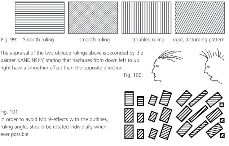
Psychological effect of pattern angles
Fig.98: smooth pattern disturbing column effect smooth pattern area impression weakened
Fig. 99: Smooth ruling smooth ruling troubled ruling rigid, disturbing pattern The appraisal of the two oblique rulings above is seconded by the
painter KANDINSKY, stating that hachures from down left to up right have a smoother effect than the opposite direction.
Fig. 100:
Fig. 101:
In order to avoid Moiré-effects with the outlines, ruling angles should be rotated individially when- ever possible.
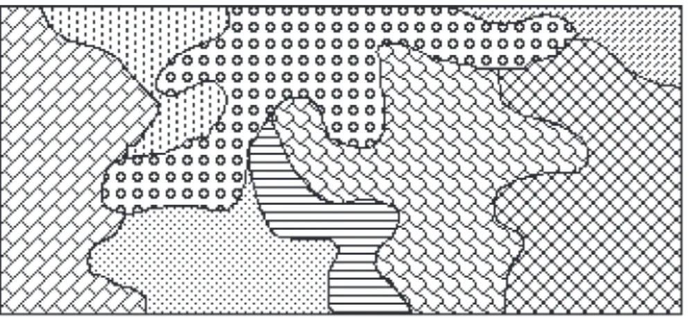
Strategies for the use of area patterns in thematic cartography
A series of area patterns give a harmonic effect, if their composition follows a certain perceiveable con- cept. The same rules can be applied as with colour harmonies. Apparently it is important to keep at least one of the variables constant:
L = L S = S F ≠ F A ≠ A (see fig. 102) L = lightness, value S = spacing
L = L S ≠ S F = F A = A F = pattern form
A = angle of the pattern L ≠ L S ≠ S F ≠ F A = A ? (this combination is slightly chaotic)
L ≠ L S ≠ S F ≠ F A ≠ A ??? (see fig. 103; chaotic, to be avoided) Fig. 102: Without a
dominant pattern Fig. 103:
No common variable
Regular or irregular area patterns
Regular patterns give a strong and rigid impression. What may be appropriate for artificial or construc-
ted objects, does not portray natural objects (forests, bushes, savanna etc.) which are usually random
distributed. Therefore random distributed patterns are prefered for these items. A series of such patterns
have been developed for our interactive cartographic system. The program developed allows for the
variation of the following parameters:
• basic array (orthogonal and diagonal squares, hexagons)
• vertical and horizontal spacing
• amount of vertical and horizontal deviation from the regular array, up to a maximum, when the figures dont yet touch each other
• line widths of the pattern elements
Fig.104: Regular tree pattern on a diagonal array Fig.105: Irregular tree pattern with random loca-
Fig.106: For easier control by the program the symbol is replaced by a case; these cases can be moved around as long as they do not touch each other.
Fig.107: Patterns are affected when masked with area outlines or prominant lines like ri- vers, railroads, etc.
Fig.108: It is recommended to eliminate all pattern
symbols that are fully or partly masked
away. This operation needs a somewhat
more sophisticated program that can
take care of all affected elements.
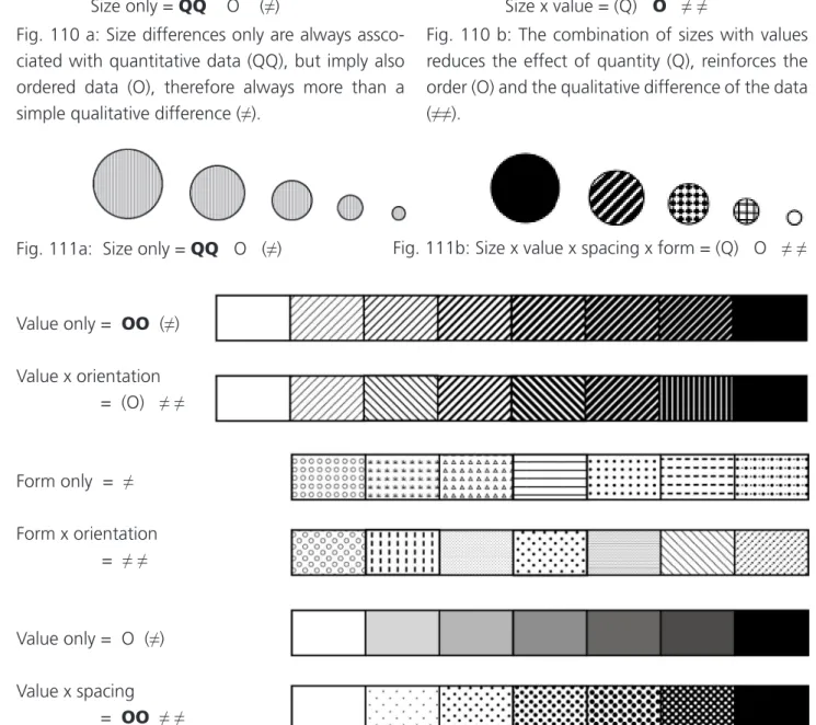
2.11 Summary of the properties of the different graphic variables (Fig. 109)
O
For a spontaneous understanding of map information it is indispensable that each graphic variable applied allows for the same information level as is inherent to the information. Also it is recommended not to use a graphically higher level, because this tends to overestimate the information. In practice this means e.g. not to use ordered tints for objects that cannot be brought into an order.
Properties of combinations of graphic variables
What happens with the above properties, if two or more variables are combined ? Some scales may give an answer:
Fig. 110 a: Size differences only are always assco- ciated with quantitative data (QQ), but imply also ordered data (O), therefore always more than a simple qualitative difference (≠).
Size only = QQ O (≠) Size x value = (Q) O ≠ ≠
Fig. 110 b: The combination of sizes with values reduces the effect of quantity (Q), reinforces the order (O) and the qualitative difference of the data (≠≠).
Fig. 111a: Size only = QQ O (≠) Fig. 111b: Size x value x spacing x form = (Q) O ≠ ≠
Value only = OO (≠) Value x orientation
= (O) ≠ ≠
Form only = ≠ Form x orientation = ≠ ≠
Value only = O (≠) Value x spacing
= OO ≠ ≠
Fig. 112: A series of scales with combinations of different variables; problems with available patterns Results:
• Properties that are inherent to all variables of a combination are reinforced.
• Properties that are not inherent to all variables of a combination are reduced.
If not all the variables are brought into action, when implementing a map, one should make use of this redundance, of course only where the effect is positive, so that the message becomes more evident. It may be useful also in certain cases to activate a variable not only on one information level. An ordinal scale e.g. may be combined with textures in order to achieve a better separation of the classes over the whole map sheet.
2.12 Minimal dimensions and identifiable steps Minimal dimensions
The legibility of a map is affected by symbols that are below their minimal size. There is no reason to use them in the design of a map. We may distinguish two thresholds:
• below this first threshold the symbol form disappears
• below this second threshold the whole symbol disappears
• and leaves back a gray tone Fig. 113: Threshold for symbols
The resolution of map details by the eye is approximately 1 to 2
c. Regular patterns or lines are easier recognized than isolated point symbols, because missing elements are reconstructed in our mind. There are a number of research results with respect to minimal dimensions, but too often their random condi- tions were quite different from other map reading situations.
The minimal dimensions on the following page (fig.2.40 to 2.43 and fig.2.48 to 2.53 of the Basic Carto- graphy for students and technicians, vol. 2) have been derived from a variety of map samples. They are valid under the following conditions:
• black printing colour on white paper • dimensions, that can no longer be reduced
• dimensions must be increased for ease of legibility, when lighter colours are used, when the map image is congested
• normal reading distance, no wall map situation • good reproduction
Identifiable steps
Besides the minimal dimensions it is equally important to select ideal steps for graded symbols, for tints,
for steps in the colour space and for form differences. An identification with the correct symbol in the
legend must always be possible. This implies a clear separation of the neighbouring classes in an ordinal
or nominal scale.
Examples for graded line widths and fonts
5 lines between 0,08 and 0,50 mm, that can be distinguished (It maybe reminded that they have not equal intervals!):
line width in mm 0,08 0,16 0,27 0,40 0,55 mm interval in mm 0,08 0,11 0.13 0,15 mm
interval in % 100% 70% 50% 40%
5 classes of italic type fonts, that can be visually ordered:
capital size in mm 1,0 1,2 1,7 2,3 3,0 mm
interval in mm 0,2 0,5 0,6 0,7 mm
increase in mm 20% 40% 35% 30%
type size