An Eye-Tracking Study on Differences in Information Transfer by Infographics
12
0
0
Volltext
(2)
(3)
(4)
(5)
(8)
(9)
(10)
(11)
(12)
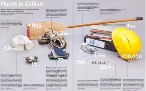
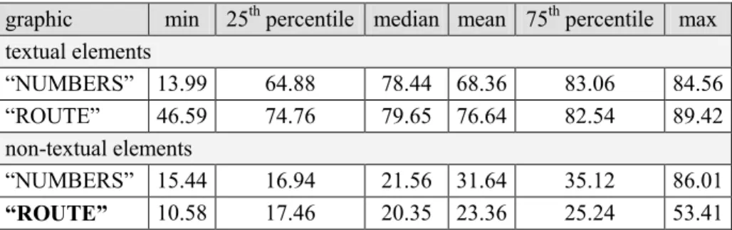
Abbildung
ÄHNLICHE DOKUMENTE
The smaller and, thus, different sample in Study II but also differences in the data processing might explain why in this study cortical activity in the broad alpha band was
The high growth kinetics of nickel-oxide and affinity of nickel towards oxygen and the ability of nickel to diffuse faster to the surface than it is able to diffuse inside the
Stringent IP enforcement measures only target counterfeit medicines, and cannot be relied upon to ensure that the much broader categories of substandard and falsified medicines
Tracking zur Reduktion dieser Unsicherheiten stellt dabei eine vielversprechende Möglichkeit dar und der Nutzen konnte in zahlreichen Experimenten
To connect the study with IIASA's computer network project, special attention has been given to information retrieval in distributed data bases of a network.. The complexity of
University of Minho, Núcleo de Investigação em Políticas
Hence, in more detail, the studies presented here investigated the influence of cognitive load of the central executive, the phonological loop, and the visuospatial
Some of the profound consequences a r e considered in detail in Rosen (1978). This relationship between complex systems and simple ones is, by its very nature, without
