Wim P. Krijnen
November 10, 2009
Preface
The purpose of this book is to give an introduction into statistics in order to solve some problems of bioinformatics. Statistics provides procedures to explore and visualize data as well as to test biological hypotheses. The book intends to be introductory in explaining and programming elementary statis- tical concepts, thereby bridging the gap between high school levels and the specialized statistical literature. After studying this book readers have a suf- ficient background for Bioconductor Case Studies (Hahne et al., 2008) and Bioinformatics and Computational Biology Solutions Using R and Biocon- ductor (Genteman et al., 2005). The theory is kept minimal and is always illustrated by several examples with data from research in bioinformatics.
Prerequisites to follow the stream of reasoning is limited to basic high-school knowledge about functions. It may, however, help to have some knowledge of gene expressions values (Pevsner, 2003) or statistics (Bain & Engelhardt, 1992; Ewens & Grant, 2005; Rosner, 2000; Samuels & Witmer, 2003), and elementary programming. To support self-study a sufficient amount of chal- lenging exercises are given together with an appendix with answers.
The programming language R is becoming increasingly important because it is not only very flexible in reading, manipulating, and writing data, but all its outcomes are directly available as objects for further programming.
R is a rapidly growing language making basic as well as advanced statisti- cal programming easy. From an educational point of view, R provides the possibility to combine the learning of statistical concepts by mathematics, programming, and visualization. The plots and tables produced by R can readily be used in typewriting systems such as Emacs, LATEX, or Word.
Chapter 1 gives a brief introduction into basic functionalities of R. Chap- ter 2 starts with univariate data visualization and the most important de- scriptive statistics. Chapter 3 gives commonly used discrete and continuous distributions to model events and the probability by which these occur. These distributions are applied in Chapter 4 to statistically test hypotheses from bioinformatics. For each test the statistics involved are briefly explained and its application is illustrated by examples. In Chapter 5 linear models are ex- plained and applied to testing for differences between groups. It gives a basic approach. In Chapter 6 the three phases of analysis of microarray data (pre- processing, analysis, post processing) are briefly introduced and illustrated by many examples bringing ideas together with R scrips and interpretation of results. Chapter 7 starts with an intuitive approach into Euclidian distance
and explains how it can be used in two well-known types of cluster analysis to find groups of genes. It also explains how principal components analysis can be used to explore a large data matrix for the direction of largest variation.
Chapter 8 shows how gene expressions can be used to predict the diagnosis of patients. Three such prediction methods are illustrated and compared.
Chapter 9 introduces a query language to download sequences efficiently and gives various examples of computing important quantities such as alignment scores. Chapter 10 introduces the concept of a probability transition matrix which is applied to the estimation of phylogenetic trees and (Hidden) Markov Models.
R commands come after its prompt >, except when commands are part of the ongoing text. Input and output of R will be given in verbatim typewriting style. To save space sometimes not all of the original output from R is printed. The end of an example is indicated by the box . In its Portable Document Format (PDF)1 there are many links to the Index, Table of Contents, Equations, Tables, and Figures. Readers are encouraged to copy and paste scripts from the PDF into the R system in order to study its outcome. Apart from using the book to study application of statistics in bioinformatics, it can also be useful for statistical programming.
I would like to thank my colleges Joop Bouman, Sven Warris and Jan Peter Nap for their useful remarks on parts of an earlier draft. Many thanks also go to my students for asking questions that gave hints to improve clarity.
Remarks to further improve the text are appreciated.
Wim P. Krijnen Hanze University
Institute for Life Science and Technology Zernikeplein 11
9747 AS Groningen The Netherlands
w.p.krijnen@pl.hanze.nl
Groningen October 2009
1°This document falls under the GNU Free Document Licence and may be used freelyc for educational purposes.
Contents
Preface . . . iii
1 Brief Introduction into Using R 1 1.1 Getting R Started on your PC . . . 1
1.2 Getting help . . . 3
1.3 Calculating with R . . . 4
1.4 Generating a sequence and a factor . . . 4
1.5 Computing on a data vector . . . 5
1.6 Constructing a data matrix . . . 6
1.7 Computing on a data matrix . . . 8
1.8 Application to the Golub (1999) data . . . 10
1.9 Running scripts . . . 12
1.10 Overview and concluding remarks . . . 13
1.11 Exercises. . . 14
2 Data Display and Descriptive Statistics 17 2.1 Univariate data display . . . 17
2.1.1 Pie and Frequency table . . . 17
2.1.2 Plotting data . . . 18
2.1.3 Histogram . . . 19
2.1.4 Boxplot . . . 20
2.1.5 Quantile-Quantile plot . . . 22
2.2 Descriptive statistics . . . 24
2.2.1 Measures of central tendency . . . 24
2.2.2 Measures of spread . . . 25
2.3 Overview and concluding remarks . . . 26
2.4 Exercises. . . 26 v
3 Important Distributions 31
3.1 Discrete distributions . . . 31
3.1.1 Binomial distribution . . . 31
3.2 Continuous distributions . . . 34
3.2.1 Normal distribution. . . 35
3.2.2 Chi-squared distribution . . . 37
3.2.3 T-Distribution. . . 39
3.2.4 F-Distribution. . . 40
3.2.5 Plotting a density function . . . 41
3.3 Overview and concluding remarks . . . 42
3.4 Exercises . . . 43
4 Estimation and Inference 47 4.1 Statistical hypothesis testing . . . 47
4.1.1 The Z-test . . . 48
4.1.2 One Sample t-Test . . . 51
4.1.3 Two-sample t-test with unequal variances . . . 54
4.1.4 Two sample t-test with equal variances . . . 56
4.1.5 F-test on equal variances . . . 57
4.1.6 Binomial test . . . 58
4.1.7 Chi-squared test . . . 59
4.1.8 Normality tests . . . 63
4.1.9 Outliers test . . . 64
4.1.10 Wilcoxon rank test . . . 65
4.2 Application of tests to a whole set gene expression data . . . . 66
4.3 Overview and concluding remarks . . . 68
4.4 Exercises . . . 69
5 Linear Models 73 5.1 Definition of linear models . . . 74
5.2 One-way analysis of variance . . . 77
5.3 Two-way analysis of variance . . . 83
5.4 Checking assumptions . . . 85
5.5 Robust tests . . . 86
5.6 Overview and concluding remarks . . . 88
5.7 Exercises . . . 88
6 Micro Array Analysis 91
6.1 Probe data . . . 91
6.2 Preprocessing methods . . . 94
6.3 Gene filtering . . . 97
6.4 Applications of linear models . . . 100
6.5 Searching an annotation package . . . 104
6.6 Using annotation to search literature . . . 106
6.7 Searching GO numbers and evidence . . . 107
6.8 GO parents and children . . . 108
6.9 Gene filtering by a biological term . . . 109
6.10 Significance per chromosome . . . 110
6.11 Overview and concluding remarks . . . 112
6.12 Exercises. . . 112
7 Cluster Analysis and Trees 117 7.1 Distance . . . 118
7.2 Two types of Cluster Analysis . . . 121
7.2.1 Single Linkage . . . 121
7.2.2 k-means . . . 125
7.3 The correlation coefficient . . . 130
7.4 Principal Components Analysis . . . 133
7.5 Overview and concluding remarks . . . 141
7.6 Exercises. . . 142
8 Classification Methods 145 8.1 Classification of microRNA. . . 146
8.2 ROC types of curves . . . 147
8.3 Classification trees . . . 150
8.4 Support Vector Machine . . . 160
8.5 Neural Networks . . . 162
8.6 Generalized Linear Models . . . 164
8.7 Overview and concluding remarks . . . 167
8.8 Exercises. . . 167
9 Analyzing Sequences 173 9.1 Using a query language . . . 173
9.2 Getting information on downloaded sequences . . . 174
9.3 Computations on sequences . . . 176
9.4 Matching patterns . . . 181
9.5 Pairwise alignments . . . 182
9.6 Overview and concluding remarks . . . 189
9.7 Exercises . . . 189
10 Markov Models 193 10.1 Random sampling . . . 193
10.2 Probability transition matrix. . . 194
10.3 Properties of the transition matrix . . . 199
10.4 Stationary distribution . . . 201
10.5 Phylogenetic distance . . . 203
10.6 Hidden Markov Models . . . 209
10.7 Appendix . . . 213
10.8 Overview and concluding remarks . . . 214
10.9 Exercises . . . 214
A Answers to exercises 219
B References 257
List of Figures
2.1 Plot of gene expression values of CCND3 Cyclin D3.. . . 20
2.2 Stripchart of gene expression values of CCND3 Cyclin D3 for ALL and AML patients. . . 20
2.3 Histogram of ALL expression values of gene CCND3 Cyclin D3. 21 2.4 Boxplot of ALL and AML expression values of gene CCND3 Cyclin D3. . . 21
2.5 Q-Q plot of ALL gene expression values of CCND3 Cyclin D3. 23 2.6 Boxplot with arrows and explaining text. . . 29
3.1 Binomial probabilities with n= 22 and p= 0.7 . . . 34
3.2 Binomial cumulative probabilities with n= 22 and p= 0.7. . . 34
3.3 Graph of normal density with mean 1.9 and standard deviation 0.5. . . 36
3.4 Graph of normal distribution with mean 1.9 and standard de- viation 0.5. . . 36
3.5 χ25-density. . . 38
3.6 χ25 distribution. . . 38
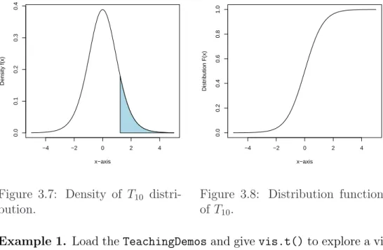
3.7 Density ofT10 distribution. . . 39
3.8 Distribution function ofT10. . . 39
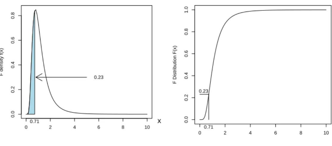
3.9 Density ofF26,10. . . 41
3.10 Distribution ofF26,10. . . 41
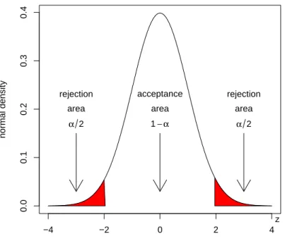
4.1 Acceptance and rejection regions of the Z-test. . . . 50
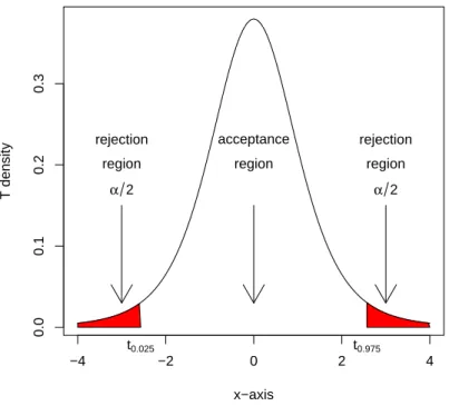
4.2 Acceptance and rejection regions of the T5-test. . . 52
4.3 Rejection region of χ23-test. . . 59
5.1 Plot of SKI-like oncogene expressions for three patient groups. 81 5.2 Plot of Ets2 expression values for three patient groups. . . 81
ix
6.1 Mat plot of intensity values for a probe of MLL.B. . . 93
6.2 Density of MLL.B data. . . 93
6.3 Boxplot of the ALL1/AF4 patients. . . 97
6.4 Boxplot of the ALL1/AF4 patients after median subtraction and MAD division. . . 97
6.5 Venn diagram of seleced ALL genes.. . . 100
6.6 Boxplot of the ALL1/AF4 patients after median subtraction and MAD division. . . 100
7.1 Plot of five points to be clustered. . . 122
7.2 Tree of single linkage cluster analysis. . . 122
7.3 Example of three without clusters. . . 123
7.4 Three clusters with different standard deviations. . . 123
7.5 Plot of gene ”CCND3 Cyclin D3” and ”Zyxin” expressions for ALL and AML patients. . . 124
7.6 Single linkage cluster diagram from gene ”CCND3 Cyclin D3” and ”Zyxin” expressions values. . . 124
7.7 K-means cluster analysis. . . 126
7.8 Tree of single linkage cluster analysis. . . 126
7.9 Plot of kmeans (stars) cluster analysis on CCND3 Cyclin D3 and Zyxin discriminating between ALL (red) and AML (black) patients. . . 130
7.10 Vectors of linear combinations.. . . 135
7.11 First principal component with projections of data. . . 135
7.12 Scatter plot of selected genes with row labels on the first two principal components. . . 138
7.13 Single linkage cluster diagram of selected gene expression values.138 7.14 Biplot of selected genes from the golub data. . . 144
8.1 ROC plot for expression values of CCND3 Cyclin D3. . . 149
8.2 ROC plot for expression values of gene Gdf5. . . 149
8.3 Boxplot of expression values of gene a for each leukemia class. 151 8.4 Classification tree for gene for three classes of leukemia. . . 151
8.5 Boxplot of expression values of gene a for each leukemia class. 154 8.6 Classification tree of expression values from gene A, B, and C for the classification of ALL1, ALL2, and AML patients. . . . 154
8.7 Boxplot of expression values from gene CCND3 Cyclin D3 for ALL and AML patients . . . 156
8.8 Classification tree of expression values from gene CCND3 Cy-
clin D3 for classification of ALL and AML patients. . . 156
8.9 rpart on ALL B-cel 123 data. . . 159
8.10 Variable importance plot on ALL B-cell 123 data. . . 159
8.11 Logit fit to the CCND3 Cyclin D3 expression values. . . 171
9.1 G + C fraction of sequence ”AF517525.CCND3” along a win- dow of length 50 nt. . . 178
9.2 Frequency plot of amino acids from accession number AF517525.CCND3.179 9.3 Frequency plot of amino acids from accession number AL160163.CCND3.179 10.1 Graph of probability transition matrix . . . 196
10.2 Evaluation of models by AIC . . . 216
10.3 Tree according to GTR model.. . . 217
List of Tables
2.1 A frequency table and its pie of Zyxin gene. . . 18 3.1 Discrete density and distribution function values of S3, with
p= 0.6. . . 33 3.2 Built-in-functions for random variables used in this chapter. . 42 3.3 Density, mean, and variance of distributions used in this chapter. 43 7.1 Data set for principal components analysis. . . 134 8.1 Frequencies empirical p-values lower than or equal to 0.01. . . 146 8.2 Ordered expression values of gene CCND3 Cyclin D3, index
2 indicates ALL, 1 indicates AML, cutoff points, number of false positives, false positive rate, number of true positives, true positive rate. . . 170 9.1 BLOSUM50 matrix. . . 186
xiii
Chapter 1
Brief Introduction into Using R
To get started a gentle introduction to the statistical programming language R will be given (R Development Core Team, 2009), specific for our purposes.
This will solve the practical issues to follow the stream of reasoning. In particular, it is briefly explained how to install R and Bioconductor, how to obtain help, and how to perform simple calculations.
Since many computations are essentially performed on data vectors, sev- eral basic illustrations of this are given. With respect to gene expressions the data vectors are placed one beneath the other to form a data matrix with the genes as rows and the patients as columns. The idea of a data matrix is extensively explained and illustrated by several examples. A larger example consists of the classical Golub et al. (1999) data, which will be analyzed frequently to illustrate statistical procedures.
1.1 Getting R Started on your PC
You can downloaded R freely from http://cran.r-project.org. Click on your favorite operating system (Windows,Linux orMacOS) and simply follow the instructions. After a little patience you should be able to start R (Ihaka
& Gentleman, 1996) after which a screen is opened with the prompt >. The input and output of R will be displayed in verbatim typewriting style.
All useful functions of R are contained in libraries which are called ”pack- ages”. The standard installation of R makes basic packages available such as base and stats. From the button Packages at cran.r-project.org it can be seen that R has a huge number of packages available for a wide scale
1
of statistical procedures. To download a specific package you can use the following.
> install.packages(c("TeachingDemos"),repo="http://cran.r-project.org", + dep=TRUE)
This installs the packageTeachingDemos developed by Greg Snow from the repositoryhttp://cran.r-project.org. By setting the optiondeptoTRUE the packages on which theTeachingDemosdepend are also installed. This is strongly recommended! Alternatively, in the Windows application of R you can simply click on thePackagesbutton at the top of your screen and follow the instructions. After installing you have to load the package in order to use its functions. For instance, to produce a nice plot of the outcome of throwing twelve times with a die, you can use the following.
> library(TeachingDemos)
> plot(dice(12,1))
In the sequel we shall often use packages from Bioconductor, a very useful open source software project for the analysis and comprehension of genomic data. To follow the book it is essential to install Bioconductor on your PC or network. Bioconductor is primarily based on R and can be installed, as follows.
> source("http://www.bioconductor.org/biocLite.R")
> biocLite()
Then to download theALLpackage from a repository to your system, to load it, and to make theALLdata (Chiaretti, et. al, 2004) available for usage, you can use the following.
> biocLite("ALL")
> library(ALL)
> data(ALL)
These data will be analyzed extensively later-on in Chapter 5 and 6. General help on loaded Bioconductor packages becomes available byopenVignette().
For further information the reader is referred to www.bioconductor.org or to several other URL’s1 .
1 http://mccammon.ucsd.edu/~bgrant/bio3d/user_guide/user_guide.html http://rafalab.jhsph.edu/software.html
http://dir.gmane.org/gmane.science.biology.informatics.conductor
In this and the following chapters we will illustrate many statistical ideas by the Golub et al. (1999) data, see also Section1.8. Thegolubdata become available by the following.2
> library(multtest)
> data(golub)
R is object-oriented in the sense that everything consists of objects belonging to certain classes. Typeclass(golub)to obtain the class of the objectgolub and str(golub)to obtain its structure or content. Typeobjects()orls() to view the currently loaded objects, a list probably growing soon to be large.
To prevent conflicting definitions, it is wise to remove them all at the end of a session by rm(list=ls()). To quit a session, type q(), or simply click on the cross in the upper right corner of your screen.
1.2 Getting help
All functionalities of R are well-organized in so-called packages. Use the func- tion library() to see which packages are currently installed on your oper- ating system. The packagesstats and baseare automatically installed, be- cause these contain many basic functionalities. To obtain an overview of the content of a package use ls(package:stats) or library(help="stats").
Help on the purpose of specific functions can be obtained from the (package) manual by typing a question mark in front of a function. For instance, ?sum gives details on summation. In case you are seeking help on a function which usesif, simply typeapropos("if"). When you are starting with a new con- cept such as ”boxplot”, it is convenient to have an example showing output (a plot) and programming code. Such is given by example(boxplot). The function history can be useful for collecting previously given commands.
Type help.start() to launch an HTML page linking to several well- written R manuals such as: ”An Introduction to R”, ”The R Language Defi- nition”, ”R Installation and Administration”, and ”R Data Import/Export”.
Further help can be obtained from http://cran.r-project.org. Its ”con- tributed” page contains well-written freely available on-line books3 and use- ful reference charts4. At http://www.r-project.org you can use R site
2Functions to read data into R areread.tableorread.csv, see also the ”The R Data Import/Export manual”.
3”R for Beginners” by Emmanuel Paradis or the ”The R Guide” by Jason Owen
4”R reference card” by Tom Short or by Jonathan Baron
search, Rseek, or other useful search engines. There are a number of useful URL’s with information on R.5
1.3 Calculating with R
R can be used as a simple calculator. For instance, to add 2 and 3 we simply insert the following.
> 2+3 [1] 5
In many calculations the natural basee= 2.718282 of exponential functions is used. Such type of functions can be called as follows.
> exp(1) [1] 2.718282
To compute e2 =e·e we use exp(2).6 So, indeed, we haveex =exp(x), for any value ofx.
The sum 1 + 2 + 3 + 4 + 5 can be computed by
> sum(1:5) [1] 15
and the product 5! = 5·4·3·2·1 by
> prod(1:5) [1] 120
1.4 Generating a sequence and a factor
In order to compute so-called quantiles of distributions (see e.g. Section 2.1.4) or plots of functions, we need to generate sequences of numbers. The easiest way to construct a sequence of numbers is by
> 1:5
[1] 1 2 3 4 5
5We mention in particular:
http://faculty.ucr.edu/~tgirke/Documents/R_BioCond/R_BioCondManual.html
6The argument of functions is always placed between parenthesis().
This sequence can also be produced by the function seq, which allows for various sizes of steps to be chosen. For instance, in order to compute per- centiles of a distribution we may want to generate numbers between zero and one with step size equal to 0.1.
> seq(0,1,0.1)
[1] 0.0 0.1 0.2 0.3 0.4 0.5 0.6 0.7 0.8 0.9 1.0
For plotting and testing of hypotheses we need to generate yet another type of sequence, called a “factor”. It is designed to indicate an experimen- tal condition of a measurement or the group to which a patient belongs.7 When, for instance, for each of three experimental conditions there are mea- surements from five patients, the corresponding factor can be generated as follows.
> factor <- gl(3,5)
> factor
[1] 1 1 1 1 1 2 2 2 2 2 3 3 3 3 3 Levels: 1 2 3
The three conditions are often called “levels” of a factor. Each of these levels has five repeats corresponding to the number of observations (patients) within each level (type of disease). We shall further illustrate the idea of a factor soon because it is very useful for purposes of visualization.
1.5 Computing on a data vector
A data vector is simply a collection of numbers obtained as outcomes from measurements. This can be illustrated by a simple example on expression values of a gene. Suppose that gene expression values 1,1.5, and 1.25 from the persons ”Eric”, ”Peter”, and ”Anna” are available. To store these in a vector we use the concatenate command c(), as follows.
> gene1 <- c(1.00,1.50,1.25)
> gene1
[1] 1.00 1.50 1.25
7 See e.g. Samuals & Witmer (2003, Chap. 8) for a full explanation of experiments and statistical principles of design.
Now we have created the objectgene1 containing three gene expression val- ues. To compute the sum, mean, and standard deviation of the gene expres- sion values we use the corresponding built-in-functions.
> sum(gene1) [1] 3.75
> mean(gene1) [1] 1.25
> sum(gene1)/3 [1] 1.25
> sd(gene1) [1] 0.25
> sqrt(sum((gene1-mean(gene1))^2)/2) [1] 0.25
By defining x1 = 1.00, x2 = 1.50, andx3 = 1.25, the sum of the weights can be expressed asPn
i=1xi = 3.75. The mathematical summation symbol P is in R language simply sum. The mean is denoted by x = P3
i=1xi/3 = 1.25 and the sample standard deviation as
s= vu utX3
i=1
(xi−x)2/(3−1) = 0.25.
1.6 Constructing a data matrix
In various types of spreadsheets it is custom to store data values in the form of a matrix consisting of rows and columns. In bioinformatics gene expression values (from several groups of patients) are stored as rows such that each row contains the expressions values of the patients corresponding to a particular gene and each column contains all gene expression values for a particular person. To illustrate this by a small example suppose that we have the following expression values on three genes from Eric, Peter, and Anna.8
> gene2 <- c(1.35,1.55,1.00)
> gene3 <- c(-1.10,-1.50,-1.25)
> gene4 <- c(-1.20,-1.30,-1.00)
8By the function data.entry you can open and edit a screen with the values of a matrix.
Before constructing the matrix it is convenient to add the names of the rows and the columns. To do so we construct the following list.
> rowcolnames <- list(c("gene1","gene2","gene3","gene4"), + c("Eric","Peter","Anna"))
After the last comma in the first line we give a carriage return for R to come up with a new line starting with +in order to complete a command. Now we can construct a matrix containing the expression values from our four genes, as follows.
> gendat <- matrix(c(gene1,gene2,gene3,gene4), nrow=4, ncol=3, + byrow=TRUE, dimnames = rowcolnames)
Here, nrow indicates the number of rows and ncol the number of columns.
The gene vectors are placed in the matrix as rows. The names of the rows and columns are attached by the dimnamesparameter. To see the content of the just created object gendat, we print it to the screen.
> gendat
Eric Peter Anna gene1 1.00 1.50 1.25 gene2 1.35 1.55 1.30 gene3 -1.10 -1.50 -1.25 gene4 -1.20 -1.30 -1.00
A matrix such as gendat has two indices [i,j], the first of which refers to rows and the second to columns9. Thus, if you want to print the second element of the first row to the screen, then type gendat[1,2]. If you want to print the first row, then use gendat[1,]. For the second column, use gendat[,2].
It may be desirable to write the data to a file for using these in a later stage or to send these to a college of yours. Consider the following script.
> write.table(gendat,file="D:/data/gendat.Rdata")
> gendatread <- read.table("D:/data/gendat.Rdata")
> gendatread
Eric Peter Anna gene1 1.00 1.50 1.25
9Indices referring to rows, columns, or elements are always between square brackets[].
gene2 1.35 1.55 1.30 gene3 -1.10 -1.50 -1.25 gene4 -1.20 -1.30 -1.00
An alternative is to use write.csv.10
1.7 Computing on a data matrix
Means or standard deviations of rows or columns are often important for drawing biologically relevant conclusions. Such type of computations on a data matrix can be accomplished by “for loops”. However, it is much more convenient to use the apply functionality on a matrix. To do so we specify the name of the matrix, indicate rows or columns (1 for rows and 2 for columns), and the name of the function. To illustrate this we compute the mean of each person (column).
> apply(gendat,2,mean) Eric Peter Anna 0.0125 0.0625 0.0750
Similarly, the mean of each gene (row) can be computed.
> apply(gendat,1,mean)
gene1 gene2 gene3 gene4
1.250000 1.400000 -1.283333 -1.166667
It frequently happens that we want to re-order the rows of a matrix according to a certain criterion, or, more specifically, the values in a certain column vector. For instance, to re-order the matrix gendat according to the row means, it is convenient to store these in a vector and to use the function order.
> meanexprsval <- apply(gendat,1,mean)
> o <- order(meanexprsval,decreasing=TRUE)
> o
[1] 2 1 4 3
10For more see the ”R Data import/Export” manual, Chapter 3 of the book ”R for Beginners”, or search the internet by the key ”r wiki matrix”.
Thus gene2 appears first because it has the largest mean 1.4, then gene1 with 1.25, followed by gene4 with -1.16 and, finally, gene3 with -1.28. Now that we have collected the order numbers in the vector o, we can re-order the whole matrix by specifying o as the row index.11
> gendat[o,]
Eric Peter Anna gene2 1.35 1.55 1.30 gene1 1.00 1.50 1.25 gene4 -1.20 -1.30 -1.00 gene3 -1.10 -1.50 -1.25
Another frequently occurring problem is that of selecting genes with a certain property. We illustrate this by several methods to select genes with positive mean expression values. A first method starts with the observation that the first two rows have positive means and to use c(1,2) as a row index.
> gendat[c(1,2),]
Eric Peter Anna gene1 1.00 1.50 1.25 gene2 1.35 1.55 1.30
A second way is to use the row names as an index.
> gendat[c("gene1","gene2"),]
Eric Peter Anna gene1 1.00 1.50 1.25 gene2 1.35 1.55 1.30
A third and more advanced way is to use an evaluation in terms of TRUE or FALSE of logical elements of a vector. For instance, we may evaluate whether the row mean is positive.
> meanexprsval > 0 gene1 gene2 gene3 gene4
TRUE TRUE FALSE FALSE
Now we can use the evaluation of meanexprsval > 0in terms of the values TRUE or FALSE as a row index.
11You can also use functions likesortor rank.
> gendat[meanexprsval > 0,]
Eric Peter Anna gene1 1.00 1.50 1.25 gene2 1.35 1.55 1.30
Observe that this selects genes for which the evaluation equals TRUE. This illustrates that genes can be selected by their row index, row name or value on a logical variable.
1.8 Application to the Golub (1999) data
The gene expression data collected by Golub et al. (1999) are among the clas- sical in bioinformatics. A selection of the set is calledgoluband is contained in the multtest package, which is part of Bioconductor. The data consist of gene expression values of 3051 genes (rows) from 38 leukemia patients12. Twenty seven patients are diagnosed as acute lymphoblastic leukemia (ALL) and eleven as acute myeloid leukemia (AML). The tumor class is given by the numeric vector golub.cl, where ALL is indicated by 0 and AML by 1. The gene names are collected in the matrix golub.gnames of which the columns correspond to the gene index, ID, and Name, respectively. We shall first concentrate on expression values of a gene with manufacturer name
"M92287_at", which is known in biology as "CCND3 Cyclin D3". The ex- pression values of this gene are collected in row 1042 of golub. To load the data and to obtain relevant information from row 1042 ofgolub.gnames, use the following.
> library(multtest); data(golub)
> golub.gnames[1042,]
[1] "2354" "CCND3 Cyclin D3" "M92287_at"
The data are stored in a matrix called golub. The number of rows and columns can be obtained by the functions nrowand ncol, respectively.
> nrow(golub) [1] 3051
> ncol(golub) [1] 38
12The data are pre-processed by procedures described in Dudoit et al. (2002).
So the matrix has 3051 rows and 38 columns, see also dim(golub). Each data element has a row and a column index. Recall that the first index refers to rows and the second to columns. Hence, the second value from row 1042 can be printed to the screen as follows.
> golub[1042,2]
[1] 1.52405
So 1.52405 is the expression value of gene CCND3 Cyclin D3 from patient number 2. The values of the first column can be printed to the screen by the following.
> golub[,1]
To save space the output is not shown. We may now print the expression values of gene CCND3 Cyclin D3 (row 1042) to the screen.
> golub[1042,]
[1] 2.10892 1.52405 1.96403 2.33597 1.85111 1.99391 2.06597 1.81649 [9] 2.17622 1.80861 2.44562 1.90496 2.76610 1.32551 2.59385 1.92776 [17] 1.10546 1.27645 1.83051 1.78352 0.45827 2.18119 2.31428 1.99927 [25] 1.36844 2.37351 1.83485 0.88941 1.45014 0.42904 0.82667 0.63637 [33] 1.02250 0.12758 -0.74333 0.73784 0.49470 1.12058
To print the expression values of gene CCND3 Cyclin D3 to the screen only for the ALL patients, we have to refer to the first twenty seven elements of row 1042. A possibility to do so is by the following.
> golub[1042,1:27]
However, for the work ahead it is much more convenient to construct a factor indicating the tumor class of the patients. This will turn out useful e.g.
for separating the tumor groups in various visualization procedures. The factor will be called gol.fac and is constructed from the vector golub.cl, as follows.
> gol.fac <- factor(golub.cl, levels=0:1, labels = c("ALL","AML")) In the sequel this factor will be used frequently. Obviously, the labels corre- spond to the two tumor classes. The evaluation of gol.fac=="ALL" returns TRUE for the first twenty seven values and FALSE for the remaining eleven.
This is useful as a column index for selecting the expression values of the ALL patients. The expression values of gene CCND3 Cyclin D3 from the ALL patients can now be printed to the screen, as follows.
> golub[1042,gol.fac=="ALL"]
For many types of computations it is very useful to combine a factor with the apply functionality. For instance, to compute the mean gene expression over the ALL patients for each of the genes, we may use the following.
> meanALL <- apply(golub[,gol.fac=="ALL"], 1, mean)
The specificationgolub[,gol.fac=="ALL"]selects the matrix with gene ex- pressions corresponding to the ALL patients. The 3051 means are assigned to the vectormeanALL.
After reading the classical article by Golub et al. (1999), which is strongly recommended, one becomes easily interested in the properties of certain genes. For instance, gene CD33 plays an important role in distinguishing lymphoid from myeloid lineage cells. To perform computations on the ex- pressions of this gene we need to know its row index. This can obtained by the grep function.13
> grep("CD33",golub.gnames[,2]) [1] 808
Hence, the expression values of antigen CD33 are available at golub[808,]
and further information on it bygolub.gnames[808,].
1.9 Running scripts
It is very convenient to use a plain text writer like Notepad, Kate, Emacs, or WinEdt for the formulation of several consecutive R commands as separated lines (scripts). Such command lines can be executed by simply using copy and paste into the command line editor of R. Another possibility is to execute a script from a file. To illustrate the latter consider the following.
> library(multtest); data(golub)
> gol.fac <- factor(golub.cl,levels=0:1, labels= c("ALL","AML"))
> mall <- apply(golub[,gol.fac=="ALL"], 1, mean)
> maml <- apply(golub[,gol.fac=="AML"], 1, mean)
> o <- order(abs(mall-maml), decreasing=TRUE)
> print(golub.gnames[o[1:5],2])
13Indeed, several functions of R are inspired by the Linux operating system.
[1] "CST3 Cystatin C (amyloid angiopathy and cerebral hemorrhage)"
[2] "INTERLEUKIN-8 PRECURSOR"
[3] "Interleukin 8 (IL8) gene"
[4] "DF D component of complement (adipsin)"
[5] "MPO Myeloperoxidase"
The row means of the expression values per patient group are computed and stored in the object malland maml, respectively. The absolute values of the differences in means are computed and their order numbers (from large to small) are stored in the vector o. Next, the names of the five genes with the largest differences in mean are printed to the screen.
After saving the script under e.g. the name meandif.R in the directory
D:\\Rscripts\\meandif.R, it can be executed by usingsource("D:\\Rscripts\\meandif.R").
Once the script is available for a typewriter it is easy to adapt it and to re-run it.
Readers are strongly recommended to trial-and-error with respect to writ- ing programming scripts. To run these it is very convenient to have your favorite word processor available and to use, for instance, the copy-and-paste functionality.
1.10 Overview and concluding remarks
It is easy to install R and Bioconductor. R has many convenient built-in- functions for statistical programming. Help and illustrations on many topics are available from various sources. With the reference charts, R manuals, (on-line) books and R Wiki at hand you have various sources of information to help you along with practical issues. Although there recently became several GUI’s available, we shall concentrate on the command line editor because its range of possibilities is much larger.
The above introduction is of course very brief. A more extensive in- troduction into R, assuming some background on biomedical statistics, is given by Dalgaard (2002). There are book length treatments combining R with statistics (Venables, & Ripley, 2002; Everitt & Hothorn, 2006). Other treatments go much deeper into programming aspects (Becker, Chambers, &
Wilks, 1988; Venables & Ripley, 2000; Gentleman, 2008).
For the sake of illustration we shall work frequently with the data kindly provided by Golub et al. (1999) and Chiaretti et al. (2004). The corre-
sponding scientific articles are freely available from the web. Having these available may further motivate readers for the computations ahead.
1.11 Exercises
1. Some questions to orientate yourself.
(a) Use the function class to find the class to which the follow- ing objects belong: golub,golub[1,1],golub.cl,golub.gnames, apply, exp,gol.fac, plot,ALL.
(b) What is the meaning of the following abbreviations: rm,sum,prod, seq, sd, nrow.
(c) For what purpose are the following functions useful: grep,apply, gl,library, source, setwd, history, str.
2. gendat Consider the data in the matrix gendat, constructed in Sec- tion 1.6. Its small size has the advantage that you can check your computations even by a pocket calculator. 14
(a) Use apply to compute the standard deviation of the persons.
(b) Use apply to compute the standard deviation of the genes.
(c) Order the matrix according to the gene standard deviations.
(d) Which gene has the largest standard deviation?
3. Computations on gene means of the Golub data.
(a) Use apply to compute the mean gene expression value.
(b) Order the data matrix according to the gene means.
(c) Give the names of the three genes with the largest mean expression value.
(d) Give the biological names of these genes.
4. Computations on gene standard deviations of the Golub data.
(a) Use apply to compute the standard deviation per gene.
14Obtaining some routine with the apply functionality is quite helpful for what follows.
(b) Select the expression values of the genes with standard deviation larger than two.
(c) How many genes have this property?
5. Oncogenes in Golub data.
(a) How many oncogenes are there in the dataset? Hint: Use grep.
(b) Find the biological names of the three oncogenes with the largest mean expression value for the ALL patients.
(c) Do the same for the AML patients.
(d) Write the gene probe ID and the gene names of the ten genes with largest mean gene expression value to acsv file.
6. Constructing a factor. Construct factors that correspond to the follow- ing setting.
(a) An experiment with two conditions each with four measurements.
(b) Five conditions each with three measurements.
(c) Three conditions each with five measurements.
7. Gene means for B1 patients. Load the ALL data from the ALL library and use strand openVignette() for a further orientation.
(a) Use exprs(ALL[,ALL$BT=="B1"] to extract the gene expressions from the patients in disease stage B1. Compute the mean gene expressions over these patients.
(b) Give the gene identifiers of the three genes with the largest mean.
Chapter 2
Data Display and Descriptive Statistics
A few essential methods are given to display and visualize data. It quickly answers questions like: How are my data distributed? How can the frequen- cies of nucleotides from a gene be visualized? Are there outliers in my data?
Does the distribution of my data resemble that of a bell-shaped curve? Are there differences between gene expression values taken from two groups of patients?
The most important central tendencies (mean, median) are defined and illustrated together with the most important measures of spread (standard deviation, variance, inter quartile range, and median absolute deviation).
2.1 Univariate data display
To observe the distribution of data various visualization methods are made available. These are frequently used by practitioners as well as by experts.
2.1.1 Frequency table
Discrete data occur when the values naturally fall into categories. A fre- quency table simply gives the number of occurrences within a category.
Example 1. A gene consists of a sequence of nucleotides {A, C, G, T}.
The number of each nucleotide can be displayed in a frequency table. This 17
will be illustrated by the Zyxin gene which plays an important role in cell adhesion (Golub et al., 1999). The accession number (X94991.1) of one of its variants can be found in a data base like NCBI (UniGene). The code below illustrates how to read the sequence ”X94991.1” of the species homo sapiens from GenBank, , to construct a pie from a frequency table of the four nucleotides.
install.packages(c("ape"),repo="http://cran.r-project.org",dep=TRUE) library(ape)
table(read.GenBank(c("X94991.1"),as.character=TRUE)) pie(table(read.GenBank(c("X94991.1"))))
From the resulting frequencies in Table 2.1 it seems that the nucleotides are not equally likely. A nice way to visualize a frequency table is by plotting a pie.
Table 2.1: A frequency table and its pie of Zyxin gene.
A C G T
410 789 573 394
a
c
g
t
2.1.2 Plotting data
An elementary method to visualize data is by using a so-called stripchart, by which the values of the data are represented as e.g. small boxes. Often,
it is useful in combination with a factor that distinguishes members from different experimental conditions or patients groups.
Example 1. Many visualization methods will be illustrated by the Golub et al. (1999) data. We shall concentrate on the expression values of gene
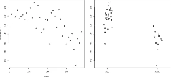
"CCND3 Cyclin D3", which are collected in row 1042 of the data matrix golub. To plot the data values one can simply useplot(golub[1042,]). In the resulting plot in Figure2.1the vertical axis gives the size of the expression values and the horizontal axis the index of the patients. It can be observed that the values for patient 28 to 38 are somewhat lower, but, indeed, the picture is not very clear because the groups are not plotted separately.
To produce two adjacent stripcharts one for the ALL and one for the AML patients, we use the factor called gol.facfrom the previous chapter.
data(golub, package = "multtest")
gol.fac <- factor(golub.cl,levels=0:1, labels= c("ALL","AML")) stripchart(golub[1042,] ~ gol.fac, method="jitter")
From the resulting Figure 2.2 it can be observed that the CCND3 Cyclin D3 expression values of the ALL patients tend to have larger expression values than those of the AML patients.
2.1.3 Histogram
Another method to visualize data is by dividing the range of data values into a number of intervals and to plot the frequency per interval as a bar. Such a plot is called a histogram.
Example 1. A histogram of the expression values of gene"CCND3 Cyclin D3"of the acute lymphoblastic leukemia patients can be produced as follows.
> hist(golub[1042, gol.fac=="ALL"])
The function hist divides the data into 5 intervals having width equal to 0.5, see Figure 2.3. Observe from the latter that one value is small and the other are more or less symmetrically distributed around the mean.
0 10 20 30
−0.50.00.51.01.52.02.5
Index
golub[1042, ]
Figure 2.1: Plot of gene ex- pression values of CCND3 Cyclin D3.
ALL AML
−0.50.00.51.01.52.02.5
Figure 2.2: Stripchart of gene expression values of CCND3 Cyclin D3 for ALL and AML patients.
2.1.4 Boxplot
It is always possible to sortn data values to have increasing orderx1 ≤x2 ≤
· · · ≤ xn, where x1 is the smallest, x2 is the first-to-the smallest, etc. Let x0.25 be a number for which it holds that 25% of the data values x1,· · · , xn is smaller. That is, 25% of the data values lay on the left side of the number x0.25, reason for which it is called the first quartile or the 25th percentile.
The second quartile is the value x0.50 such that 50% of the data values are smaller. Similarly, the third quartile or 75th percentile is the valuex0.75 such that 75% of the data is smaller. A popular method to display data is by drawing a box around the first and the third quartile (a bold line segment for the median), and the smaller line segments (whiskers) for the smallest and the largest data values. Such a data display is known as a box-and-whisker plot.
Example 1. A vector with gene expression values can be put into in- creasing order by the function sort. We shall illustrate this by the ALL
expression values of gene "CCND3 Cyclin D3" in row 1042 of golub.
> x <- sort(golub[1042, gol.fac=="ALL"], decreasing = FALSE)
> x[1:5]
[1] 0.458 1.105 1.276 1.326 1.368
The second command prints the first five values of the sorted data values to the screen, so that we have x1 = 0.458, x2 = 1.105, etc. Note that the mathematical notation xi corresponds exactly to the R notationx[i]
Histogram of golub[1042, gol.fac == "ALL"]
golub[1042, gol.fac == "ALL"]
Frequency
0.0 0.5 1.0 1.5 2.0 2.5 3.0
024681012
Figure 2.3: Histogram of ALL ex- pression values of gene CCND3 Cyclin D3.
ALL AML
−0.50.00.51.01.52.02.5
Figure 2.4: Boxplot of ALL and AML expression values of gene CCND3 Cyclin D3.
Example 2. A view on the distribution of the expression values of the ALL and the AML patients on gene CCND3 Cyclin D3 can be obtained by constructing two separate boxplots adjacent to one another. To produce such a plot the factor gol.facis again very useful.
> boxplot(golub[1042,] ~ gol.fac)
From the position of the boxes in Figure 2.4it can be observed that the gene expression values for ALL are larger than those for AML. Furthermore, since the two sub-boxes around the median are more or less equally wide, the data are quite symmetrically distributed around the median.
To compute exact values for the quartiles we need a sequence running from 0.00 to 1.00 with steps equal to 0.25. To construct such a sequence the functionseq is useful.
> pvec <- seq(0,1,0.25)
> quantile(golub[1042, gol.fac=="ALL"],pvec) 0% 25% 50% 75% 100%
0.458 1.796 1.928 2.179 2.766
The first quartile x0.25 = 1.796, the second x0.50 = 1.928, and the third x0.75 = 2.179. The smallest observed expression value equals x0.00 = 0.458 and the largest x1.00= 2.77. The latter can also be obtained by the function min(golub[1042, gol.fac=="ALL"])andmax(golub[1042, gol.fac=="ALL"]), or more briefly by range(golub[1042, gol.fac=="ALL"]).
Outliers are data values laying far apart from the pattern set by the majority of the data values. The implementation in R of the (modified) boxplotdraws such outlier points separately as small circles. A data point xis defined as an outlier point if
x < x0.25−1.5·(x0.75−x0.25) or x > x0.75+ 1.5·(x0.75−x0.25).
From Figure 2.4 it can be observed that there are outliers among the gene expression values of ALL patients. These are the smaller values 0.45827 and 1.10546, and the largest value 2.76610. The AML expression values have one outlier with value -0.74333.
To define extreme outliers, the factor 1.5 is raised to 3.0. Note that this is a descriptive way of defining outliers instead of statistically testing for the existence of an outlier.
2.1.5 Quantile-Quantile plot
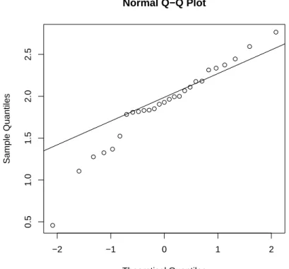
A method to visualize the distribution of gene expression values is by the so-called quantile-quantile (Q-Q) plot. In such a plot the quantiles of the gene expression values are displayed against the corresponding quantiles of the normal (bell-shaped). A straight line is added representing points which correspond exactly to the quantiles of the normal distribution. By observing the extent in which the points appear on the line, it can be evaluated to what degree the data are normally distributed. That is, the closer the gene
expression values appear to the line, the more likely it is that the data are normally distributed.
−2 −1 0 1 2
0.51.01.52.02.5
Normal Q−Q Plot
Theoretical Quantiles
Sample Quantiles
Figure 2.5: Q-Q plot of ALL gene expression values of CCND3 Cyclin D3.
Example 1. To produce a Q-Q plot of the ALL gene expression values of CCND3 Cyclin D3 one may use the following.
qqnorm(golub[1042, gol.fac=="ALL"]) qqline(golub[1042, gol.fac=="ALL"])
From the resulting Figure2.5 it can be observed that most of the data points are on or near the straight line, while a few others are further away.
The above example illustrates a case where the degree of non-normality is moderate so that a clear conclusion cannot be drawn. By making the
exercises below, the reader will gather more experience with the degree in which gene expression values are normally distributed.
2.2 Descriptive statistics
There exist various ways to describe the central tendency as well as the spread of data. In particular, the central tendency can be described by the mean or the median, and the spread by the variance, standard deviation, interquartile range, or median absolute deviation. These will be defined and illustrated.
2.2.1 Measures of central tendency
The most important descriptive statistics for central tendency are the mean and the median. The sample mean of the data values x1,· · · , xn is defined as
x= 1 n
Xn
i=1
xi = 1
n(x1+· · ·+xn).
Thus the sample mean is simply the average of the n data values. Since it is the sum of all data values divided by the sample size, a few extreme data values may largely influence its size. In other words, the mean is not robust against outliers.
The median is defined as the second quartile or the 50th percentile, and is denoted byx0.50. When the data are symmetrically distributed around the mean, then the mean and the median are equal. Since extreme data values do not influence the size of the median, it is very robust against outliers.
Robustness is important in bioinformatics because data are frequently con- taminated by extreme or otherwise influential data values.
Example 1. To compute the mean and median of the ALL expression values of gene CCND3 Cyclin D3 consider the following.
> mean(golub[1042, gol.fac=="ALL"]) [1] 1.89
> median(golub[1042, gol.fac=="ALL"]) [1] 1.93
Note that the mean and the median do not differ much so that the distribu- tion seems quite symmetric.
2.2.2 Measures of spread
The most important measures of spread are the standard deviation, the in- terquartile range, and the median absolute deviation. Thestandard deviation is the square root of the sample variance, which is defined as
s2 = 1 n−1
Xn
i=1
(xi−x)2 = 1 n−1
¡(x1−x)2+· · ·+ (xn−x)2¢ .
Hence, it is the average of the squared differences between the data values and the sample mean. The sample standard deviation s is the square root of the sample variance and may be interpreted as the distance of the data values to the mean. The variance and the standard deviation are not robust against outliers.
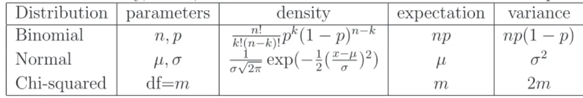
Theinterquartile rangeis defined as the difference between the third and the first quartile, that is x0.75−x0.25. It can be computed by the function IQR(x). More specifically, the value IQR(x)/1.349 is a robust estimator of the standard deviation. The median absolute deviation(MAD) is defined as a constant times the median of the absolute deviations of the data from the median (e.g. Jureˇckov´a & Picek, 2006, p. 63). In R it is computed by the functionmaddefined as the median of the sequence|x1−x0.50|,· · · ,|xn−x0.50| multiplied by the constant 1.4826. It equals the standard deviation in case the data come from a bell-shaped (normal) distribution (see Section 3.2.1).
Because the interquartile range and the median absolute deviation are based on quantiles, these are robust against outliers.
Example 1. These measures of spread for the ALL expression values of gene CCND3 Cyclin D3 can be computed as follows.
> sd(golub[1042, gol.fac=="ALL"]) [1] 0.491
> IQR(golub[1042, gol.fac=="ALL"]) / 1.349 [1] 0.284
> mad(golub[1042, gol.fac=="ALL"]) [1] 0.368
Due to the three outliers (cf. Figure 2.4) the standard deviation is larger than the interquartile range and the mean absolute deviation. That is, the absolute differences with respect to the median are somewhat smaller, than the root of the squared differences.
2.3 Overview and concluding remarks
Data can be stored as a vector or a data matrix on which various useful functions are defined. In particular, it is easy to produce a pie, histogram, boxplot, or Q-Q plot of a vector of data. These plots give a useful first impression of the degree of (non)normality of gene expression values.
To construct the histogram used the default method to compute the num- ber of bars or breaks. If the data are distributed according to a bell-shaped curve, then this is often a good strategy. The number of bars can be chosen by thebreaks option of the function hist. Optimal choices for this are dis- cussed by e.g. Venables and Ripley (2002).
2.4 Exercises
Since the majority of the exercises are based on the Golub et al. (1999) data, it is essential to make these available and to learn to work with it. To stimulate self-study the answers are given at the end of the book.
1. Illustration of mean and standard deviation.
(a) Compute the mean and the standard deviation for 1,1.5,2,2.5,3.
(b) Compute the mean and the standard deviation for 1,1.5,2,2.5,30.
(c) Comment on the differences.
2. Comparing normality for two genes. Consider the gene expression val- ues in row 790 and 66 of the Golub et al. (1999) data.
(a) Produce a boxplot for the expression values of the ALL patients and comment on the differences. Are there outliers?
(b) Produce a QQ-plot and formulate a hypothesis about the normal- ity of the genes.
(c) Compute the mean and the median for the expression values of the ALL patients and compare these. Do this for both genes.
3. Effect size. An important statistic to measure the effect size which is defined for a sample as x/s. It measures the mean relative to the standard deviation, so that is value is large when the mean is large and the standard deviation small.
(a) Determine the five genes with the largest effect size of the ALL patients from the Golub et al. (1999) data. Comment on their size.
(b) Invent a robust variant of the effect size and use it to answer the previous question.
4. Plotting gene expressions "CCND3 Cyclin D3". Use the gene expres- sions from "CCND3 Cyclin D3" of Golub et al. (1999) collected in row 1042 of the object golub from the multtest library. After using the function plot you produce an object on which you can program.
(a) Produce a so-called stripchart for the gene expressions separately for the ALL as well as for the AML patients. Hint: Use a factor for appropriate separation.
(b) Rotate the plot to a vertical position and keep it that way for the questions to come.
(c) Color the ALL expressions red and AML blue. Hint: Use the col parameter.
(d) Add a title to the plot. Hint: Usetitle.
(e) Change the boxes into stars. Hint: Use thepch parameter.
Hint: Store the final script you like the most in your typewriter in order to be able to use it efficiently later on.
5. Box-and-Whiskers plot of "CCND3 Cyclin D3". Use the gene expres- sions "CCND3 Cyclin D3" of Golub et al. (1999) from row 1042 of the object golub of the multtestlibrary.
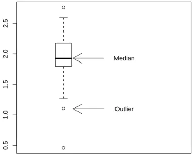
(a) Construct the boxplot in Figure 2.6.
(b) Add text to the plot to explain the meaning of the upper and lower part of the box.
(c) Do the same for the wiskers.
(d) Export your plot to eps format.
Hint 1: Use locator() to find coordinates of the position of the plot.
Hint 2: Use xlim to make the plot somewhat wider.
Hint 3: Use arrows to add an arrow.
Hint 4: Use text to add information at a certain position.
6. Box-and-wiskers plot of persons of Golub et al. (1999) data.
(a) Useboxplot(data.frame(golub))to produce a box-and-wiskers plot for each column (person). Make a screen shot to save it in a word processor. Describe what you see. Are the medians of similar size? Is the inter quartile range more or less equal. Are there outliers?
(b) Compute the mean and medians of the persons. What do you observe?
(c) Compute the range (minimal and maximum value) of the standard deviations, the IQR and MAD of the persons. Comment of what you observe.
7. Oncogenes of Golub et al. (1999) data.
(a) Select the oncogens by the grep facility and produce a box-and- wiskers plot of the gene expressions of the ALL patients.
(b) Do the same for the AML patients and use par(mfrow=c(2,1)) to combine the two plots such that the second is beneath the first.
Are there genes with clear differences between the groups?
8. Descriptive statistics for the ALL gene expression values of the Golub et al. (1999) data.
(a) Compute the mean and median for gene expression values of the ALL patients, report their range and comment on it.
(b) Compute the SD, IQR, and MAD for gene expression values of the ALL patients, report their range and comment on it.
0.51.01.52.02.5
Median
Outlier
Figure 2.6: Boxplot with arrows and explaining text.
Chapter 3
Important Distributions
Questions that concern us in this chapter are: What is the probability to find fourteen purines in a microRNA of length twenty two? If expressions from ALL patients of gene CCND3 Cyclin D3 are normally distributed with mean 1.90 and standard deviation 0.5, what is the probability to observe expression values larger than 2.4?
To answer such type of questions we need to know more about statis- tical distributions (e.g. Samuels & Witmer, 2003). In this chapter several important distributions will be defined, explained, and illustrated. In par- ticular, the discrete distribution binomial and the continuous distributions normal, T, F, and chi-squared will be elaborated. These distributions have a wealth of applications to statistically testing biological hypotheses. Only when deemed relevant, the density function, the distribution function, the mean µ (mu), and the standard deviationσ (sigma), are explicitly defined.
3.1 Discrete distributions
The binomial distribution is fundamental and has many applications in medicine and bioinformatics.
3.1.1 Binomial distribution
The binomial distribution fits to repeated trials each with a dichotomous out- come such as succes-failure, healthy-disease, heads-tails, purine-pyrimidine, etc. When there are n trials, then the number of ways to obtain k successes
31
out of n is given by the binomial coefficient n!
k!(n−k)!,
where n! = n ·(n −1)· · ·1 and 0! = 1 (Samuels & Witmer, 2003). The binomial probability of k successes out of n consists of the product of this coefficient with the probability of k successes and the probability of n − k failures. Let p be the probability of succes in a single trial and X the (random) variable denoting the number of successes. Then the probabilityP of the event (X =k) thatk successes occur out of n trails can be expressed as
P(X =k) = n!
k!(n−k)!pk(1−p)n−k, for k = 0,· · · , n. (3.1) The collection of these probabilities is called the probability density function.
1
Example 1. To visualize the Binomial distribution, load theTeachingDemos package and use the command vis.binom(). Click on ”Show Normal Ap- proximation” and observe that the approximation improves as n increases, taking pfor instance near 0.5.
Example 2. If two carriers of the gen for albinism marry, then each of the children has probability of 1/4 of being albino. What is the probability for one child out of three to be albino? To answer this question we take n = 3, k= 1, and p= 0.25 into Equation (3.1) and obtain
P(X = 1) = 3!
1!(3−1)!0.2510.752 = 3·0.140625 = 0.421875.
An elementary manner to compute this in R is by
> choose(3,1)* 0.25^1* 0.75^2
wherechoose(3,1) computes the binomial coefficient. It is more efficient to compute this by the built-in-density-function dbinom(k,n,p), for instance to print the values of the probabilities.
1For a binomially distributed variable np is the mean, np(1−p) the variance, and pnp(1−p) the standard deviation.
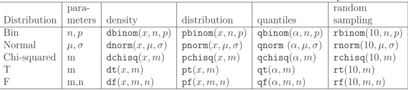
> for (k in 0:3) print(dbinom(k,3,0.25))
Changing dintopyields the so-called distribution function with the cumula- tive probabilities. That is, the probability that the number of Heads is lower than or equal to two P(X ≤ 2) is computed by pbinom(2,3,0.25). The values of the density and distribution function are summarized in Table 3.1.
From the table we read that the probability of no albino child is 0.4218 and the probability that all three children are albino equals 0.0156.
Table 3.1: Discrete density and distribution function values of S3, with p = 0.6. number of Heads k = 0 k= 1 k = 2 k = 3
density P(X =k) 0.4218 0.4218 0.1406 0.0156 distribution P(X ≤k) 0.4218 0.843 0.9843 1
Example 3. RNA consists of a sequence of nucleotides A, G, U, and C, where the first two are purines and the last two are pyrimidines. Suppose, for the purpose of illustration, that the length of a certain micro RNA is 22, that the probability of a purine equals 0.7, and that the process of placing purines and pyrimidines is binomially distributed. The event that our microRNA contains 14 purines can be represented by X = 14. The probability of this event can be computed by
P(X = 14) = 22!
14!(22−14)!0.7140.38 =dbinom(14,22,0.7) = 0.1423.
This is the value of the density function at 14. The probability of the event of less than or equal to 13 purines equals the value of the distribution function at value 13, that is
P(X ≤13) =pbinom(13,22,0.7) = 0.1865.
The probability of strictly more than 10 purines is
P(X ≥11) = X22
k=11
P(S22=k) =sum(dbinom(11:22,22,0.7)) = 0.9860.
The binomial density function can be plotted by:
0 5 10 15 20
0.000.050.100.15
x
f(x)
Figure 3.1: Binomial probabilities with n= 22 and p= 0.7
0 5 10 15 20
0.00.20.40.60.81.0
x
F(x)
Figure 3.2: Binomial cumulative probabilities with n = 22 and p= 0.7.
> x <- 0:22
> plot(x,dbinom(x,size=22,prob=.7),type="h")
By the first line the sequence of integers{1,2,· · ·,22}is constructed and by the second the density function is plotted, where the argument h specifies pins. From Figure 3.1 it can be observed that the largest probabilities oc- cur near the expectation 15.4. The graph in Figure 3.2 illustrates that the distribution is an increasing step function, with xon the horizontal axis and P(X ≤x) on the vertical.
A random sample of size 1000 from the binomial distribution withn= 22 and p = 0.7 can be drawn by the command rbinom(1000,22,0.7). This simulates the number of purines in 1000 microRNA’s each with purine prob- ability equal to 0.7 and length 22.
3.2 Continuous distributions
The continuous distributions normal, T, F, and chi-squared will be defined, explained and illustrated.