Policy Research Working Paper 7270
Poverty Dynamics in India between 2004 and 2012
Insights from Longitudinal Analysis Using Synthetic Panel Data
Hai-Anh H. Dang Peter F. Lanjouw
Development Research Group Poverty and Inequality Team May 2015
WPS7270
Public Disclosure AuthorizedPublic Disclosure AuthorizedPublic Disclosure AuthorizedPublic Disclosure Authorized
Produced by the Research Support Team
Abstract
The Policy Research Working Paper Series disseminates the findings of work in progress to encourage the exchange of ideas about development issues. An objective of the series is to get the findings out quickly, even if the presentations are less than fully polished. The papers carry the names of the authors and should be cited accordingly. The findings, interpretations, and conclusions expressed in this paper are entirely those of the authors. They do not necessarily represent the views of the International Bank for Reconstruction and Development/World Bank and its affiliated organizations, or those of the Executive Directors of the World Bank or the governments they represent.
Policy Research Working Paper 7270
This paper is a product of the Poverty and Inequality Team, Development Research Group. It is part of a larger effort by the World Bank to provide open access to its research and make a contribution to development policy discussions around the world. Policy Research Working Papers are also posted on the Web at http://econ.worldbank.org. The authors may be contacted at hdang@worldbank.org.
Recent National Sample Surveys point to significant pov- erty reduction in India since 2004/05, with a marked acceleration between 2009/10 and 2011/12. This paper enquires into important aspects of income mobility between 2004/05 and 2011/12, based on new statistical methods to convert the three pertinent National Sample Survey rounds into synthetic panels. The analysis draws on the synthetic panels to derive a vulnerability line for India that can be used to separate out a population subgroup com- prising non-poor households facing a heightened risk of
falling into poverty. The paper documents a strong pattern of upward mobility out of poverty and vulnerability into the middle class, with a noticeable acceleration between 2009/10 and 2011/12. The paper further undertakes a careful investigation into the comparability of the survey rounds, prompted by the observation that fairly signifi- cant modifications had been made to survey questionnaires.
The findings suggest that changes in questionnaire design have not compromised the comparability of the data.
Poverty Dynamics in India between 2004 and 2012:
Insights from Longitudinal Analysis Using Synthetic Panel Data Hai-Anh H. Dang and Peter F. Lanjouw*
World Bank
JEL: C15, I32, O15
Key words: poverty dynamics, mobility, imputation, synthetic panel, India
* Dang (hdang@worldbank.org) and Lanjouw (p.f.lanjouw@vu.nl) are respectively with the Poverty and Inequality Unit, Development Research Group, World Bank, and VU University, Amsterdam. This paper is a background paper for the India Poverty Assessment Report. We are grateful to Rinku Murgai, Ambar Narayan, Himanshu, Abhijit Sen, and participants at a workshop for the India Poverty Assessment Report (Washington, DC) and a seminar at Jawaharlal Nehru University (New Delhi) for helpful discussions on earlier versions. We thank Yichen Tu for very capable research assistance. We would further like to thank the South Asia Data for Goals program for financial support, and the UK Department of International Development for funding assistance through its Knowledge for Change and Strategic Research Programs.
I. Introduction
Poverty has steadily decreased in India over the past decade. Since India makes up a quarter of the world’s poor (i.e., those living under $1.25 a day), which is roughly half again its share of the world’s population (17 percent), reducing poverty in this country would not only impact its welfare alone but would also register a significant impact on global poverty estimates.1 What is particularly striking is the acceleration of poverty reduction that appears to be taking place.
Between 2004/5 and 2009/10 poverty declined from 37.7 percent to 29.9 percent. Over the subsequent two years, poverty declined by a further 10 percentage points, to 20.0 percent. These achievements in poverty reduction have been widely remarked on and celebrated.2
The aim of this paper is to consider the recent experience of poverty decline from two perspectives that have not historically received a great deal of attention in the Indian context – due most likely to the scarcity of nationally representative panel survey data.3 First, we ask whether there is any suggestion that those who are currently non-poor remain at a heightened risk of falling into poverty. Second, we investigate to what extent one can discern a core subset of the population
1 We use the poverty rates and population data respectively from the World Bank’s PovCalNet database (http://iresearch.worldbank.org/PovcalNet/index.htm) and Development Indicators database. All figures are estimated averages for the two years 2011 and 2012.
2 There have been nevertheless some concerns raised around the credibility of the most recent episode of poverty decline, we come back to more discussion in the next section. Unless otherwise noted, all the poverty rates are based on the national poverty lines.
3 Smaller panel surveys have been fielded for India, but none of these provide nationally representative data; see Dercon and Shapiro (2007) for a recent review. For recent studies that use these panel surveys, see, e.g., Munshi and Rosenzweig (2009), Krishna and Shariff (2011), and Dercon, Krishnan, and Krutikova (2013) respectively for analysis of the REDS panel between 1982 and 1999, the NCAER panel between 1993-94 and 2004-05, and the ICRISAT panel between 1975 and 2006. While panel surveys allow more in-depth analysis of mobility, Rosenzweig (2003) discusses potential issues that can bias these surveys (that are not nationally representative) such as split-offs or attrition. A new nationally representative panel survey (IHDS) fielded by the University of Maryland and NCAER promises much improvement over the previous panels (http://ihds.umd.edu/index.html). But note that compared to the NSSs, the IHDS has less than half the sample size and collects a much reduced version of household consumption data (i.e., 47 consumption items in the latter vs. more than 400 items in the former).
2
that remains stuck in poverty and is somehow unable to participate in the processes of upward mobility.
Our analysis studies the period between 2004/5 and 2011/12, and draws on three “thick” rounds of National Sample Survey data referring to 2004/5, 2009/10, and 2011/12. As noted above, these data sources indicate a substantial decline in poverty over the entire 7-year period, with a sharp acceleration occurring after 2009/10. Our analysis suggests that during the first episode of poverty reduction between 2004/5 and 2009/10, poverty decline was accompanied by an increase in the share of the population that can be considered vulnerable, or facing a heightened risk of falling into poverty. Between 2009/10 and 2011/12, poverty decline accelerated further, and this was now accompanied also by a decline in the fraction of the population that was particularly at risk of falling into poverty.
We show further that aggregate trends in poverty reduction mask a considerable degree of entry into, and exit out of, poverty, but that a substantial core of the poor have remained poor over the duration of the study period. We document some of the key household characteristics of those who have managed to escape poverty and vulnerability, and contrast these with those who have fallen into this undesirable welfare status during this period.
Before turning to a detailed discussion of our empirical findings, we confront in this paper several methodological challenges that have typically held back investigations of the kind we are attempting here. The key difficulty is that analysis of poverty transitions and of the likelihood of escaping, or falling into, poverty depends on the availability of panel data that permit the analyst to follow households over time. Yet in India, as in many other countries, nationally representative panel data are not available. The existing data sources underpinning poverty analysis—the NSS
3
surveys—are high quality cross-sectional data sources that offer at best a snapshot of living conditions at specific moments of time.
In order to overcome this limitation, we implement in this paper a methodology for converting the NSS cross-sectional surveys into synthetic panels. The approach we follow has been recently introduced into the literature (Dang, Lanjouw, Luoto and McKenzie, 2014a; Dang and Lanjouw, 2013) and a number of studies which validate the method have generally yielded encouraging findings (Dang et al., 2014a; Dang and Lanjouw, 2013; Cruces et al., 2014; Martinez, 2015). We highlight the assumptions imposed by the methodology and discuss their applicability to the Indian context.4
The methodology for constructing synthetic panels is predicated on strict comparability of the underlying cross-section surveys. It has already been noted that India’s NSS surveys are generally regarded as high-quality data sources. We also focus our attention here on the “thick” rounds that involve larger sample sizes and that are designed to be representative at the rural/urban and state level. Nonetheless we investigate whether the 2009/10 and 2011/12 rounds are strictly comparable, since the possibility of a breakdown in comparability is prompted by the remarkable rate of poverty decline as well as evidence that there are some noticeable changes in the design of the consumption questionnaire between these two years. We note that there had been intensive and contentious debate around the comparability of the 1999/00 round of the NSS survey with earlier NSS rounds, after a certain number of changes and adjustments had been made to the
4 Synthetic panels constructed using the Dang et al. (2014a) and Dang and Lanjouw (2013) methods have been applied to study poverty dynamics in various settings including multi-country analysis for Latin America (Ferreira et al., 2013;
Vakis, Rigolini, and Lucchetti, 2015), South Asia (Rama et al., 2015), and Europe and Central Asia (Cancho et al., 2015). Specific country case studies using synthetic panels investigate countries including the Kyrgyz Republic (Bierbaum and Gassmann, 2012), Bhutan (World Bank, 2014), and Senegal (Dang, Lanjouw, and Swinkels, forthcoming). Another promising use of synthetic panels is to evaluate program impacts (Garbero, 2014).
4
questionnaire (Deaton and Kozel, 2005). We ask therefore, whether there is any call for similar disquiet with the surveys examined in this paper.
We tackle this question with an imputation-based method recently explored in Dang, Lanjouw and Serajuddin (2014b) that builds on a number of earlier studies (Elbers, Lanjouw, and Lanjouw, 2003; Tarozzi, 2007).5 Our findings suggest that the 2009/10 and 2011/12 survey rounds do not appear to suffer from serious comparability issues. The observation of a sharply accelerated poverty decline after the 2009/10 round, from 29.9 to 20 percent in 2011/12, seems robust. We also appear to be on solid footing with respect to the data underpinnings for converting these three NSS rounds into synthetic panels.
We start, in Section II, with a brief discussion of poverty trends during the late 2000s and explore further the question of whether the 2009/10 and 2011/12 NSS rounds are comparable.
Section III describes our efforts to assess the comparability of the 2009/10 and 2011/12 surveys.
Besides offering validation evidence for the recent poverty decline, these two sections also describe the preparatory data work required to construct synthetic panels with which to study poverty dynamics. Section IV then implements our approach to convert the three most recent NSS rounds between 2004/05 and 2011/12 into synthetic panels. We also describe and implement in this section an approach to construct “vulnerability lines” that permits a richer mobility analysis by allowing us to identify a particular portion of the population that is non-poor but that faces a heightened risk of falling into poverty. We implement a procedure proposed in Dang and Lanjouw (2014) for specifying vulnerability lines anchored explicitly to the observed incidence of non-poor
5 Elbers et al. (2003) provide a method that imputes household consumption from a survey into a population census.
Adapting this approach for survey-to-survey imputation, Christiaensen et al. (2012) impute poverty estimates using data from several countries including China, Kenya, Russia, and Vietnam; other studies analyze data from Morocco (Douidich et al., 2014) and Uganda (Mathiassen, 2013). See also Tarozzi and Deaton (2009) and Rao (2003) for other studies on survey-to-census imputation.
5
households falling into poverty. This procedure makes light demands on data and can be straightforwardly applied to synthetic panel data.
We then turn in Section V to a discussion of mobility between the three population segments that derive from this analysis: the poor, the vulnerable, and the middle class, and we produce some basic profiles of the population in different transition categories. We end in Section VI with concluding remarks.
II. Poverty Trends and Data
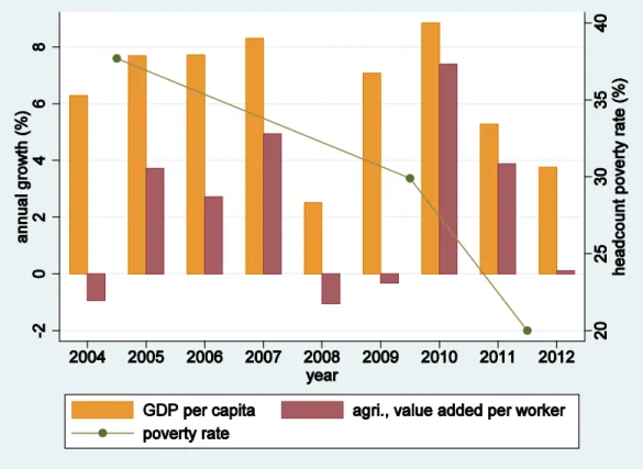
Steady GDP per capita growth has helped drive down poverty rates in India in the late 2000s.6 In particular, GDP per capita increased by almost half (47 percent) during the period 2004-2009 (World Bank, 2015), and poverty decreased by 21 percent over the same period. The country’s continued economic growth resulted in a further increase of GDP per capita over the subsequent two years, by almost one-fifth (19 percent) in 2011/12. While this robust growth rate should be expected to bring more poverty reduction, the contemporaneous fall in poverty rates turned out to be much larger than expected. To quite a few observers, the fall in poverty has been startling.7
Figure 1 plots the annual growth rate of GDP per capita (left axis) and the headcount poverty rate (right axis) between 2004 and 2012. Since a large share of the labor force is employed in agriculture, the figure also displays the annual growth rate of the value added per worker of the agricultural sector. The disconnect between GDP per capita growth rates and poverty reduction is
6 See, e.g., Datt and Ravallion (2011) and Ravallion (2011) for comprehensive discussions on economic growth and poverty in India for earlier periods.
7 For example, Dutta and Panda (2014) observe that there is much controversy around the (arbitrariness) of the specification of the poverty line. Saxena (2013) points out a couple of inconsistencies such as the share of the population that need food subsidies or the slum population in major cities are much larger than the reported poverty rate, and that the specified poverty lines may be too low and may potentially be distorted due to political motives. In addition to these last two issues, Himanshu (cited in Rao, 2013) voices the concern that imputed spending values for certain social transfer programs may not be calculated correctly. See also the BBC (Limaye, 2013), New York Times (Gupta, 2013), and Washington Post (Lakshmi, 2012) for related discussion on the debates on poverty in this period.
6
brought out sharply where, despite a remarkably weaker growth of the former, the slope of the line representing the latter is much steeper in the second period than that in the first period. An even weaker growth of the agricultural sector further highlights this difference.
Despite the various arguments for or against this swift fall in poverty, one simple but perhaps not unreasonable hypothesis is that the questionnaire design of the consumption module in the 2011/12 (68th) round of the NSS is not comparable to that in the 2009/10 (66th) round (and 2004/05 or 61th round), which in turn leads to inconsistently constructed and incomparable consumption data. Indeed, there are several major changes to the questionnaire in the 68th round that include: i) changing the consumption code, ii) aggregating consumption items in broader groups, iii) disaggregating consumption items in smaller groups, iv) using/ providing somewhat different item names, v) dropping some consumption items in previous rounds, and vi) adding new consumption items. These changes may not be harmless in affecting the comparability of the consumption data over time.8
To further investigate whether these changes may lead to different consumption aggregates over time, we explore the raw item-by-item consumption data at the household level and examine a variety of alternative consumption aggregations over time. The results shown in Appendix 1, Table 1.1 confirm that these questionnaire revisions could be a source of concern. While most consumption groupings make up rather similar shares in total household consumption, the share of the items with some change in code (grouping number 2) are two percentage points lower, and the share of the new items added in the 68th round are three percentage points higher than those
8 We use data from Type 1 Schedule for all survey rounds. An Excel file that provides a comparison and detailed tracking of the change to each consumption item for the 61th, 66th, and 68th rounds of the NSS are available upon request. Survey design issues that compromise the comparability of poverty estimates are found in various countries such as China (Gibson, Huang, and Rozelle, 2003), Tanzania (Beegle et al., 2012), and Vietnam (World Bank, 2012).
See also Deaton and Grosh (2000) and Crossley and Winter (forthcoming) for general reviews on the influence of survey design on the quality of consumption data in developing and richer countries respectively.
7
items in the 66th round that are dropped.9 While these differences may balance out on average, and may not result in any significant change to the total consumption aggregate, they may also point to potentially deeper comparability issues with the consumption data. Moreover, even if mean values are not much affected, these changes could affect different parts of the consumption distribution differently, and could thus still have a bearing on poverty estimates.
The discussion above evokes a similar, but much larger, poverty debate that took place in India in the early 2000s. In the late 1990s, the National Sample Survey Office (NSSO) revised the questionnaire of the NSS in 1999/2000 (55th round) in an attempt to bring estimates of household consumption from the survey in line with those from national accounts. In particular, these revisions include changing the recall period for household durables and education expenses from a 30-day interval to a 365-day interval, and using both the traditional 30-day recall period as well as a new 7-day recall period for food items. The Government of India published estimates showing that the headcount poverty rate fell by 10 percentage points between 1993/1994 and 1999/2000.
Independent researchers, however, noted the possibility of non-comparability of the published consumption data, and applied a variety of methods to adjust for this. A variety of estimates were produced with some suggesting a rate of decline ranging from only somewhat lower than the official estimates (Deaton and Dreze, 2002; Tarozzi, 2007) to one estimate suggesting a mere three percentage point decline in poverty during the decade of the 1990s (Sen and Himanshu, 2005; see also Kijima and Lanjouw, 2003). As is powerfully argued in the book “The Great Indian Poverty Debate” (Deaton and Kozel, 2005), concerns about comparability can greatly complicate assessments of poverty trends.
9 Compared with the 61th round, the share of the new items added in the 66th round is approximately 0.1 percent and equals the share of the items that are dropped from the former. This implies greater comparability between these two survey rounds.
8
We describe in the next section a method for gauging comparability between the 2009/10 and the 2011/12 rounds of the NSS.
III. Predicted Poverty Trends Using Imputation
We provide here a brief overview of the survey-to-survey imputation method described in Dang et al. (2014b) before discussing results. Further discussion on technical details and estimation procedures are available in the cited paper.
III.1. Overview of the Imputation Method
Let xj be a vector of characteristics that are commonly observed between the two surveys, where j indicates survey round, j= 1, 2.10 These characteristics can include household variables such as the household head’s age, sex, education, ethnicity, religion, language, occupation, household assets or incomes, and other community or regional variables. Household consumption (or income) data exist in one survey round but are missing in the other survey round, thus without loss of generality, let (survey) round 1 and round 2 respectively represent the survey round with and without household consumption data, and y1 represent household consumption in round 1.
Alternatively, we can also refer to round 1 as the base survey, and round 2 as the target survey.
To further operationalize our estimation, we assume that the linear projection of household consumption on household and other characteristics (x) in both survey rounds—if such consumption data were also available in period 2—are given by a cluster random-effects model11
j j j j
j x
y =β ' +µ +ε (1)
10 To make notation less cluttered, we suppress the subscript for each household in the following equations.
11 This assumption assumes that the returns to the characteristics xj in both periods are captured by equation (1) and precludes the (perhaps exceptionally) rare situations where there could be no correlation between these characteristics and household consumption due to unexpected upheavals in the economy or calamitous disasters. Contexts where there are sudden changes to the economic structures (e.g., overnight regime change) may also introduce noise into the comparability of the estimated parameters.
9
whereβjare the vector of coefficients, and the cluster random effects µjand the error term εj are assumed uncorrelated with each other and to follow a normal distribution, conditional on household characteristics. Equation (1) thus provides a standard linear random effects model that can be estimated using most available statistical packages. Let z2 be the poverty line in period 2, if y2 existed the (headcount) poverty rate P2 in this period could be estimated with the following quantity
) (y2 z2
P ≤ (2)
where P(.) is the probability (or poverty) function that gives the percentage of the population that are under the poverty line z2 in round 2.
Assume that the sampled data in round 1 and round 2 are representative of the population in each respective time period, such that estimates based on the same characteristics x in these two survey rounds are consistent and comparable over time (Assumption 1). And assume further that given the estimated consumption parameters from round 1, the changes in the distributions of the explanatory variables x between the two periods can capture the change in poverty rate in the next period (Assumption 2).12 Given these two assumptions, Dang et al. (2014b) propose an approach to impute the poverty rate for round 2, where the parameter estimateβˆ1and the distributions of the cluster random effects and the error term estimated from data in round 1 can be imposed on the data in round 2. Note that the standard errors of the imputation-based estimates can in fact be even smaller than that of the true (or design-based) rate if there is a good model fit (or the sample size in the target survey is larger than that in the base survey; see, e.g., Matloff, 1981).
12 While this assumption may seem counterintuitive, it may be especially relevant to economies where the returns to characteristics do not change or simply change little over time (i.e. involving survey rounds that are implemented close in time, assuming the returns to characteristics in most economies do not normally change much within a short time interval).
10
If consumption data are available from both the base and target surveys, we can use an Oaxaca- Blinder type decomposition to formally test for Assumption 2 to shed further light on model selection. In particular, the change in poverty between the survey rounds can be broken down into two components, one due to the changes in the estimated coefficients (the first term in square brackets in equation (3) below) and the other the changes in the x characteristics (the second term in square brackets in equation (3) below). Assumption 2 would be satisfied if the poverty change is mostly explained by the latter component. This can be expressed as
[
( ) ( )] [
( ) ( )]
) ( )
(y2 P y1 P y2 P y12 P y12 P y1
P − = − + − (3)
Furthermore, if we make a stricter assumption about the error term in equation (1) following a standard normal distribution, that is εj |xj ~N(0,1), we can estimate equation (1) by a random effects probit model instead of the linear random effects model.
) '
( )
(yj j xj j j
P =Φ β +µ +ε (4)
But the standard modelling tradeoff holds: if our stricter assumption is correct, estimation results are more accurate and vice versa. For comparison purposes, we will later present estimates using both the linear random effects and random effects probit models.13
Following the estimation procedures in Dang et al. (2014b), our empirical implementation involves a two-stage process. First, we apply the estimated parameters from the 2004/05 round on the 2009/10 data to impute poverty for the latter. Since the questionnaires remain the same over these two survey rounds, their consumption data are comparable, and we can thus validate these estimated poverty rates against those based on the actual consumption data for the 2009/10 round.
13 We provide a Stata ado program named “povimp” that automates the proposed estimation process (Dang and Nguyen, 2014). Type “ssc install povimp” from within Stata (StataCorp., 2013) to download this program from the SSC Archive, which is maintained by Christopher F. Baum at Boston College. Our Stata program automatically allows for complex survey designs by offering an option to specify the variables indicating the clusters and the strata.
11
Second, we produce imputation-based poverty estimates for 2011/12 using the same (model) specifications as with the first step, but with the estimated parameters from the 2009/10 round on the data from the 2011/12 round. Put differently, the first step would offer further validation that this imputation method works in the context of India, as well as provide the appropriate specification to use for the imputation; these two steps would satisfy the two assumptions discussed earlier.
III.2. Estimation Results
Since changes in household (heads’) characteristics may indicate the corresponding changes in household consumption, it can be useful to examine as a preliminary check the distributions of household characteristics across the two survey rounds in 2009/10 and 2011/12. The summary statistics provided in Appendix 1, Table 1.2 show that these changes appear rather negligible with most of the differences being not statistically significant. Some characteristics that are associated with higher levels of household welfare (e.g. heads with completed post-graduate education, household members with regular salary incomes, or urban residents receiving regular wages) show a statistically significant improvement over time; but others that have opposite effects (e.g., backward classes and radio ownership) also have statistically significant changes.14 The picture provided from considering the pairwise changes in the distributions of these variables over time thus seems mixed at best.
We then proceed to impute poverty for the target survey in 2009/10, using the estimated parameters from the base survey in 2004/05. Assumption 1 on survey comparability is satisfied since the questionnaires (and sample design) for these two survey rounds remain the same. To satisfy Assumption 2, we can then consider five different household consumption model
14 We can infer the direction of the correlation between these characteristics and household consumption from the regression results in Appendix 1, Tables 1.3 and 1.4.
12
specifications where the changes in the distributions of the explanatory variables x between the two periods can capture to varying degrees the change in poverty over time. These specifications are built on a cumulative basis for comparison purposes (and robustness checks), with later specifications sequentially adding more variables to earlier specifications.
Specification 1 is the most parsimonious specification and consists of household size, household heads’ age, gender, and dummy variables indicating whether the head is Hindu or Islam, whether the head belongs to a scheduled tribe, a scheduled caste or backward classes, whether the head is literate, and the head’s education levels. Specification 2 adds to Specification 1 household demographics such as the shares of household members in the age ranges 0-14, 15-24, and 25-59 (with the reference group being those 60 years old and older). Specification 3 adds to Specification 2 employment variables, which include dummy variables indicating whether the household has any member working for a regular salary, whether the head is self-employed in the agricultural sector or the non-agricultural sector (for rural residents), and whether the head works for regular wage, is self-employed or engaged in casual work or other type of work (for urban residents).
Specification 4 adds to Specification 3 a variable indicating home ownership. Finally, Specification 5 adds a more detailed list of asset variables, which include the energy sources for lighting and cooking, whether the household has a radio, television set, electric fan, sewing machine, freezer, air conditioner, bicycle, motorbike, and a car. However, slightly more than 5,000 and 1,000 households are missing these assets variables in the 2004/05 and 2009/10 rounds, respectively. Full model specifications and regression results are provided in Appendix 1, Table 1.3.
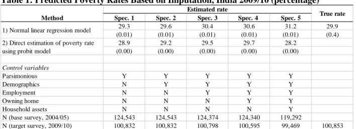
Estimation results using the linear random effects model shown in Table 1 (row 1) indicate that all the imputation-based poverty estimates in Specifications 1 to 4 fall within the 95 percent
13
confidence interval of the true poverty rate estimated from the actual consumption data for 2009/10. Put differently, these estimates are not statistically significantly different from the true poverty rate of 29.9 percent. The exception is Specification 5 where the imputation-based estimate is half a percentage point outside this confidence interval, which can be due to either model overfitting or smaller sample sizes with both the base and target surveys. Estimation results using the random effects probit model (row 2) are broadly similar, with estimates from Specifications 2 to 4 falling within the 95 percent confidence interval of the true poverty rate.
Thus for our purpose of finding a good model specification to impute poverty in the 2009/10 round, assuming consumption data in this round were not available, Specifications 1 to 4 with the normal linear regression models and Specifications 2 to 4 with the random effects probit models can all be employed. But among these specifications, our preferred specifications for interpretation are Specification 2 with the normal linear regressions and Specifications 3 and 4 with the random effects probit model since these three specifications provide better estimates that are within one standard error of the true rate.
It is useful to note that the standard errors for the imputation-based estimates are progressively smaller in the normal linear regression models and random effects probit models than that of the design-based poverty estimate. This is consistent with our earlier discussion since assuming the specification is correct, a good model fit can help bring down the standard errors. Similarly, the random effects probit models make a stricter (modelling) assumption on the error term than the linear random effects models, thus their standard errors are consequently smaller.
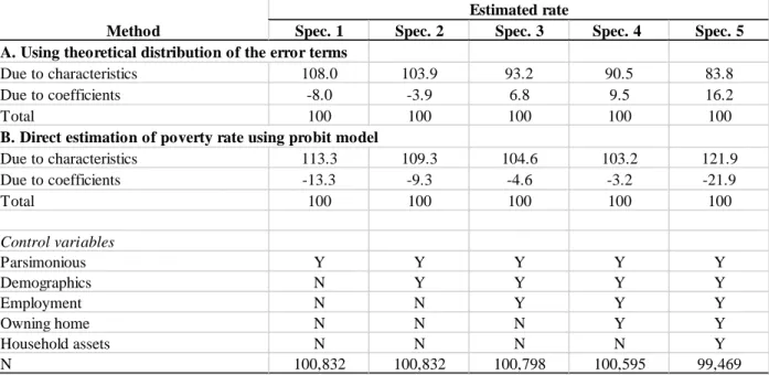
As a further check on the model specification, we provide a decomposition test of the changes in poverty due to the changes in the household characteristics and the estimated coefficients in Table 2 based on equation (3). (Note that we are now working with consumption data in both
14
surveys, rather than working with consumption data in only the base survey, as with the estimates for Table 1.) Estimation results confirm that, for the model specifications that provide estimates within the 95 percent confidence interval of the true poverty rates, the changes captured by the characteristics are closer to 100 percent. For example, under Specification 4 with the random effects probit regression, the change due to the coefficients is the most negligible; this specification also provides a point estimate of poverty (29.7 percent, Table 1) that is closest to the true poverty rate.
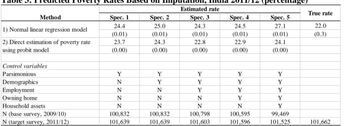
We turn next to impute poverty for 2011/12 with the estimated parameters from the 2009/10 survey round.15 We have preferred specifications for analysis but we also show estimates for all the other specifications for comparison in Table 3. Our preferred specifications show that the imputation-based poverty estimates can be range from 22.9 percent (Specifications 3 and 4, the probit model) to 25 percent (Specification 2, the linear regression model). Interestingly enough, except for Specification 5 that could be excluded due to overfitting concerns, all other estimates—
including even Specification 5 with the probit model—fall within this range.
These imputation-based estimates are larger than the design-based estimates of 22 percent, and the differences are statistically significant (outside the 95 percent confidence of the latter).
However, considering all specifications together, the difference between the probit estimates and the design-based estimate is between one and two percentage points, while that between the normal linear regression estimates and the design-based estimates is between two and three percentage points. Thus according to our imputation-based estimates, while the design-based estimate may
15 We use estimated parameters from the 2009/10 round, rather than the 2004/05 round, to impute poverty in the 2011/12 round since these parameters may change over time. Indeed, the null hypothesis of the equality of the estimated parameters in these two survey rounds is rejected with significantly large value from a Wald test (results available upon request). More generally, survey rounds that are closer in time are more appropriate for imputation.
15
underestimate poverty in 2011/12, it appears that this underestimation may in practice be not that large.
IV. Constructing Synthetic Panels
Our findings in the previous section suggest that the sharp decrease in poverty rate between 2009/10 and 2011/12 is reasonably captured by the 66th and 68th rounds of the NSSs. Put differently, these two survey rounds provide comparable consumption data for most practical poverty measurement purposes, which is a prerequisite for constructing synthetic panel data. We next provide a brief overview of the methods that will be used.
IV.1. Overview of the Synthetic Panel and Vulnerability Analysis Methods16
Let xij be a vector of household characteristics observed in survey round j (j= 1 or 2) that are also observed in the other survey round for household i, i= 1,…, N. These household characteristics include variables that may be collected in only one survey round, but whose values can be inferred for the other round. These variables may be roughly categorized in three types i) time-invariant variables such as ethnicity, religion, place of birth, or parental education; ii) deterministic variables such as age (which given the value in one survey round can then be determined given the time interval between the two survey rounds),17 and ii) time-varying household characteristics if retrospective questions about the values of such characteristics in the first survey round are asked in the second round.
16 We provide an overview of the methods that construct synthetic panels and vulnerability lines developed by Dang et al. (2014a) and Dang and Lanjouw (2013, 2014) in this section. For more details, interested readers are encouraged to read the original papers.
17 To reduce spurious changes due to changes in household composition over time, we usually restrict the estimation samples to household heads age, say 25 to 55 in the first cross section and adjust this age range accordingly in the second cross section. This restriction also helps ensure certain variables such as heads’ education attainment remains relatively stable over time (assuming most heads are finished with their schooling). This age range is usually used in traditional pseudo-panel analysis but can vary depending on the cultural and economic factors in each specific setting.
16
Then let yij represent household consumption or income in survey round j, j= 1 or 2. The linear projection of household consumption (or income) on household characteristics for each survey round is given by
ij ij j
ij x
y =β ' +ε (5)
Let zj be the poverty line in period j. We are interested in knowing such quantities as )
(y1 z1 and y2 z2
P i < i > (6a)
which represents the percentage of households that are poor in the first period but nonpoor in the second period, or
)
|
(y2 z2 y1 z1
P i > i < (6b)
which represents the percentage of poor households in the first period that escape poverty in the second period. In other words, for the average household, quantity (6a) provides the joint (unconditional) probabilities of household poverty status in both periods, and quantity (6b) the conditional probabilities of household poverty status in the second period given their poverty status in the first period.
If true panel data are available, we can straightforwardly estimate the quantities in (6a) and (6b); but in the absence of such data, we can use synthetic panels to study mobility. To operationalize the framework, we make two standard assumptions. First, we assume that the underlying population being sampled in survey rounds 1 and 2 are identical such that their time- invariant characteristics remain the same over time. More specifically, coupled with equation (5), this implies the conditional distribution of expenditure in a given period is identical whether it is conditional on the given household characteristics in period 1 or period 2 (i.e., xi1= xi2 implies yi1|xi1 and yi1|xi2 have identical distributions). Second, we assume that 𝜀𝜀i1 and 𝜀𝜀i2have a bivariate
17
normal distribution with positive correlation coefficient ρ and standard deviations σ𝜖𝜖1 and σ𝜖𝜖2
respectively. Quantity (6a) can be estimated by
− −
− − Φ
=
>
< ρ
σ β σ
β
ε ε
' , ' ,
) (
2 1
2 2 2 2 1 1 2 2 2 1
1
i i
i i
x z
x z z
y and z y
P (7)
where Φ2
()
. stands for the bivariate normal cumulative distribution function (cdf)) (and φ2()
.stands for the bivariate normal probability density function (pdf)). In equality (7), the parameters βjand
εj
σ are estimated from equation (5), andρcan be estimated using an approximation of the birth-cohort-aggregated household consumption between the two surveys. Note that in equality (7), the estimated parameters obtained from data in both survey rounds are applied to data from the second survey round (x2) (or the base year) for prediction, but we can use data from the first survey round as the base year as well. It is then straightforward to estimate quantity (6b) by
dividing quantity (6a) by
Φ −
1
2 1
1 '
σε
β xi
z , where Φ
()
. stands for the univariate normal cumulativedistribution function (cdf).18
Using the given poverty lines zj, quantities (6a) and (6b) classify the population into two groups, one is poor and the other nonpoor. But we can obtain richer analysis by further disaggregating the nonpoor group into two additional groups: the vulnerable (those that are nonpoor but still face a significant risk of falling into poverty) and the middle class (the remaining group with higher consumption levels). The dividing vulnerability line vj that separates these groups can be derived from a specified vulnerability index P, which is defined as the percentage of the non-poor population in the first period that fall into poverty in the second period. This
18 Further asymptotic results and formulae for the standard errors are provided in Dang and Lanjouw (2013).
18
vulnerability index can be anchored to, say, social protection targets, within the bounds given by the data (Dang and Lanjouw, 2014). We will further discuss the vulnerability line in the next section.
Given vj, we can extend expression (6a) to analyze the dynamics for these three categories:
poor, vulnerable, and middle class. For example, the percentage of poor households in the first period that escape poverty but still remain vulnerable in the second period (joint probability) is
− −
Φ
−
− −
Φ
=
<
<
< ρ
σ β σ
ρ β σ
β σ
β
ε ε
ε ε
' , ' ,
' , ' ,
) (
2 1
2 1
2 2 2 2 1 1 2 2
2 2 2 1 1 2 2 2 2 1
1
i i
i i
i i
x z
x z
x v
x v z
y z and z y P
(8) IV.2. Setting Vulnerability Lines
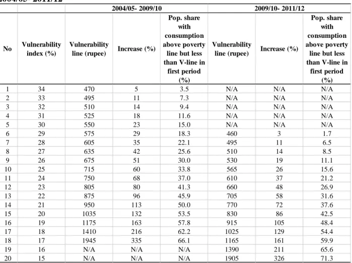
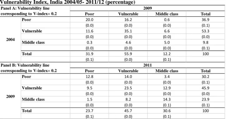
Table 4 shows a range of values of the vulnerability line that correspond to different vulnerability indexes for the two periods 2004-09 and 2009-11. The vulnerability index falls within the range [17, 34] for the first period, but this range both narrows and decreases to [15, 29] for the second period, suggesting that the population as a whole are better off in the latter. Put differently, at the same vulnerability index of, say, 20 percent in both periods, the vulnerability line is higher at 1,035 rupees per month in the first period, but shrinks by 20 percent to 830 rupees per month in the second period.19
Do we also have lower vulnerability for the longer period 2004-11? In general, this is an empirical question since a longer period is likely to be associated with larger vulnerability indexes unless household consumption grows so fast that it can offset this trend (Dang and Lanjouw, 2014).
Figure 2 then plots the vulnerability line against the vulnerability index for the two periods 2004-
19 All numbers are converted to 2004 price for all rural India. Note that we provide more detailed estimation results for India for the period 2004-09 in this paper than those in our other paper (Dang and Lanjouw, 2014). Our estimates are also different from those in the latter, which deflate all numbers to a population-weighted monthly national poverty line instead.
19
09 and 2009-11 on the same graph, and adds that for the period 2004-11 as well.20 The curve for the period 2009-11 lies everywhere below that for the period 2004-09 and is closer to the origin, which provides a graphical illustration of lower vulnerability in the latter period as discussed above. The curve for the period 2004-11 lies below both those for the other two periods, even though far more so compared with that for the period 2009-11, thus indicating that vulnerability is lowest for this period.
What is then an appropriate vulnerability line to use? A common, but rather ad hoc, approach is to arbitrarily scale up the poverty line by a certain factor to obtain the vulnerability line. In particular, vulnerability has been defined as simply occurring within a fixed income range between 1.25 times and twice the national poverty line in India (NCEUS, 2007). Other countries similarly define the vulnerability line as twice (Pakistan; Lopez-Calix et al., 2014) or 30 percent above the national poverty line (Vietnam; World Bank, 2012). This approach has the advantage of being simple and easy to understand, but appears to be based on no underlying welfare theoretical framework.
The recent approach proposed in Dang and Lanjouw (2014) instead derives the vulnerability line from a specified vulnerability index P in the spirit of vulnerability to poverty.21 This vulnerability index can in turn be obtained in several different ways. One way is to identify the percentage of the population that can be supported with the available social transfer budget which can provide a guideline to the associated level of vulnerability.22 Another way is to consider the
20 As discussed earlier, we consider the cohorts that range from 25 years old in the first year in each period, which is 2004 for the periods 2004-09 and 2004-11, and 2009 for the period 2009-11. While we may also adjust the age range so that the cohorts studied for the period 2009-11 are the same as those for the period 2004-09 (i.e., considering the cohorts that range from 30 years old in 2009), this setup is more natural if we are to compare mobility in these two periods (since it keeps ages and other associated characteristics fixed for each periods).
21 See Hoddinott and Quisumbing (2010) for a recent review of approaches to measuring vulnerability.
22 For a (very) simplistic example, assume that the available social transfer budget can help, say, 30 percent of the vulnerable population from falling into poverty, we can then identify the vulnerability index and vulnerability line
20
highest risk of falling into poverty, say, 15 percent, that is deemed socially acceptable; another is to put forward a social protection target that aims to reduce vulnerability to below a certain level (which can be similar to the recent goal of reducing the global headcount poverty to 3 percent or less by 2030 proposed by the World Bank). We will employ a vulnerability index of 20 percent and the associated vulnerability line for our welfare analysis in the next section, but we will also provide, for comparison purposes, some estimates that are based on twice the national poverty line (i.e., 893.4 rupees per month in 2004 price for all rural India) as with the existing practice in the country. Table 4 indicates that doubling the national poverty line would roughly translate into a vulnerability index of between 21 and 22 percent for 2004-2009, and between 19 and 20 percent for 2009-2011.
V. Welfare Dynamics Analysis
We have discussed the changes in poverty over time in the previous section, thus will focus on discussing the other dynamics with vulnerability in this section. We start first with showing the welfare transitions for all the population before delving further into population groups.
V.1. All Population
The welfare transition matrixes for the three consumption groups for the two periods 2004-09 and 2009-11 are respectively shown in Panel A and Panel B in Table 5, where the vulnerability index is fixed at 20 percent for both periods.23 Together with the decrease in poverty, there is an expansion of the vulnerable and the middle class (categories) in the period 2004-09. This trend
associated with this figure. For India during the period 2004-09, the associated vulnerability index and vulnerability line would be respectively 26 percent and 675 rupees per month (Table 4).
23 As noted earlier, we restrict the data to households whose head’s age is between 25 and 55 in the first survey round and adjust accordingly for the second survey round (e.g., age ranges 25-55 for 2004/05 and 30- 60 for 2009/10 in the period 2004-09) to keep household units stable. This results in some slight differences with poverty rates based on this data compared to the full data. We are using the first and second survey rounds respectively as the base and target surveys for constructing the synthetic panels. For these reasons, the estimated poverty rate for 2011/12 slightly change from 23.7 percent (Tables 5 and 6) to 25 percent (Table 7) below. This slight difference appears not very large in practice and is consistent with the imputation-based estimates of poverty in section III.
21
seems to continue in the second period 2009-11, but with a faster shrinkage of the poor and growth of the middle class and almost no change to the vulnerable. Specifically, the fall in poverty rises from 14 percent (i.e., =1- (31.9/36.9)) during the first period to 22 percent during the second period, while the middle class growth increases from 24 percent to 28 percent over the same time interval.
In terms of absolute numbers, the vulnerable category decrease by roughly ten percentage points and shrink from making up more than half of the population in 2004-09 to less than half of the population in 2009-11; the middle class is two and a half times as large in the latter compared to the former (e.g., =30.6/12.2).
Another useful way to gauge welfare mobility in the two periods is to look at the percentage of the population that change their welfare status over time. In 2004-09, 23 percent of the population move up one or two welfare categories (i.e., the sum of the upper off-diagonal cells) while 17 percent move down one or two welfare categories (i.e., the sum of the lower off-diagonal cells). The corresponding figures in 2009-11 are larger and respectively 30 percent and 19 percent, suggesting that the population as a whole are both better off and more mobile in this period.
For further comparison, we also provide analysis with the vulnerability line being twice the poverty line and show estimation results in Table 1.5, Appendix 1. Estimates are unsurprisingly rather similar for the period 2009-11, since a vulnerability line equal to twice the poverty line results in a vulnerability index between 19 and 20 percent in this period. The results for the period 2004-09 somewhat vary more, but appear qualitatively similar as well. For example, 26 percent of the population move up one or two welfare categories and 18 percent move down one or two welfare categories in this period.
Since vulnerability may change over time, the different lengths of time in the period 2004-09 and 2009-11 may not provide perfectly comparable comparison. Offering another angle at studying
22
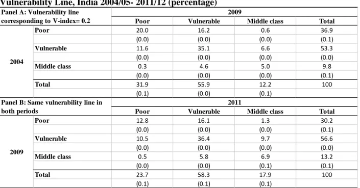
mobility in these periods, we still fix the vulnerability index at 20 percent in the first period, but use its associated vulnerability line of 1,035 rupees per month as the vulnerability line in the second period. In other words, once the vulnerability index is given in the first period, we hold constant the vulnerability line in both periods.24
Estimation results are shown in Table 6, where we keep Panel A the same as with Table 5 for convenience and provide the new estimates using the same vulnerability line in Panel B. There is also a similar shrinkage of the poor and growth of the middle class in 2009-11 as seen before, even though the middle class growth now speeds up from 24 percent in 2004-09 to 36 percent in 2009- 11. Another difference is that the vulnerable now expands in the second period, but at a slower rate (3 percent) than that (5 percent) in the first period. In terms of absolute numbers, the vulnerable are slightly larger but the middle class is around 35 percent to half a time larger in the second period. With respect to mobility, the population as a whole are still better off and more mobile in this period, with 27 percent and 17 percent of the population moving up and down one or two welfare categories respectively. These results are qualitatively similar with those obtained from keeping fixed the vulnerability index at 20 percent for both periods as shown in Table 5.
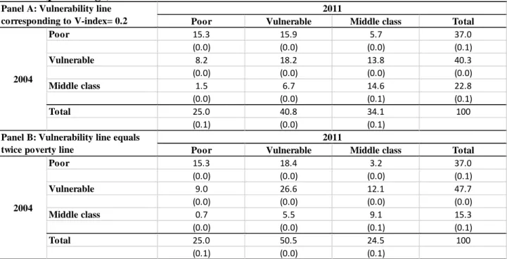
We now turn to looking at the welfare transition over the longest interval 2004-11, and provide estimation results in Table 7. For comparison purposes, we show results for two approaches with constructing the vulnerability line where Panel A provides estimates based on the vulnerability line associated with a vulnerability index of 20 percent, and Panel B shows estimates for the vulnerability line being equal to twice the national poverty line. The vulnerable category is smaller while the middle class is larger with the first approach, but both the vulnerable and the middle
24 For a graphical illustration, keeping fixed the vulnerability index for one period corresponds to drawing a vertical line in Figure 2 at the specified index, while keeping fixed the vulnerability line corresponds to drawing a horizontal line at the specified line for this period. The intersections of such lines with the curve for the other period are likely to differ, which creates different results depending on whether the vulnerability index or the vulnerability line is fixed.
23
class grow faster with the second approach. In particular, while the vulnerable remain almost the same in Panel A, this category grows by 6 percent in Panel B, and the middle class expansion climbs up from 50 percent in Panel A to 60 percent in Panel B. Mobility is rather similar, however, with both approaches: roughly 35 percent of population move up one or two welfare categories and 15 percent move down one or two welfare categories.
V.2. Profiling of Population Groups
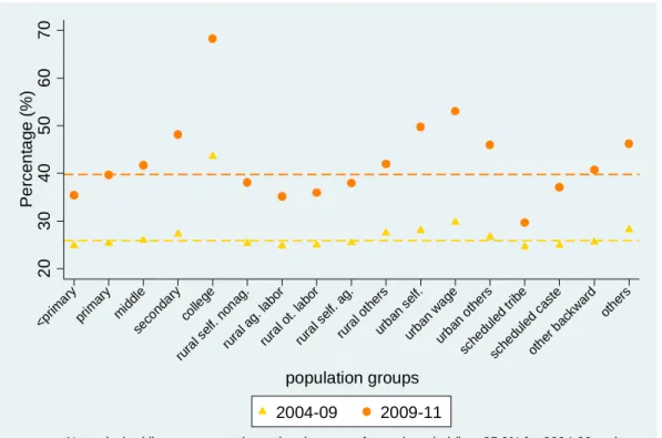
Keeping the vulnerability fixed at 20 percent, Figure 3 plots the percentage of the poor or vulnerable in the first year that move up one or two welfare categories in the second year in the two periods 2004-09 and 2009-11.25 The transitions are disaggregated by education levels (i.e., less than primary education, primary education, middle education, secondary education, and college), occupation (which is further broken down into two categories of residence: i) rural areas:
self-employment in non-agriculture, agricultural labor, other labor categories, self-employment in agriculture, remaining categories, and ii) urban areas: self-employment, wage workers, and remaining categories), and socio-ethnic groups (i.e., scheduled tribe, scheduled caste, other backward groups, and remaining groups).26
Two remarks are in order for Figure 3. First, more education achievement, urban residence, wage work, and belonging to social groups other than the scheduled or backward groups are positively associated with higher-than-average chances of upward mobility. For example, these results are shown for the period 2009-11 with the orange dots representing these probabilities lying above the orange dashed line that represents the national average. Second, the period 2004-09
25 We show the conditional, rather than the joint, probabilities for Figures 3 to 6 since this provides larger numbers that help bring out more clearly the transition patterns for the different population groups. For example, a small percentage of the population with secondary or higher education are usually found in poverty or vulnerability in the first period to start with, consequently their transitions to higher income categories are smaller.
26 An additional assumption required for producing these graphs is that mobility for each population group/ profile should generally follow that for the whole population.
24
shows qualitatively similar albeit weaker mobility than in the period 2009-11. For example, ceteris paribus, jumping from a middle education to a secondary education is associated with having one percentage point higher for upward mobility in the first period, but as large as having six percentage points higher for upward mobility in the second period. This generally concurs with our earlier findings that the period 2009-11 exhibits more mobility than the period 2004-09.
Figure 4 presents a similar graph where upward mobility is disaggregated at the state level, where, for better presentation purposes, states’ mobility in the period 2009-2011 is ranked in an ascending order. While this figure indicates that certain states maintain a similar level of performance in both periods (e.g., Chandigarh and Delhi are strong performers but Lakshadweep and Dadra & Nagar Haveli are weak performers), this may change over time. For example, such states as Meghalaya and Arunachal Pradesh are strong performers in the first period but become weak performers in the second period.
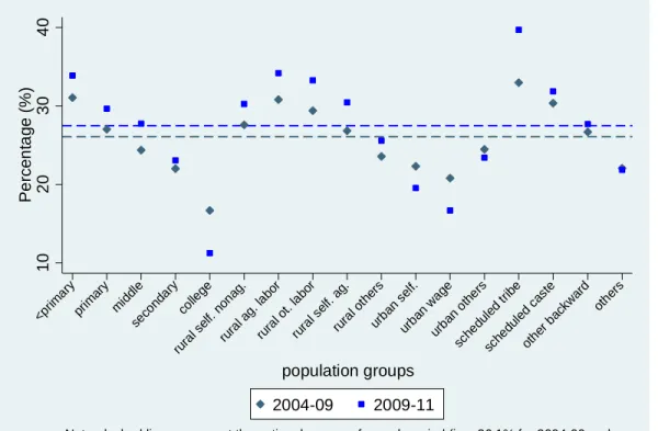
Factors that are positively correlated with upward mobility are in general related to those associated with escaping downward mobility, but this may not always hold (see, e.g., Dang, Lanjouw, and Swinkels (forthcoming) for an analysis of mobility in Senegal). We thus produce two figures for downward mobility for the same population groups (Figures 5 and 6). Interestingly, for India it is generally true that the same factor can be associated with both increasing upward mobility and decreasing downward mobility. For example, out of all occupational categories, wage workers living in urban areas have the largest and smallest chance of upward mobility and downward mobility, respectively.27
VI. Conclusion
27 But also note that the ranking of states in terms of mobility change slightly between the two periods. For example, Delhi and Chandigarh switch their place from Figure 4 (upward mobility) to Figure 6 (downward mobility).
25
We investigate in this paper the poverty and vulnerability dynamics in India between 2004/05 and 20011/12 using three rounds of the NSSs. In the absence of actual panel data, we construct synthetic panels using statistical methods that were recently developed by Dang et al. (2014a) and Dang and Lanjouw (2013). We present analysis using vulnerability lines that correspond to a vulnerability index of 20 percent and that are also close to twice the national poverty line.
Estimation results point to faster poverty reduction and more upward mobility in the period 2009-11 than in the period 2004-09. In particular, while the vulnerable category makes up more than half of the population in 2004-09, it accounts for less than half of the population in 2009-11, and the middle class grows two and a half times as large in the second period. While 23 percent and 17 percent of the population, respectively, experience upward and downward mobility in the first period, the corresponding figures in the second period are larger at respectively 30 percent and 19 percent. This pattern of stronger upward mobility is qualitatively similar when considered over the longer period 2004-11.
Factors including more educational achievement, urban residence, wage work, and belonging to socio-ethnic groups other than the scheduled or backward groups are positively associated with higher-than-average chances of upward mobility and lower-than-average changes of downward mobility.
Our paper also presents a two-step analysis procedure where careful checks should be done in the first step to ensure data comparability across survey rounds before synthetic panels can be constructed in the second step. This procedure may be relevant to quite a few other contexts since situations where data are not comparable across survey rounds—leading to, for example, the recent debate on poverty decline in 2011/12 in India—appear to occur more frequently than one might think. We discuss a statistical method (Dang et al., 2014b) that can be employed for this checking
26
purpose. Estimation results show that the poverty decline between 2009/10 and 2011/12 is not severely over-estimated (or equivalently, the design-based poverty estimate using the 2011/12 survey round is practically comparable to those from previous rounds).
Our methods are promising of richer analysis for welfare dynamics that can further exploit the richness of the NSS data. For example, future research can provide more disaggregated analysis within each state, and analyze either more survey rounds to study transition trajectories between more than two periods or survey rounds that are farther apart to investigate longer-term transitions.
Another direction is to make better use of the “thin” rounds, in addition to the “thick” rounds, to build a more comprehensive picture of these dynamics over time.
27
References
Beegle, Kathleen, Joachim De Weerdt, Jed Friedman, and John Gibson. (2012). “Methods of Household Consumption Measurement through Surveys: Experimental Results from Tanzania”. Journal of Development Economics, 98(1): 3-18.
Bierbaum, Mira and Franziska Gassmann. (2012). “Chronic and transitory poverty in the Kyrgyz Republic: What can synthetic panels tell us?” UNU-MERIT Working Paper #2012-064.
Cancho, Author César, María E. Dávalos, Giorgia Demarchi, Moritz Meyer, and Carolina Sánchez Páramo. (2015).”Economic Mobility in Europe and Central Asia: Exploring Patterns and Uncovering Puzzles”. World Bank Policy Research Paper No. 7173.
Christiaensen, Luc, Peter Lanjouw, Jill Luoto, and David Stifel. (2012). "Small Area Estimation- based Prediction Models to Track Poverty: Validation and Applications.” Journal of Economic Inequality, 10 (2): 267-297.
Crossley, Thomas F. and Joachim K. Winter. (forthcoming). “Asking Households About Expenditures: What Have We Learned?” in Carroll, C., T. F. Crossley and J. Sabelhaus. (Eds.).
Improving the Measurement of Consumer Expenditures. Studies in Income and Wealth, Volume 74. Chicago: University of Chicago Press.
Cruces, Guillermo, Peter Lanjouw, Leonardo Lucchetti, Elizaveta Perova, Renos Vakis, and Mariana Viollaz. (2014). “Estimating Poverty Transitions Repeated Cross-Sections: A Three- country Validation Exercise”. Journal of Economic Inequality, DOI 10.1007/s10888-014- 9284-9.
Dang, Hai-Anh and Peter Lanjouw. (2013). “Measuring Poverty Dynamics with Synthetic Panels Based on Cross-Sections”. World Bank Policy Research Working Paper No. 6504.
---. (2014). “Welfare Dynamics Measurement: Two Definitions of a Vulnerability Line and Their Empirical Application”. World Bank Policy Research Paper No. 6944.
Dang, Hai-Anh and Minh Cong Nguyen. (2014). "POVIMP: Stata Module to Provide Poverty Estimates in the Absence of Actual Consumption Data." Statistical Software Components S457934. Boston College, Department of Economics.
Dang, Hai-Anh, Peter Lanjouw, Jill Luoto, and David McKenzie. (2014a). “Using Repeated Cross- Sections to Explore Movements in and out of Poverty”. Journal of Development Economics, 107: 112-128.
Dang, Hai-Anh, Peter Lanjouw, Umar Serajuddin. (2014b). “Updating Poverty Estimates at Frequent Intervals in the Absence of Consumption Data: Methods and Illustration with Reference to a Middle-Income Country.” Policy Research Working Paper No.7043.
Washington DC: The World Bank.
28