• Keine Ergebnisse gefunden

The Universe of Fonts, Charted by Machine

N/A
N/A
Protected

Academic year: 2021

Aktie "The Universe of Fonts, Charted by Machine"

Copied!
1
0
0

Wird geladen.... (Jetzt Volltext ansehen)

Volltext

(1)

The Universe of Fonts, Charted by Machine

J¨orn Loviscach

Fachhochschule Bielefeld (University of Applied Sciences)

1 Introduction

Today, computer fonts come in hundreds and thousands. How do you find a font that fits for the task at hand? Which general types are available? Which ones are related—or not related at all—to the ones you know well? To address such issues, this work applies strategies from Music Information Retrieval (MIR) to organizing fonts. Finding similar music and graphically laying out a music collection according to the similarity of the tracks are standard tasks in MIR, tackled by automatically extracting meaningful but low- level descriptors from the bare content data—that is: waveforms—

and discovering high-level meaning through machine learning.

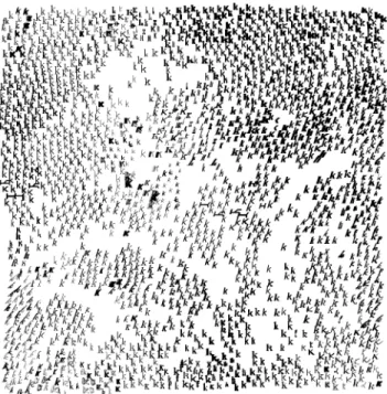
In the same spirit, this work introduces a set of descriptors to be extracted from the font files. These descriptors are used to create a two-dimensional layout of fonts according to their similarity, see Figure 1. This readily shows duplicates and clones as well as clus- ters. It also enables a serendipitous approach for finding fonts that are in some surprising respect similar to a given font.

2 Font Similarity and Charting

The software prototype fetches the outline curves of all installed fonts and computes six descriptors for each character. These are averaged according to the characters’ frequency in a given text file.

Apparent Height. The maximum height is divided in 1000 bins.

Each character’s area in each height bin is computed to create a height histogram. The “apparent height” is taken to be the 95

th

per- centile minus the 10

th

percentile of this histogram, which reliably removes descenders and spuriously tall special characters. The ap- parent height is not used directly for similarity computations, but helps to normalize other parameters since fonts of nominally equal size come at wildly differing apparent sizes.

Weight. Each character’s area is divided by the square of the arc length of its contour. This is independent of the overall size, equals 1/4π for a circle, and tends to zero as the shape gets more meager.

Roundness. A histogram of the slopes that occur in the outlines is computed by stepping along the contours, weighting by the steps’

arc lengths. A low entropy of this histogram means that some direc- tions are strongly favored. Rounded fonts possess a high entropy.

Slant. To suppress near-horizontal directions, the same histogram is weighted with the sine of the slope angle. Then, the mean value of the cosine of the angle is computed, which is zero for upright lines and positive for forward-slanted lines. The mean value is con- verted back to an angle by taking the arc cosine. The resulting angle characterizes the font outline’s mean non-horizontal direction.

Curvature. To compute a robust measure of the local curvature such as serifs or grunge-style font features, a pair of points is swept along all contours. Measured along the curve, these two points have a distance of 0.05 times the apparent font height (which is to be computed beforehand, as described above). Then the triangle is considered that is formed by this pair of points and by the point on the contour that sits at their middle in terms of arc length. The ratio of the height of the middle point in this triangle to the apparent font

e-mail: joern.loviscach@fh-bielefeld.de

Figure 1: 2000 font styles laid out as a landscape. Note that the computation of similarity takes a complete text into account, not only the single character displayed here.

height characterizes how far the contour deviates from a line. The characteristic value used is the mean of the square of this quantity.

Diagonalness. Black letter fonts can be identified by diagonal cor- ners that point up or down. For this, the square height mentioned in the former descriptor is weighted depending on the slope of the line connecting the original pair of points.

To cope with their wide variation in range, all values for each sin- gle descriptor are sorted to form a rank order. The rank numbers are used instead of the descriptors’ actual values. The resulting 5D vectors are used to train a toroidal or non-toroidal self-organizing map sized 50 × 50. The distance in the 5D space is taken to be Euclidean, with the exception of the visually preponderant charac- teristic “weight” appearing with a factor of √

2. Each font ends up at one specific spot on the map. To avoid overlap, the fonts’ posi- tions are spread out using incremental motions. In the toroidal case, the map is shifted vertically and horizontally in a toroidal fashion to minimize the number of fonts close to the boundary.

3 Outlook

The 2D arrangement could for be used, for instance, as a replace- ment of the standard font selection dialog. Collections of 10,000 or more fonts could be handled through a zoomable interface that—

when zooming out—replaces each cluster of fonts by a single, pro-

totypical font. There is a vast set of further options from MIR to

explore: The relative weights of the characteristics could be learned

from examples provided by the user. Furthermore, analogously to

MIR automatically building playlists, one could recommend type-

faces that go well with another.

Abbildung

Figure 1: 2000 font styles laid out as a landscape. Note that the computation of similarity takes a complete text into account, not only the single character displayed here.

Referenzen

ÄHNLICHE DOKUMENTE

❏ Puesto que cuando se selecciona una fuente en EPSON BarCode Font se añaden caracteres especiales tales como Start y Stop, el código de barras resultante puede tener más

Zu den Schriften zählen: Courier, Courier Oblique, Courier Bold, Courier Bold Oblique, Helvetica, Helvetica Oblique, Helvetica Bold, Helvetica Bold Oblique, Helvetica Narrow,

The fonts include: Courier, Courier Oblique, Courier Bold, Courier Bold Oblique, Helvetica, Helvetica Oblique, Helvetica Bold, Helvetica Bold Oblique, Helvetica Narrow, Helvetica

Se incluyen 17 fuentes escalables, Entre las fuentes se incluyen: Courier, Courier Oblique, Courier Bold, Courier Bold Oblique, Helvetica, Helvetica Oblique, Helvetica Bold,

Les polices suivantes sont incluses : Courier, Courier Oblique, Courier Bold, Courier Bold Oblique, Helvetica, Helvetica Oblique, Helvetica Bold, Helvetica Bold Oblique,

I caratteri includono: Courier, Courier Oblique, Courier Bold, Courier Bold Oblique, Helvetica, Helvetica Oblique, Helvetica Bold, Helvetica Bold Oblique, Helvetica Narrow,

Dit zijn: Courier, Courier Oblique, Courier Bold, Courier Bold Oblique, Helvetica, Helvetica Oblique, Helvetica Bold, Helvetica Bold Oblique, Helvetica Narrow, Helvetica Narrow

Clarendon, Helvetica, New Century Schoolbook, Optima, Palatino, Stempel Garamond, Times und Univers sind eingetragene Marken der Heidelberger Druckmaschinen AG, die in